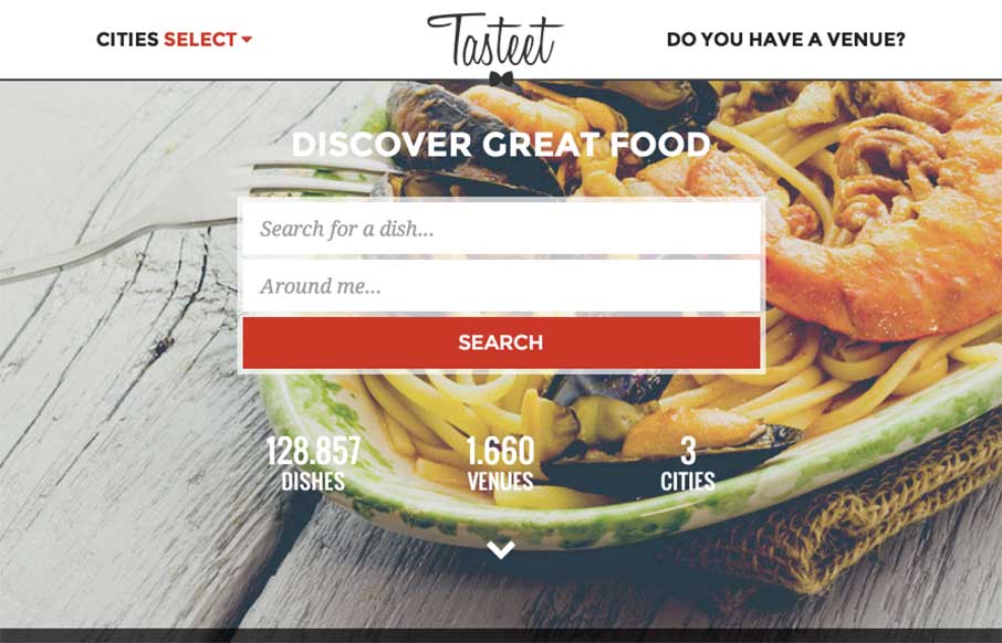
by Aaron Griswold | Jan 22, 2015 | Food and Beverage, Gallery
Hope you already had lunch… don’t go to this site if you haven’t – but if you haven’t, and happen to be in Italy, check out Tasteet. Pretty innovative foodie / food finder site. Great design on desktop and mobile. And like the layout of...
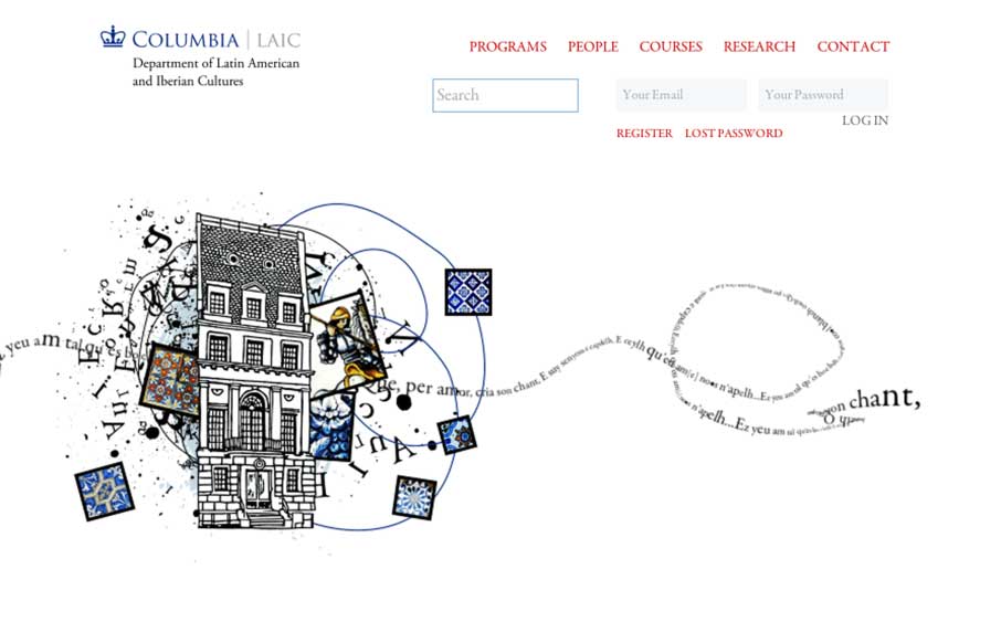
by Aaron Griswold | Jan 22, 2015 | Education, Gallery
Cool canvas work from Miguel Ripoll for Columbia University’s Dept of Latin American and Iberian Cultures. The coloring and tiles conveys a specific cultural element that you don’t see in most sites – which is very relevant to the client. And the...
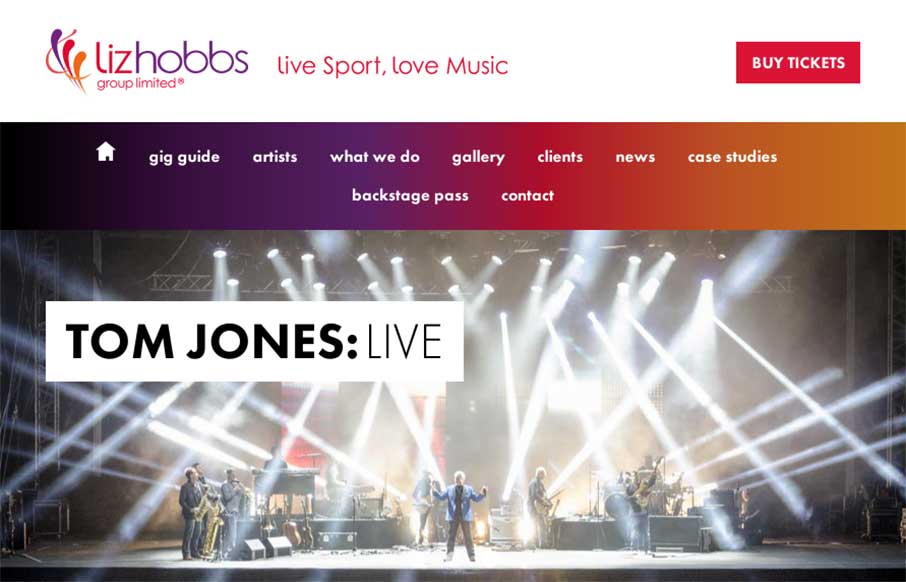
by Aaron Griswold | Jan 21, 2015 | Entertainment, Gallery
Good responsive work by Root Studio on the Liz Hobbs Group site out of the UK. Has a smart integration with Spotify to give you a taste of their artists, as well as hi-res images and color splashes to set a vibrant tone. From the Designer: “Liz Hobbs Group is a...
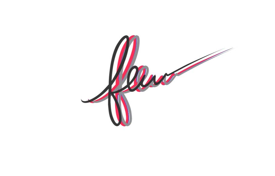
by Aaron Griswold | Jan 20, 2015 | Gallery
Great colorful on a nice white canvas site from Few, out of Little Rock, Arkansas. Like how you’re greeted with the all the colors of the site flying in to make the one black logo for Few. The illustrations of the peeps are cool, and really like how the video...
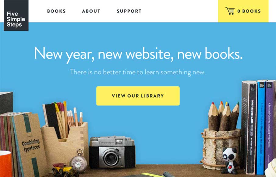
by Aaron Griswold | Jan 20, 2015 | Gallery, Shopping
Love the changes to the Five Simple Steps site from when we reviewed them last March. This feels right – it’s clean, simple, beautiful, and practical like the books they sell. It looks to be built on Shopify, but doesn’t have the feel of most...