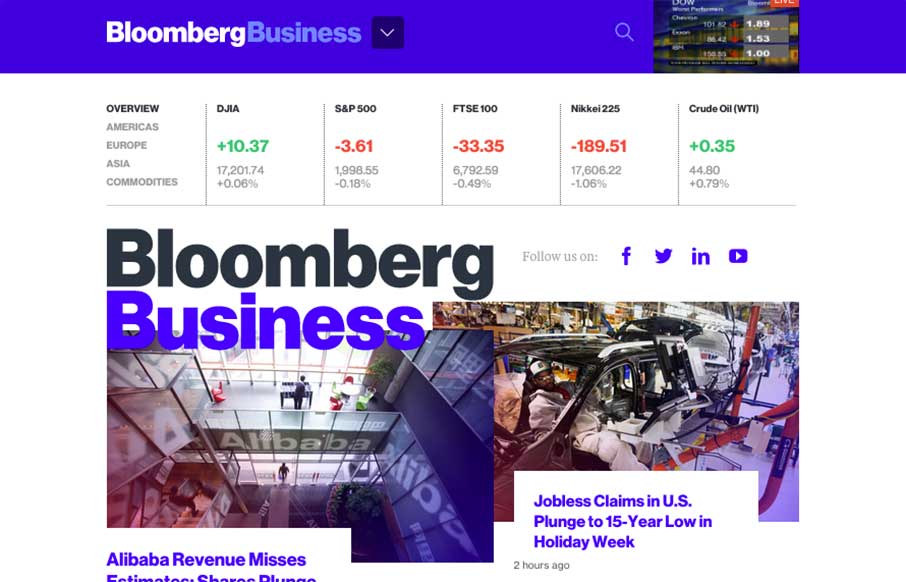
by Aaron Griswold | Jan 30, 2015 | Gallery
I just mentioned to Gene that I don’t even know where to start on this site review. Brad Weaver’s tweet (below) kind of says it all of Bloomberg’s (@business) new website – gorgeous and usable. There’s already been so much praise and...
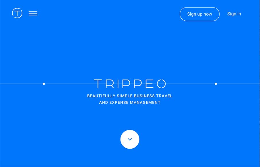
by Aaron Griswold | Jan 29, 2015 | Gallery, Travel
We reviewed the Trippeo site last year, pre-launch, and remembered it was pretty cool. So we’re looking at it again today – even better. The SVG animation that’s integrated with the video backgrounds and content areas give you a good idea of what the...

by Aaron Griswold | Jan 27, 2015 | Gallery
Like these folks, their energy, and philosophy: “The only thing we take seriously is your work. We are a collective of creative freelance professionals.” And their work is good. Their site scrolls down easily, with subtle fly-ins to help punctuate the...
by Aaron Griswold | Jan 27, 2015 | Gallery, Software
Your App Product Page is broken. You only have some icons, copy, and an image of someone staring at their smartphone with a happy smile…. What you haven’t done is to take your prospective client / user, and given them a clear path that explicitly states:...

by Aaron Griswold | Jan 26, 2015 | Gallery, Portfolio
Good and “quick” portfolio site from James Madson from Arizona. Again, like the Home page used as the navigation to the portfolio part. Then a simple “left/right” to move between Work detail pages, and his logo to get back to the home page. I...