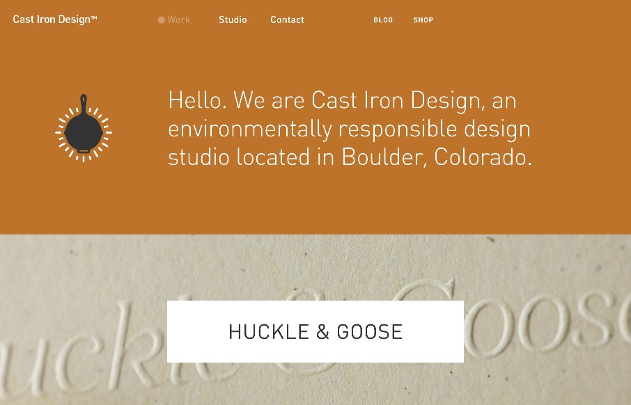
by Aaron Griswold | Apr 29, 2015 | Gallery
Man – this is some sweet work from Cast Iron Design out of Boulder, Colorado. After going back through the site, I almost made this a Friday in-depth review. They go straight to the heart of showing off their work on the home page, using this trend of background...
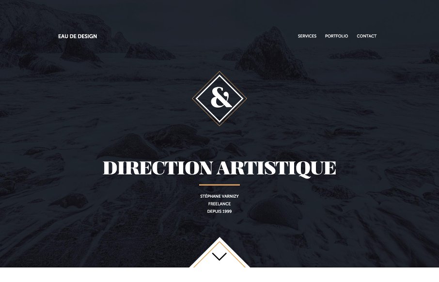
by Aaron Griswold | Apr 28, 2015 | Gallery, Portfolio
We really like this site from Stephane Varnizy out of Paris. Excellent movement on scroll and in the drawing of the SVGs. Also really like the coloring – and the Portfolio – good stuff there. From the Designer: Hi, my name is Stéphane Varnizy and...
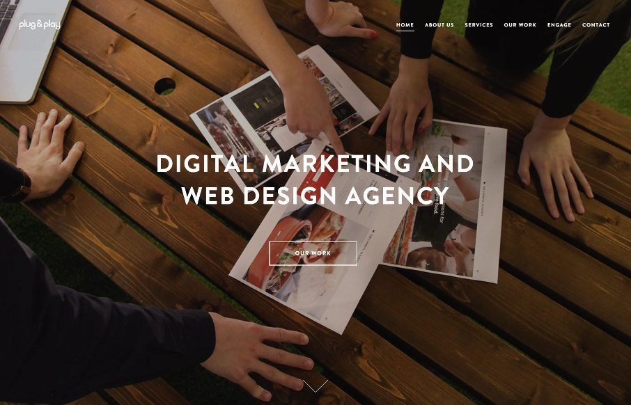
by Aaron Griswold | Apr 27, 2015 | Gallery
Plug and Play out of London has an interesting site. The content parts are fairly basic, and you might even think Bootstrap in those areas – but there are parts of the site that I really like. I’m really into movement on sites right now, so like the...
by Gene Crawford | Apr 25, 2015 | Gallery, Nonprofit
I like the blocky-ness to this layout. Though at first it comes off as little cluttery looking, I find myself liking the way the navigation is done. The small black line with standard nav items and then the larger more central nav items under that to stand out more is...
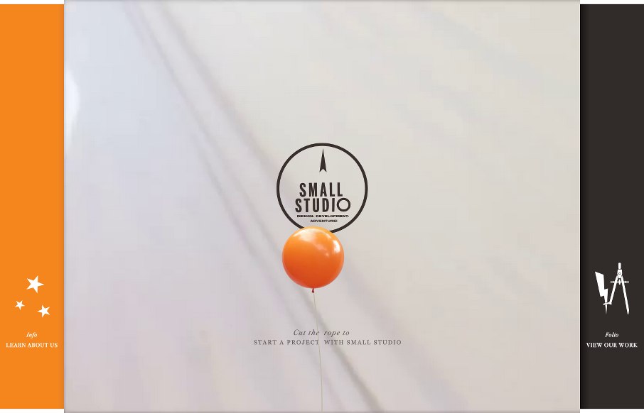
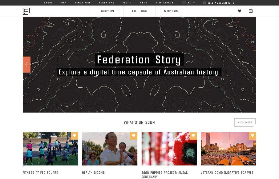
by Aaron Griswold | Apr 23, 2015 | Gallery
Whoah. I’m not sure where to start on the agency site from Small Studio out of Melbourne, Australia. There is so much going on, and for the most part it seems seamless design-wise (I’m still a little tripped up on what the balloon is in the client...