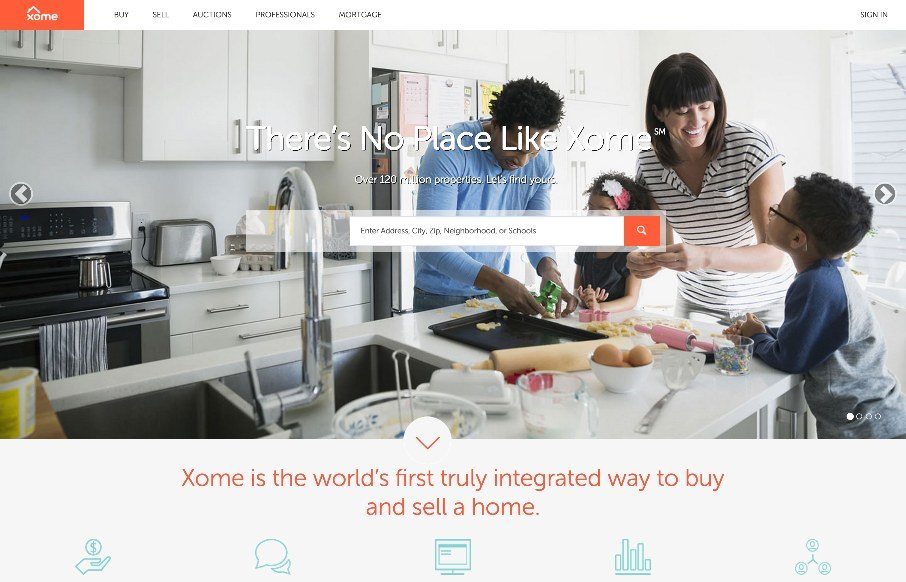
by Aaron Griswold | Jun 18, 2015 | Gallery
Pretty cool experience for a search based website. I like how the search is focused on top of the main hero image space. Keeps it front and center. There’s very little small screen width experience here but overall for desktop it’s tops. Cool form elements...
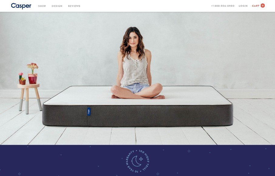
by Gene Crawford | Jun 18, 2015 | Gallery, Product, Shopping
I just love it when a nice brand has a minimal approach to it’s website. Casper is a great example of what a minimal approach can do for you. The messaging is crystal clear and simple and there are still some really great interaction sections on the site to...
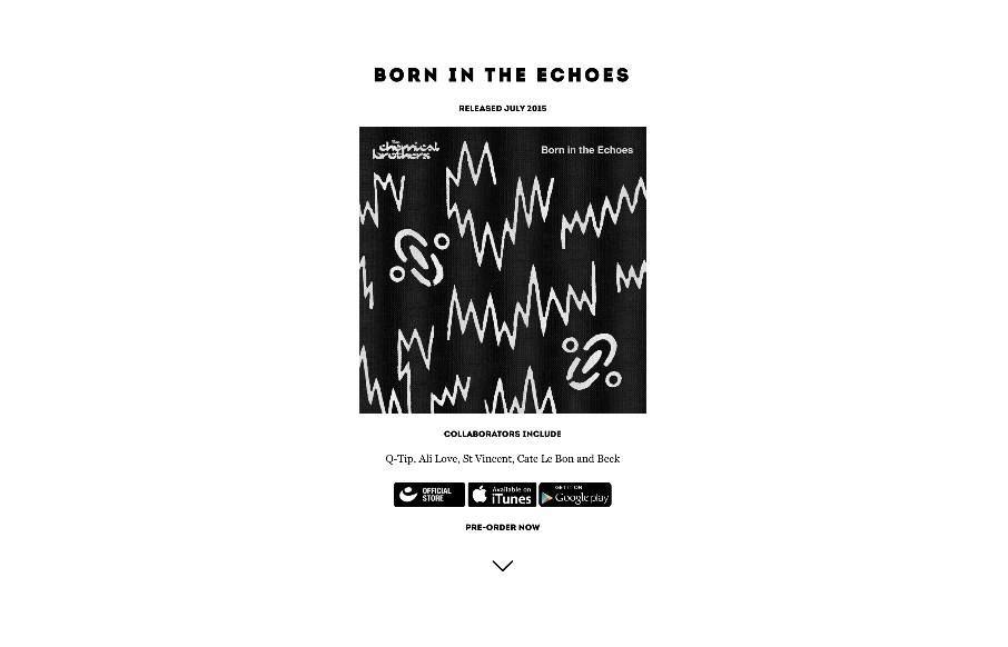
by Aaron Griswold | Jun 17, 2015 | Gallery, Music
The Chemical Brothers are back after a little hiatus – and since music is a personal thing, I’ll just comment that I like their new stuff – love the new site too. It’s wild, and fit’s the band’s image / music. Exceptional parallax...
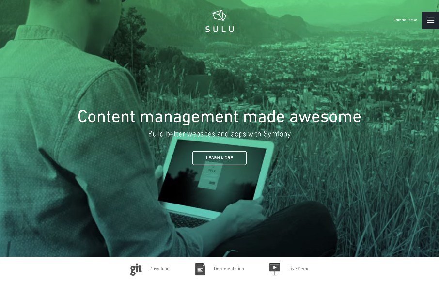
by Aaron Griswold | Jun 17, 2015 | Gallery
Good clean design on Sulu, a CMS built on Symfony. We almost listed it in Radar as a resource instead of the Gallery , but we liked the white space and the little animations that happen on-scroll. @sulu_io : Handcrafted in the Alps Privately funded by...
by Aaron Griswold | Jun 16, 2015 | Gallery, Music
When we were in Nashville last week for BDConf, I walked into a concert for one of Master Channel’s clients, (no, not R5 with Ross Lynch from Disney’s Austin and Ally… which my kids watch..) but country star, Kip Moore. And yes, I used the website...