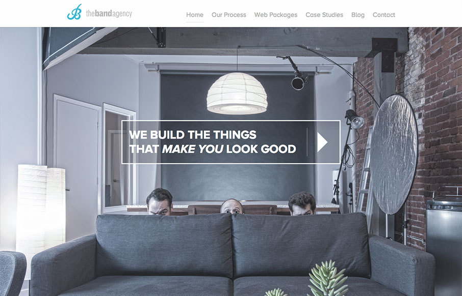
by Giovanni DiFeterici | Aug 15, 2013 | Design Firm, Gallery
I don’t know these guys, but I already love them. This site is funny as hell, but serious. I take them seriously. Seriously…. But seriously, the design has more character and fun that you can shake a stick at. And it looks good at all sizes. And it’s...
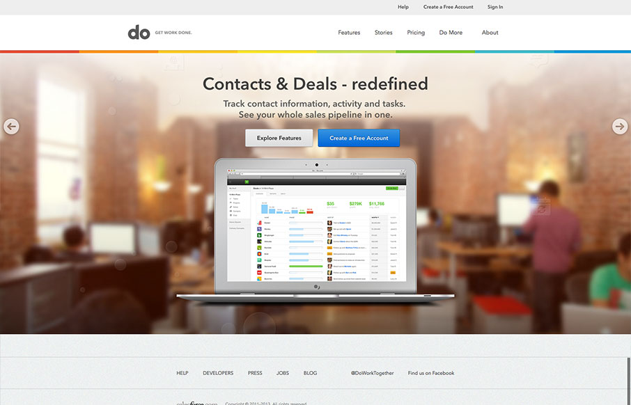
by Gene Crawford | Aug 14, 2013 | Gallery
I really love the simplicity of the Do site design. It’s boiled down to just what’s needed. The overall palette is muted, but not really which is a clever understatement to work into the design. I also dig the Features page, I like how it goes from just...

by Gene Crawford | Aug 13, 2013 | Gallery
The new Uber site design is slick and upscale. Nice use of the slideshow IMHO, the images are something out of vogue and adds to the visual branding that they’re rolling with. The site is a stark black and white design with a hint of of the blue/green color used...
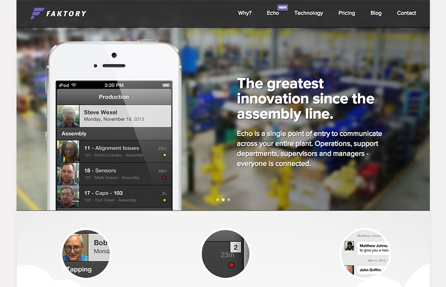
by Gene Crawford | Aug 12, 2013 | Gallery
I really dig the smooth nature of this layout. It looks visually complete as you scroll down and/or click through different sections of the page. I do think it lacks in content, for example I want more on the pricing section. I get that they need to consult with you a...
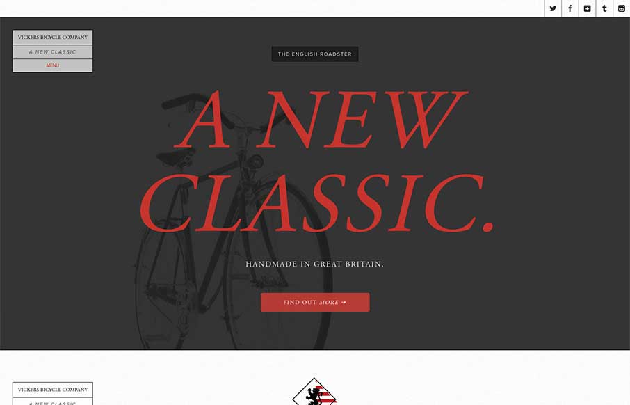
by Giovanni DiFeterici | Jul 18, 2013 | Gallery, Sports/Recreation
The Vickers Bicycles site is a small one that has one clear purpose: promote and sell the English Roadster Bike – a beautiful machine, if I do say so – and does so wonderfully. The simple, open layout has a slightly mechanical feel that doesn’t feel...