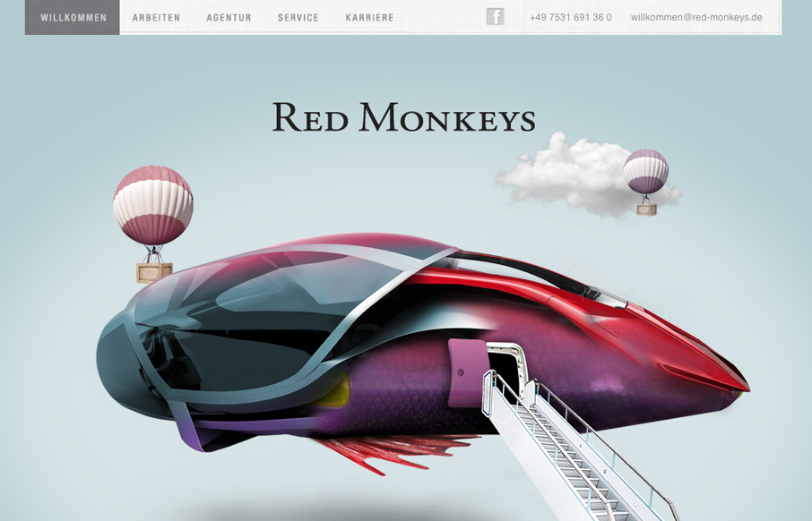
by Gene Crawford | Jul 24, 2012 | Design Firm, Gallery
Nice mix of fantastical illustration and parallax here. It’s fun and keeps you engaged with enough eye candy then the visual structure behind it delivers what it needs content wise. One little detail I both like and dislike is the tool tip that shows the...
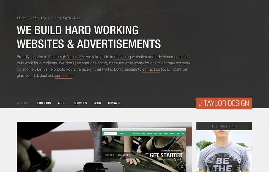
by Gene Crawford | Jul 23, 2012 | Gallery
Very thorough design. Overall the layout is engaging and crisp then the detail work is top-notch. From the interactions on the navigation and logo, the way the main navigation bar fixes itself in place as you scroll down and fades in and out. I also really like how...
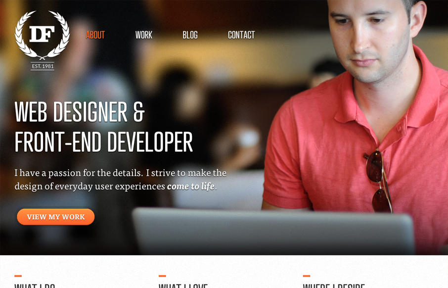
by Gene Crawford | Jul 20, 2012 | Gallery
Nice asymmetrical layout, I really think the larger photo/work shot really helps bring a sense of focus to that section below the gray background/header area. The type is nicely treated visually and there is a solid rhythm as you scroll down the site. I don’t...

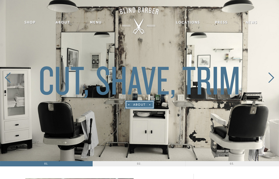
by Gene Crawford | Jul 19, 2012 | Gallery
I like the simple way in which this design shows off how to use the app and what it does with drawings of the hands using it. It’s straight forward and feels simple enough. The design is plush with textures and that plays nicely off the iPhone photo really well....
by Gene Crawford | Jul 19, 2012 | Gallery
For once I almost like a loading screen, it doesn’t take too long on this site which is good but it’s entertaining too. I think the monochromatic color scheme pulled out of the main photos and just the single blue. I also dig how the slider is done with...