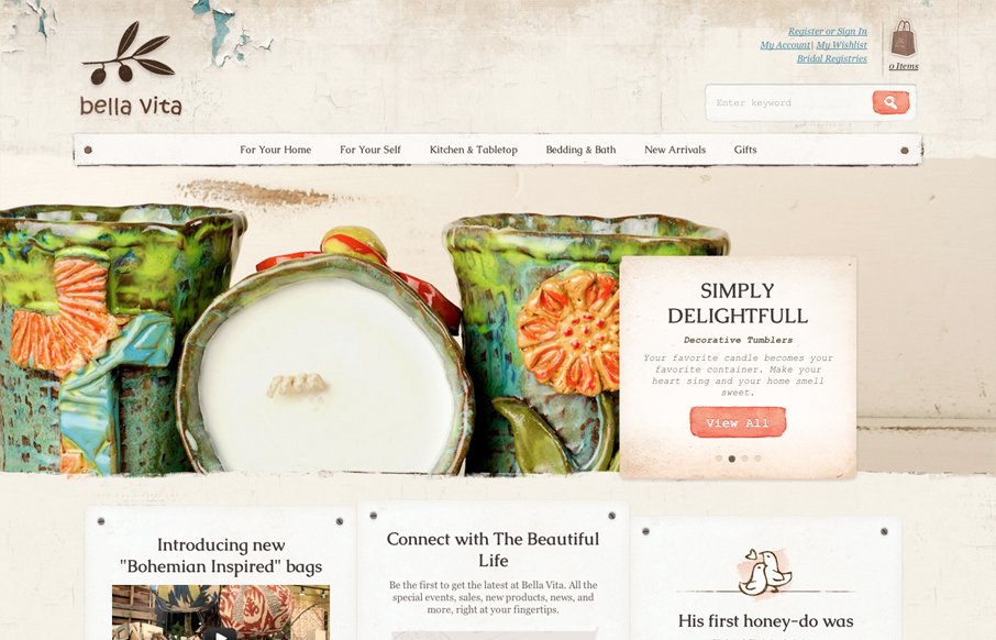
by Gene Crawford | Jul 30, 2012 | Gallery, Shopping
What I like most about the Bella Vita website is the consistency that the textures and colors are used. I love that search button, the same esthetic is echoed throughout the site’s details too, like on the back and next interactions on the slideshow. The main...
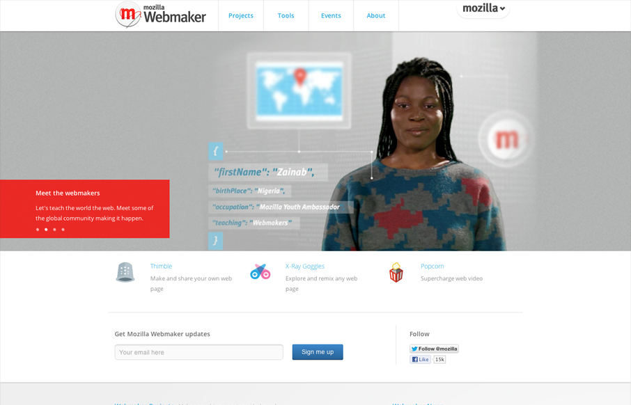
by Maria | Jul 30, 2012 | Gallery
Nice clean and straight forward design for the Mozilla Webmaker website. Some interesting responsive navigation changes too. Wonder why they chose to drop that big selection nav off the Mozilla logo on smaller screen sizes. Overall I like the minimal feel to it while...
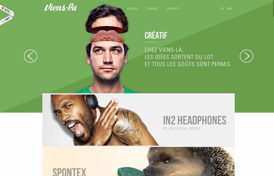
by Gene Crawford | Jul 26, 2012 | Design Firm, Gallery
I like how the big images are put together in the main slideshow/hero image area. Those are clever and engage you. Then my favorite part is the large tiles of projects and such as you scroll down, those help tell a good story visually for each piece they represent and...
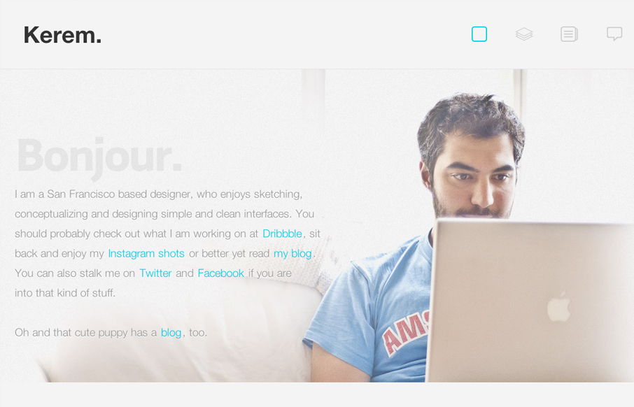
by Gene Crawford | Jul 25, 2012 | Gallery
Nice work on the photo and how the copy plays right up to it, even visually with the copy about the dog right above the dog. I just dig that. Love the fixed header and how it feels really well tailored into the site. Random numbers section in the footer area is...
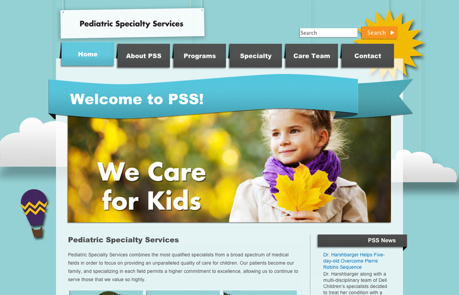
by Gene Crawford | Jul 25, 2012 | Gallery, Medical
There’s a kind of rough and unfinished feel to the shapes/illustrations here. I’m sure it’s on purpose when you consider the scope of execution on this website. The responsive design and other details leave me with this feeling. I especially love the...