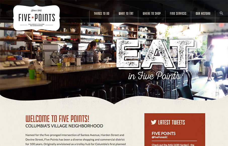
by Aaron Griswold | Apr 3, 2015 | Food and Beverage, Gallery, In-Depth Review, Nonprofit, Travel
We see so many local websites that are just, well, not good. Our buddy Joe Lemmons @joslemmons just finished this site for the Five Points Association in Columbia, SC – and friends aside, we were pretty wowed with the work. So we decided to go a little more...
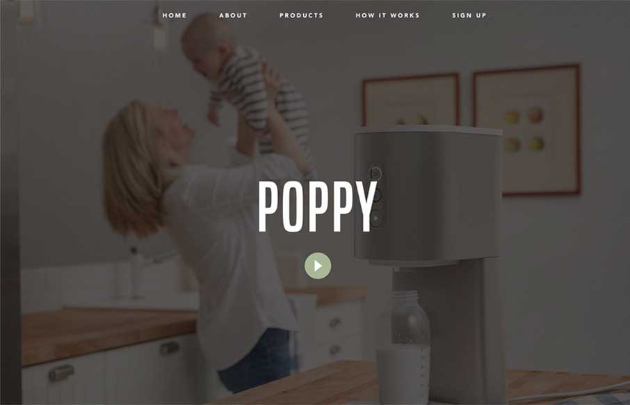
by Aaron Griswold | Apr 2, 2015 | Gallery, Product
Poppy, from Quirky out of New York, caught my eye because once upon a time I was COO of a start up that tried to do some of the same things in the pet industry before we had a lot of technology that is ingrained into our daily lives today… Besides some awesome...

by Aaron Griswold | Apr 1, 2015 | Gallery
I admit, at first I was taken aback on the Website Store UK website out of the UK.. (wait, what did I write there?) – mainly because of the name and the image of the iPhone and iMac site mock ups in front of the full width and height images. Pressing on, found...
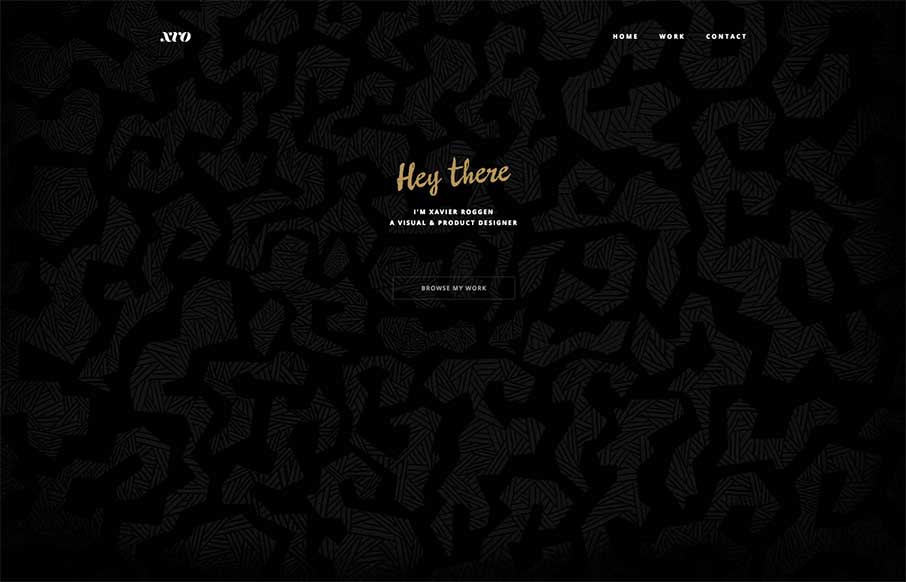
by Aaron Griswold | Mar 31, 2015 | Gallery, Portfolio
Xavier Roggen’s portfolio site out of Brussels is minimal, but there are some cool takeaways from it (we try to get those in each site we look at). I like the full width image slider background and the filtered images he uses. Sometimes style is a matter of...
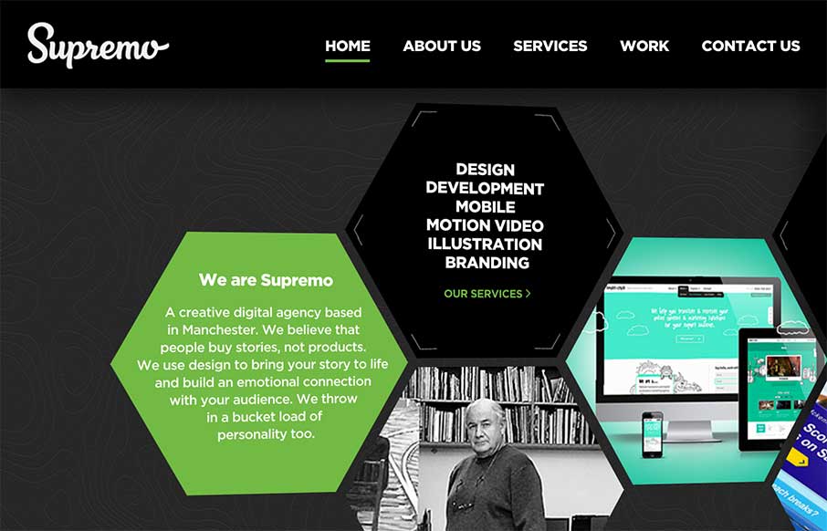
by Aaron Griswold | Mar 30, 2015 | Gallery
Good start to the week with Supremo’s site, out of England. The home page is a different take on interactive navigation, which sets it apart from other agency sites. The Work (portfolio / case studies) area is strong and well thought out. Cheers! From the...