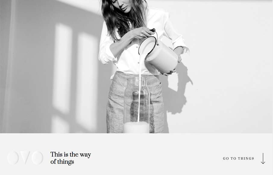
by Aaron Griswold | Oct 26, 2015 | Fashion, Gallery, Shopping
We’ve started to see a couple of good sites coming out of Lithuania lately – and I like this one from OVO. I really like the transparent logo, and how it plays on different pages – also like the fact that they are willing to partially cover up the...
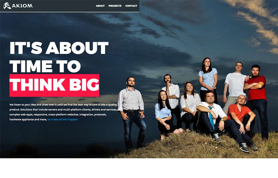
by Aaron Griswold | Oct 19, 2015 | Gallery
I had to look at this site by Akiom, out of Romania, a few times – and I think it’s grown on me. At first I thought the site was unbalanced (leaning to the right) – but the more I look at it, I like how it flows – I think the large,...
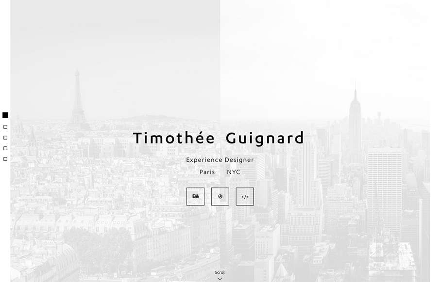
by Aaron Griswold | Oct 16, 2015 | Gallery, Portfolio
Love this portfolio site from Timothee Guignard out of NYC. Simple and understated on top – awesome detail in the Portfolio Detail pages. From the Designer: Portfolio of Timothee Guignard, UX, UI, Webdesigner Submitted by: Timothee Guignard Twitter: @timguignard...
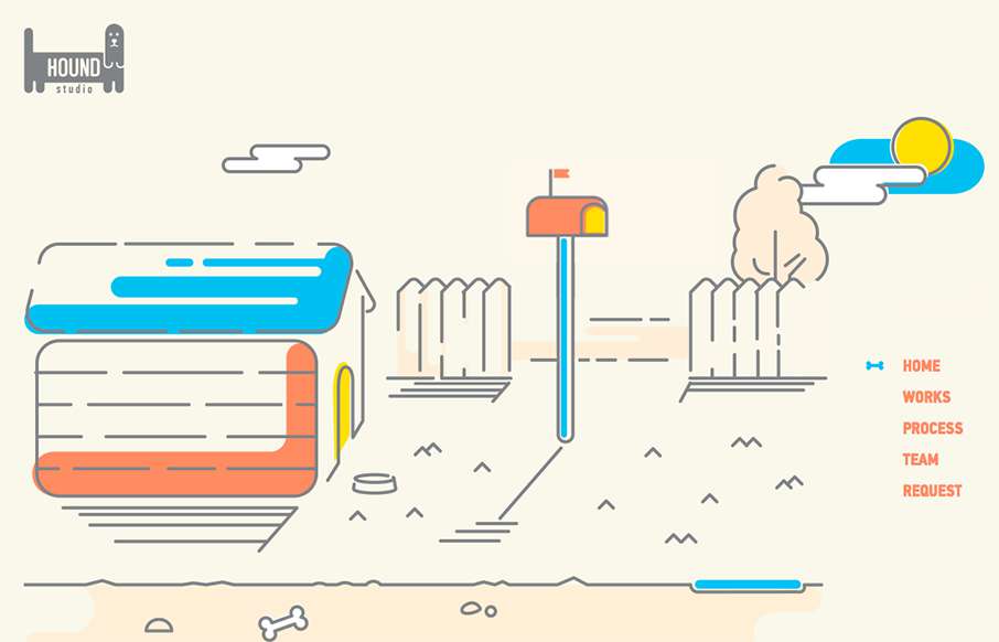
by Aaron Griswold | Oct 15, 2015 | Gallery, Marketing Company
This is a fun, quick, one-pager from Hound Studio out of the Ukraine, with cool animated illustration gifs – and good animated sales funnel. From the Designer: Imagine that you have 90 seconds to explain the customer the main idea of your business and all its...

by Aaron Griswold | Oct 14, 2015 | Gallery
Very cool single page site done for Hadgins Engraving, by 15 Fingers out of Buffalo. Two colors, some illustrations, some good typeface, and a little interaction – very good. Especially like the “skull fashion plates” lower in the page. From the...