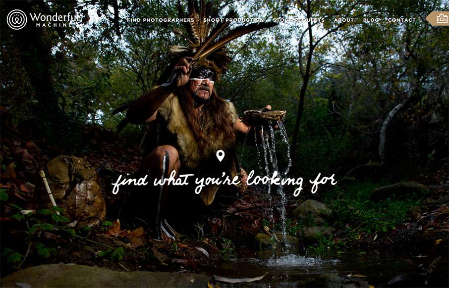
by Gene Crawford | Nov 4, 2015 | Gallery, Marketing
Wonderful Machine is a production company with a network of more than 700 highly curated commercial photographers worldwide. The site houses a photographer search used by agencies worldwide, and Wonderful Machine’s other services such as stock photo requests,...
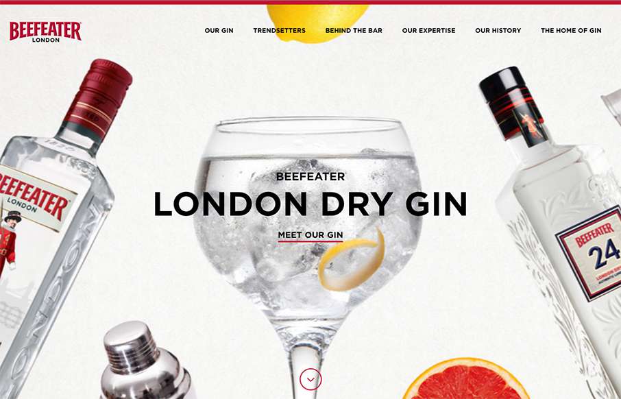
by Aaron Griswold | Nov 2, 2015 | Food and Beverage, Gallery
Excellent site for Beefeater Gin out of London – bright and clean, with big bold, full width images. Also like what they’ve done on one of their pages with the London Sounds interactive music map – very cool. Submitted by: Lauren McGregor Twitter:...
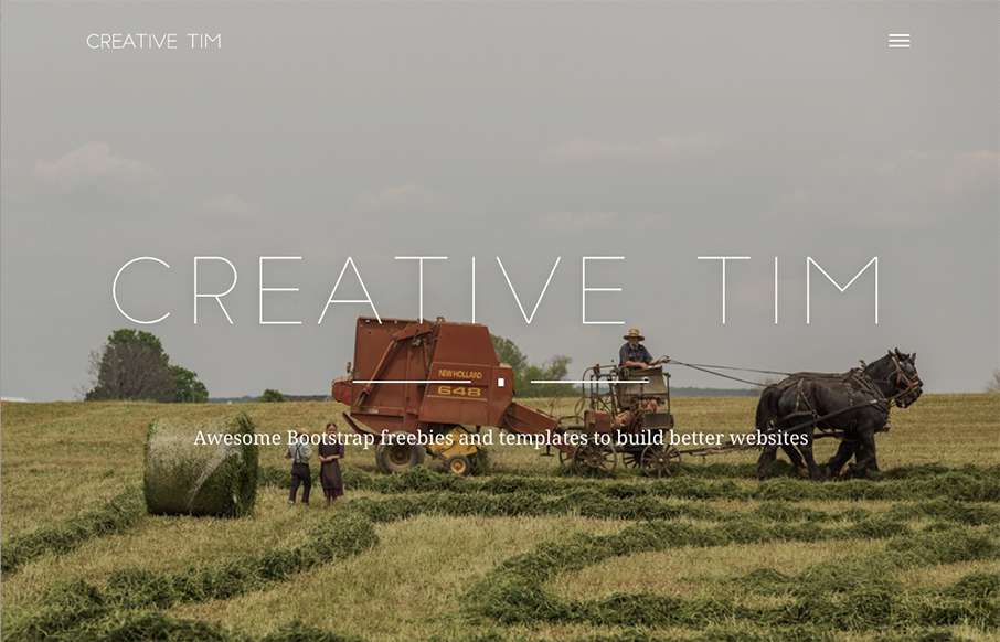
by Aaron Griswold | Oct 29, 2015 | Gallery
I like that Creative Tim, the design team out of Romania that brought you the “Get S*** Done” Bootstrap UI Kit, has added a layer to their normal site. While their main site is a clear shopping site for themes / kits / etc, the “presentation”...
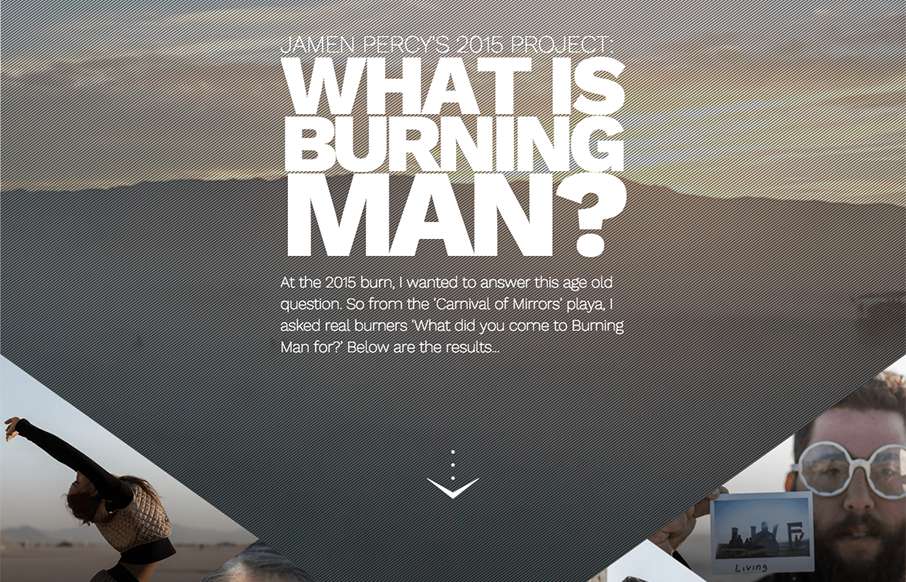
by Aaron Griswold | Oct 29, 2015 | Gallery
Here’s a cool pet project from Jamen Percy of London about his experience at Burning Man this year. Listen, if you’re going to do something fun for yourself – make it dynamic and awe-inspiring like Jamen has here. Love the site in general –...

by Aaron Griswold | Oct 28, 2015 | Gallery, Portfolio
Solid and simple portfolio from Emma Lawler out of San Francisco. I like the movement when you click a work sample – also like that there are only three work examples (as not to clutter the page), but that each example has a nice quick narrative, so you get a...