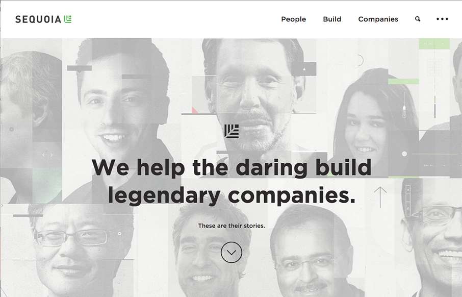
by Aaron Griswold | Oct 13, 2015 | Gallery
Sharp new site from Sequoia Capital out of Menlo Park. Like the intro image that leads down to the cool vertical slideshow, with great suped-up images, and a cool overlay on the left.
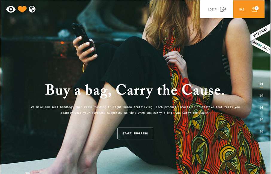
by Aaron Griswold | Oct 12, 2015 | Gallery, Shopping, Social Cause
Great looking site, with really good purpose – Eye Heart World, out of Tampa, Florida, is a non-profit dedicated to stopping human trafficking. Really good work on The Cause page too.
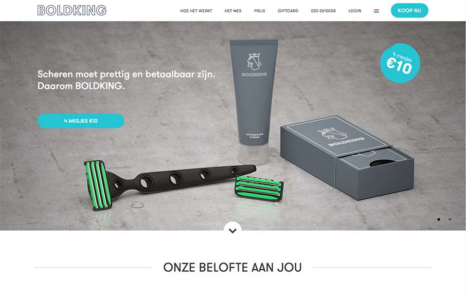
by Aaron Griswold | Oct 8, 2015 | Gallery, Product
Love this site from Boldking out of Amsterdam. Great illustrations and animation help tell their story. Also love how the real and non-real elements work together.
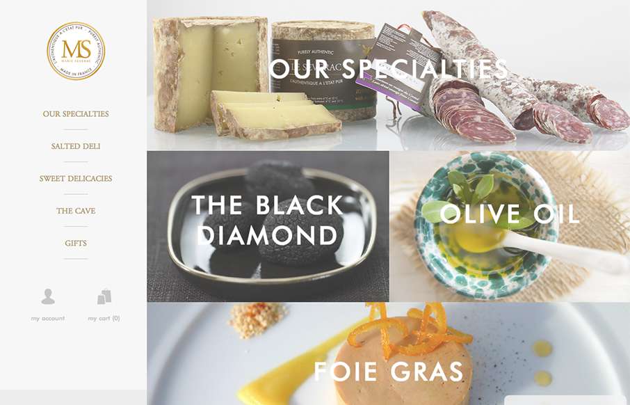
by Aaron Griswold | Oct 7, 2015 | Food and Beverage, Gallery
This site from Marie Severac, a gastro e-commerce store out of France (not sure if a physical location too), is simple and clean – which is great when you’re showcasing things like specialty foods. I think there are a few missing pages, but I like the...
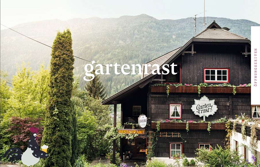
by Aaron Griswold | Oct 5, 2015 | Gallery, Travel
Clean, and a lot of gut white space. Love the hamburger / fork-knife-spoon menu – and roosters too.