Creative Arts at Haywood Community College

Creative Arts at Haywood Community College

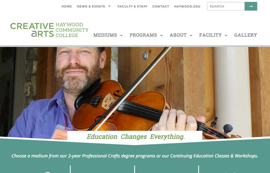
Sweet responsive site for Haywood College. I like the downward angle used to anchor the page visually, that's a nice touch. Marisa Falcigno @helloODDS Role: Designer & Developer The website project was integral in highlighting the new identity while providing a...

KBT-mottagningen

KBT-mottagningen

What a great visual mark; the KBT logo. I'm probably biased, since I love everything Swedish. But man it's hot. I love the light feel to the design and the colors throughout. I do wish it was responsive, but it's hard to tell sometimes how old a site is. Great work...

Racket

Racket

I love the dark and light mixed on the page here. The hand written type is very nice and makes the work gel as well. Lovely responsive approach finishes off a really nice website. Submitted by: Paul Mosig @r_a_c_k_e_t Role: Designer & Developer Re-design of Blue...

On The Road Again

On The Road Again

Really nice little single page(ish) website for traveling in Australia. Super nice photography and maps and a fun way to explore the page. On The Road Again is a website dedicated our Australian roadtrip done in Van. This presents an overview of our entire journey....

thegrid.io

thegrid.io

The page just keeps going and going, but it's all good stuff. That's rare for website's I come across.

Cronnection

Cronnection

I love a lot of the detail work in the different visual sections of this site. The way things are stacked and lined up is pretty tight and while very similar to other website's feels a little different somehow. Submitted by: Álvaro Castaño @cronnection Role: Designer...

Font Smith

Font Smith

Very clean and simple design but very effective. Especially for font websites brevity is clarity. Luuurrve this.

Final

Final

You just have to love a website design that get's spacing. That's the thing that hits me the most on this site, the spacing and timing of all the elements and sections as you scroll down. Put that together with the soft feel they've used for all the elements and this...

The Washed-Up Dead

The Washed-Up Dead

Oh man! So much fun! There's not much to say about it, but really awesome stuff for October.

Slice Jack

Slice Jack

Super strong colors and bold graphics define the Slice Jack site design in a good way. I really dig the scroll animation of the axe too.

Stop the Vultures

Stop the Vultures

I love a good narrative and Stop the Vultures doesn't disappoint. I like the way the illustrations load as you scroll down the page too, it helps things evolve for you as the reader. Also it all looks pretty aces.

Bitly

Bitly

New Bitly site design by H1 studios. Top notch work, some good details here including the hero area animation of the different devices. Sweet work! Submitted by: John Ashenden @h1studios Role: Designer & Developer Bitly is the world's most popular link shortener,...

Saboc

Saboc

Cool site design. I like the vibe of this single pager. The hamburger icon is in play here, but it's really just for anchors along the page. Nice use of that in this instance IMHO.

UMS Radar #64

UMS Radar #64

Some of you already know this, but we've been publishing something called Radar for a little over a year now. Radar is a weekly collection of industry stuff that looks cool. And, since we're at ConvergeRVA www.convergerva.com today, we figured it was a good time to...

mu

mu

Very nice clean layout for mu the folding smartphone charger. Like the product design the website design echos the design ethos. I love that.

Rileys Cycles

Rileys Cycles

Beautiful site design. I love the video image in the background of the main hero area. The little scroll graphic using the mouse and the length of the scroll wheel is smart too.

Pixel Eyes

Pixel Eyes

Nice little details here, like the way the main nav scales down in size as you scroll down and then comes back as you scroll back up. Nice grid layout with some bold graphics and overlay interactions. This is our digital design agency website. I wanted to utilise all...

Mr Marcel School

Mr Marcel School

What a fun looking visual brand. Nice to see it spill out onto the overall layout and design of the website too. Lovely stuff.

Lunarbot Studio

Lunarbot Studio

It took me the second look at this site to see the very slight parallax of the planets vs the star background, but I'm glad I saw it. That adds to how much I like this site. Like Keith says below, it's a minimal site - that just happens to have some awesome images and...

Logicart

Logicart

I really like how this site flows. The scrolling of the subtle parallax and the reveals is very smooth. The muting of colors helps accent the portfolio and the designers themselves. Submitted by: Monika Majkowska @logicartpl Role: Designer Logicart is a small creative...

Lab21

Lab21

There is really a lot going on with this site to love. I really dig how it's educational as well as neat looking. With the 'responsive approach' thing up in the hero area they are using it to describe to potential clients exactly what they're doing. Very smart, I've...

Jbis Propaganda

Jbis Propaganda

The vibrant images in the slider really help to sell the rest of the one page site. The interaction of the form fields are pretty cool too. Submitted by: ORO Digital Role: Designer & Developer

Dang & Blast

Dang & Blast

"Live Free or Dang (and Blast)" - ok, living in New Hampshire for six years, I saw a joke there... just sorry it was a bad joke... But Dang and Blast's agency site is neither of those. It's a good, clean site that is modern, without having too many bells and whistles...

Christina Michelitsch

Christina Michelitsch

The beauty of this site is less in the home page, but more in the portfolio pages of Christina's work. Each page has a different feel to go along with the different branding work she has done for her clients. Really like the work on Probots, and like the idea that she...

France & Co Wine

France & Co Wine

Looks like a simple site - but some nice background image, slight parallax feel in the scroll. A little confused on the copy translation and repeats, and the social icons that go nowhere. But the design itself is vibrant, and seems to get the brand's image across as...

Andy Wolf

Andy Wolf

Crazy and cool... I get in trouble at family gatherings for doing bug eyes with raised eyebrows for, well, every picture. AWE's site uses that look, figuratively (as well as literally), to pull off a slick and slightly irreverent site to sell cool hipster glasses. The...

Lois Jeans AW 2014

Lois Jeans AW 2014

Pretty cool to see a page for a campaign, something that's part of something larger and possibly offline to boot. Good stuff. This site is wild and has all sorts of stuff going on but at the same time it's easy enough to get into. Submitted by: Raul Ortiz...

CardNest

CardNest

Very nice all around design for CardNest. I love the simple approach but attention to detail. Great responsive design too. Submitted By: David Robinson @hypeandslippers Role: Designer & Developer The team at Hype & Slippers (www.hypeandslippers.com) have...

fiasam solutions

fiasam solutions

This is a case of the ubiquity of the internet. Maybe it's because I live in a place that has a lot of "first-world" problems, but I was pleasantly surprised when I saw that Fiasam is based out of Pakistan. Besides the fact that this is a simple,  clean and crisp site...

Amplified Creations

Amplified Creations

I like a lot about this website. It's simple, single page, minimal color palette. But it communicates what they do and has some bells and whistles to show off to potential clients. Submitted by: Pedro Thomaz @PTthe13 Role: Designer Clean and modern single page website...