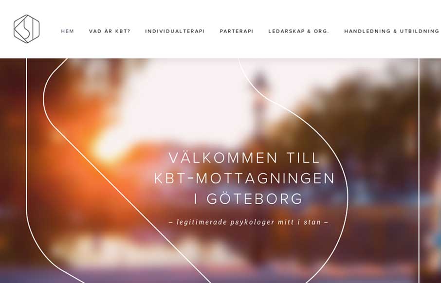
What a great visual mark; the KBT logo. I’m probably biased, since I love everything Swedish. But man it’s hot.

I love the light feel to the design and the colors throughout. I do wish it was responsive, but it’s hard to tell sometimes how old a site is.
Great work though.
Submitted by: Lucia Walden Vega
Role: Designer & Developer


0 Comments