
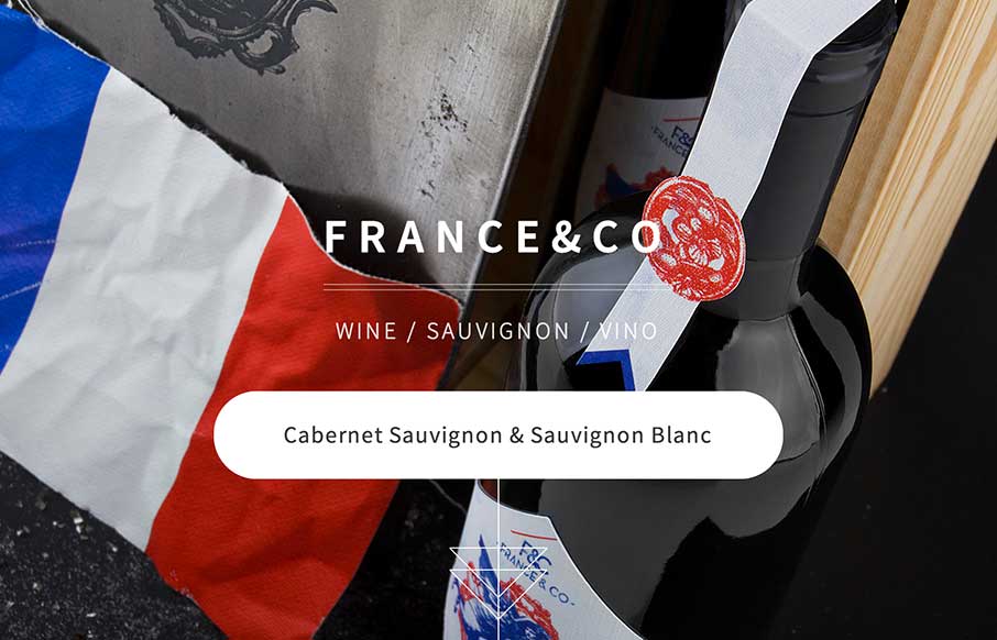
Looks like a simple site – but some nice background image, slight parallax feel in the scroll. A little confused on the copy translation and repeats, and the social icons that go nowhere. But the design itself is vibrant, and seems to get the brand’s image across as such.


Fitts’s Law: Why the Easy Button Wins
Large, close targets are faster to hit than small, distant ones, that’s Fitts’s Law. A look at the 1954 rule behind buttons, prime and magic pixels, thumb zones, and dark patterns.


0 Comments