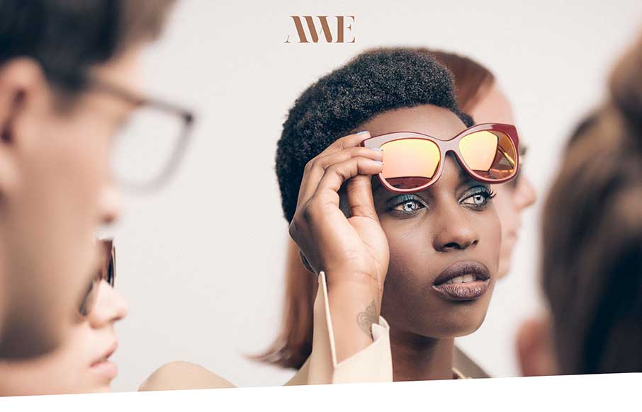
Crazy and cool… I get in trouble at family gatherings for doing bug eyes with raised eyebrows for, well, every picture. AWE’s site uses that look, figuratively (as well as literally), to pull off a slick and slightly irreverent site to sell cool hipster glasses. The bit’s of animation when you click on the glasses themselves, give a great transition buffer image, over the normal swirling circle pattern that I watch on my iPhone daily. (and what is Harry Potter doing on this site without round frames?)
Glassmorphism: The Transparent Design Trend That Refuses to Fade
Glassmorphism brings transparency, depth, and light back into modern UI. Learn how this “frosted glass” design trend enhances hierarchy, focus, and atmosphere, plus how to implement it in CSS responsibly.


0 Comments