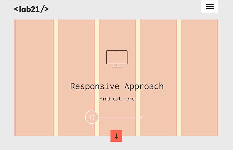
There is really a lot going on with this site to love. I really dig how it’s educational as well as neat looking. With the ‘responsive approach’ thing up in the hero area they are using it to describe to potential clients exactly what they’re doing. Very smart, I’ve not seen a site used like this before. Outside of that all the detail work is nicely done. Love this this site.
Glassmorphism: The Transparent Design Trend That Refuses to Fade
Glassmorphism brings transparency, depth, and light back into modern UI. Learn how this “frosted glass” design trend enhances hierarchy, focus, and atmosphere, plus how to implement it in CSS responsibly.


0 Comments