by Maria | Feb 25, 2013 | Education, Gallery
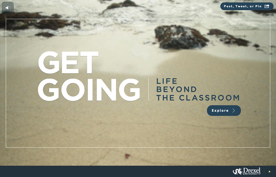
Sensory parfait. The layers of sounds, texture, and motion are only the beginning. I love the parallel, whether intended or not, of the site having a Choose Your Own Adventure feel. Metaphorically, it works so well on a site for getting a higher education degree. I...
by Gene Crawford | Jan 22, 2013 | Conference, Gallery
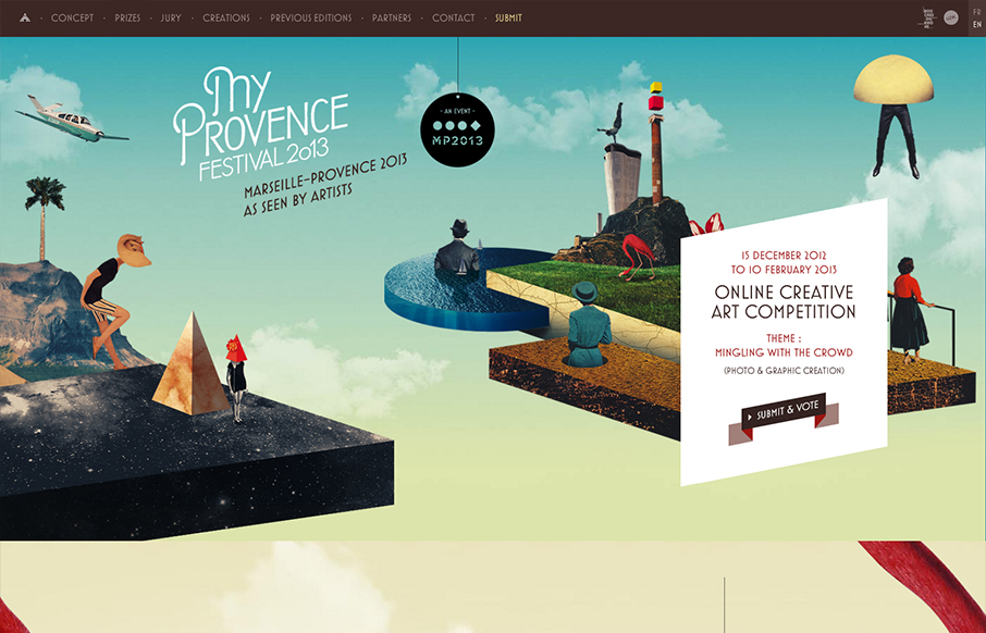
Submitted by: Florian Monfrini @AgenceUzik Role: Project Manager My Provence Festival is an online creative art competition, open to all, and run by Bouches-du-Rhône Tourisme (France) between December 15, 2012 and February 10, 2013. This year the theme of the...
by Gene Crawford | Jan 22, 2013 | Gallery
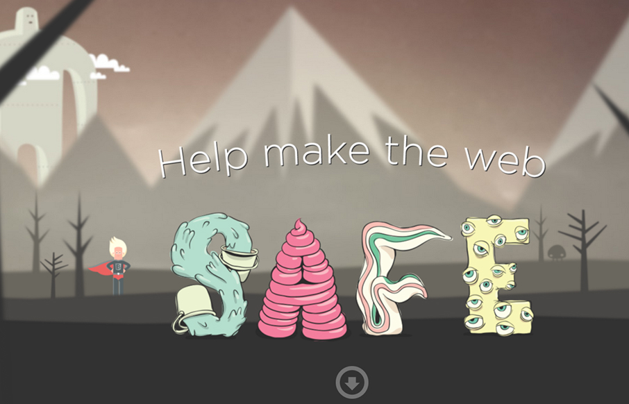
Submitted by: Ryan Ryan Role: Designer & Developer Saving the Internet, one browser update at a time. Pretty fun design. I like the illustrations very much, they feel like the Adventure Time cartoon.
by Gene Crawford | Jan 21, 2013 | Gallery, Portfolio
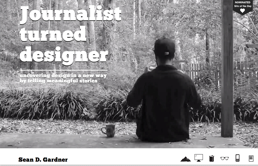
I love the freshness in this design. The soul of this website feels like exploration, from the video background to the navigation design using icons like it does, it just feels fun.

by Gene Crawford | Jan 21, 2013 | Gallery
had a blast working with the talented team over @boomtownroi on our recent launch. really proud of this one. boomtownroi.com— {e} house studio (@ehousestudio) January 16, 2013 Nice soft colors with a strong call-to-action makes this site look like a...