by Gene Crawford | May 8, 2013 | Gallery
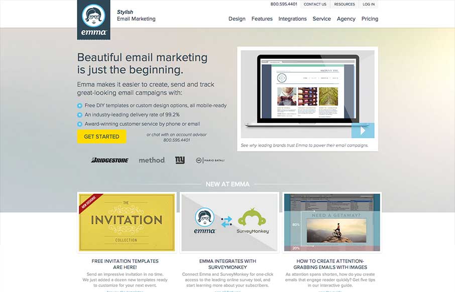
There’s a lot going on with this website design. There are so many different nav items and little things that you can click on, in a lot of ways it suffers the same issues that most big product websites do: too much stuff. They do a good job with keeping the...

by Gene Crawford | Apr 19, 2013 | Gallery
Yes, it’s not often we feature a ‘coming soon’ page here on UMS but this one is very well done. I love how they’ve taken the product and the RWD building process and just told the story of the app around that. Both visually and copy wise that...
by Gene Crawford | Apr 17, 2013 | Environment, Gallery
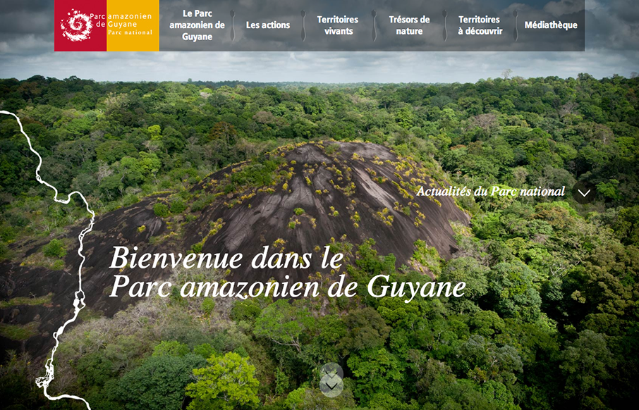
I like the rich photography and the way it’s used to time up with the “river based navigation”. It almost feels like a parallax style design but it’s not, I dig that. I also like how the nav kinda goes away and you then come to rely on the...

by Gene Crawford | Apr 16, 2013 | Design Firm, Gallery
I love the “mouse follow” animation, i’m not sure what to call that, worked into the main image and slide show on the home page. They’ve managed to make it look cool with the photography. I also like the diagonals and greens worked into the...
by Gene Crawford | Apr 9, 2013 | Gallery
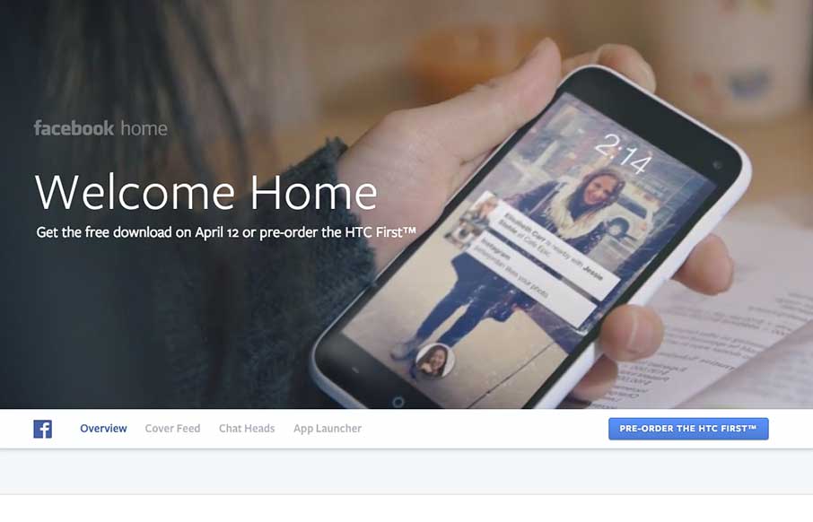
This website for Facebook Home is just a visual feast. Yes, it has all the Facebook visual brand baked in but it’s beautiful. The video in the background for the top of the page and the slide up fixed navigation design bringa nice level of fancy to this simple...
