by Gene Crawford | Apr 3, 2013 | Gallery, Gaming
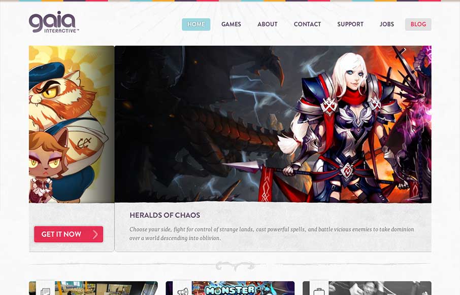
A very colorful and clean design for gia interactive. It’s a perfect fit and seems to provide perfect function for the gaming company. It’s the right amount of stuff and balanced design elements across the breadth of this site. Lovely work. Case study on...
by Gene Crawford | Apr 2, 2013 | Food and Beverage, Gallery
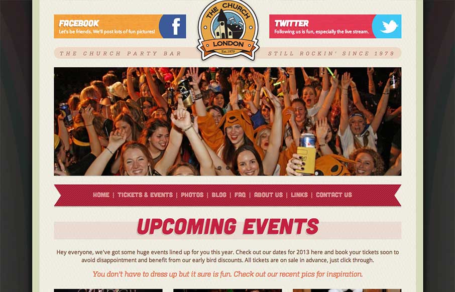
Overall a pretty simple design but it works great here. The mobile approach is a great choice, generally speaking, but for this party bar specifically it’s done right. I like the big twitter and facebook icons across the top of the page, those are going to be...

by Gene Crawford | Mar 25, 2013 | Gallery
The Dwolla site design is of good quality and execution. I like the different configuration and stacking of the elements on the page as you scale the page down to smaller screen widths. What I like most of all is the use of negative space between the main/topmost copy...
by Gene Crawford | Mar 18, 2013 | Gallery
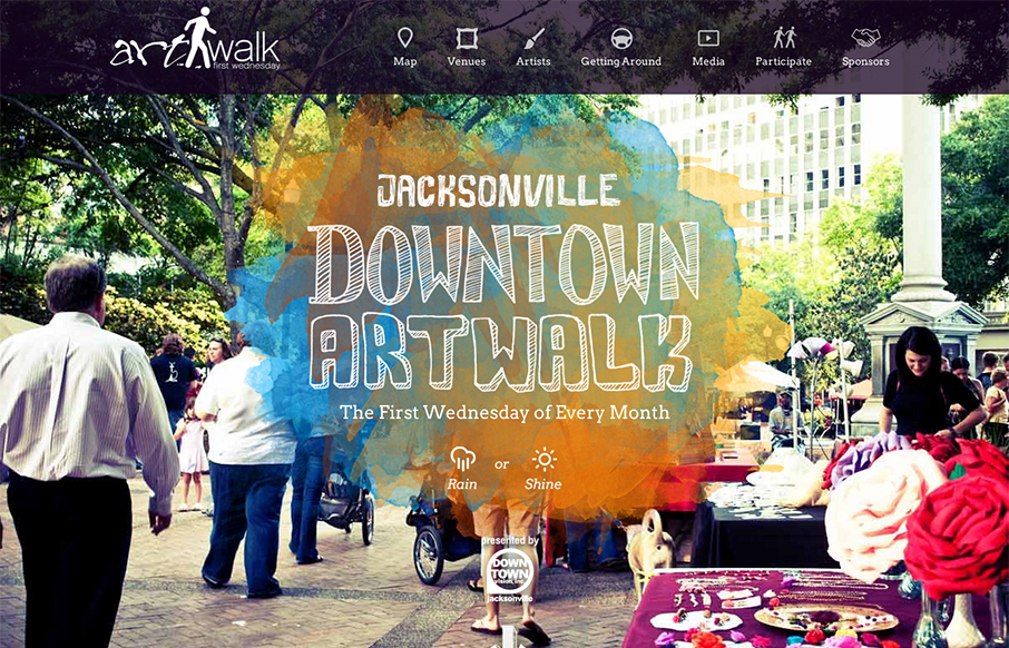
This site perfectly sells the Jacksonville Art Walk. The colors are inviting the type if accessible to most people yet fresh feeling. It’s also responsive which is a great move since a lot of folks will hit this site while at the event or close trying to find...

by Gene Crawford | Mar 11, 2013 | Education, Gallery
This is a well structured website. The grid is clear and easy to visually track the different sections of links. College websites are traditionally over-packed with links, this one is no exception but it’s designed in visual chunks so you can take it all in. I...
