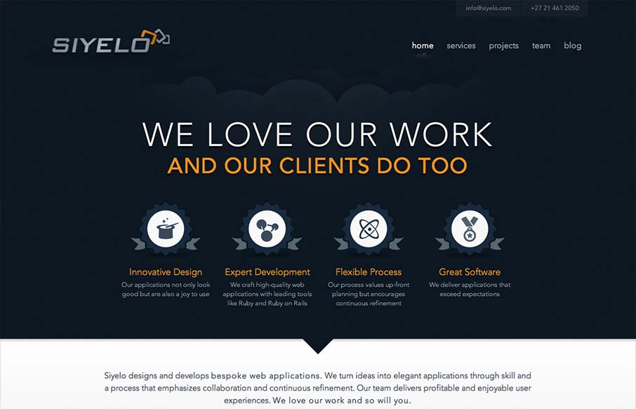
by Gene Crawford | Sep 25, 2012 | Gallery
I like the contrast between the dark background in the top half and the white in the bottom half. It’s a nice responsive layout too, check out how those main 4 icon/sections change when targeting different screen widths yo. I also really dig how there is...
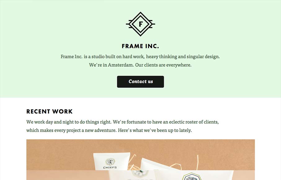
by Giovanni DiFeterici | Sep 5, 2012 | Design Firm, Gallery
I can really get behind the minimal approach to content that frameinc presents. The site isn’t cluttered up with overblown copy or quirky language and I’m not forced to wade through a huge portfolio to get a sense of what this business does. The design and...
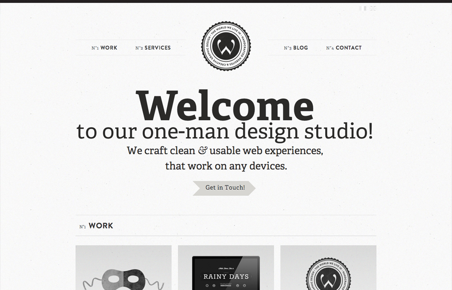
by Gene Crawford | Aug 28, 2012 | Gallery
Another solid minimal(ish) design that’s great. I love the bold typography and black and white coloring. Keeps it all very clean feeling. Then those charts of skill-sets are very craftily done.
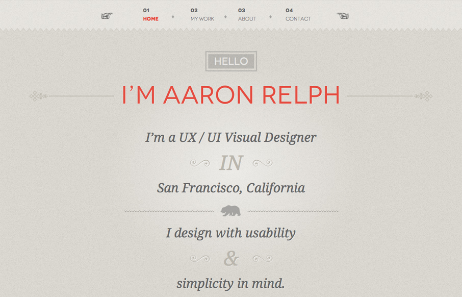
by Gene Crawford | Aug 28, 2012 | Gallery
Submitted by: Aaron Relph @aaronrelph Role: Designer & Developer Wonderfully simple, yet chock full of detail work is this site for Aaron Relph. I give it two thumbs up for the domain name alone, love that sense of humor. Plus the silhouette of the T-rex is just...

by Gene Crawford | Aug 28, 2012 | Gallery
Submitted by: Brian Onorion @WeAreO3 Role: Developer I love the bold graphic nature to this design. That illustration of the city is boss and the icons used in the main nav are nice as well. Great simple site with some visual depth in terms of the illustration and...