
by Gene Crawford | Oct 24, 2012 | Design Firm, Gallery
The thing about this site that excites me is the experience it builds as you scroll down. It just keeps making you want to see more and you’re kind of sad when you get the “FIN” part. I love the interactions designed in here and there, like on the...
by Gene Crawford | Oct 12, 2012 | Gallery
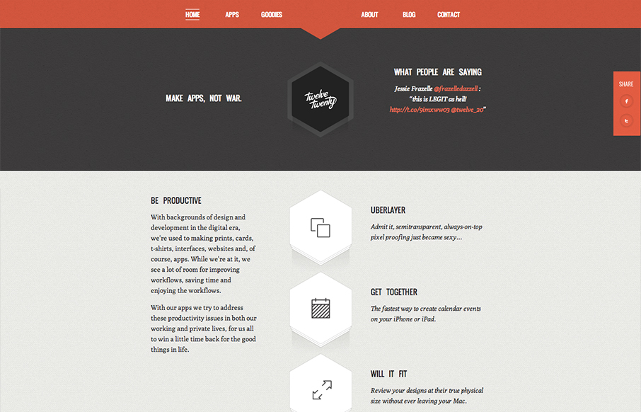
Really tightly designed website for Twelve Twenty. The little interactions that happen when you mouse over the icons are nice and keep you interested. The overall sharpness and minimal approach of the design mixed with limited color palette make it kind of stick...

by Gene Crawford | Oct 3, 2012 | Design Firm, Gallery, Screencast Review
There’s so much design goodness here it’s making me giddy. From the rich colors, the way the home page slider has been designed to the custom photography it’s just a super high level effort. Check out the more in depth video review above or at this...

by Gene Crawford | Oct 2, 2012 | Gallery, Travel
The visual pacing when you scroll this home page down is superb. There’s a nice detail of the sideways movement when you get to the “preserve yours” section with the image. This is really the structure that makes the page sing for me, it’s all...
by Gene Crawford | Sep 27, 2012 | Gallery
Nice responsive work here. I like the changes in the main hero/slide show area and the column work in the image blocks under it. I also really dig the menu icon/link that shows up in place of the main nav, they keep the icons near those nav links which is really...