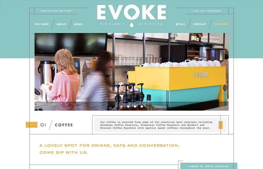
by Gene Crawford | Sep 6, 2012 | Food and Beverage, Gallery
What a great vibe this website has. I love the lines and stark yet very soft graphic feel to it. It’s amazing how this shows off hard edges and soft colors at the same time. Truly creating a harmony of the two. It’s also a superbly designed adaptive...
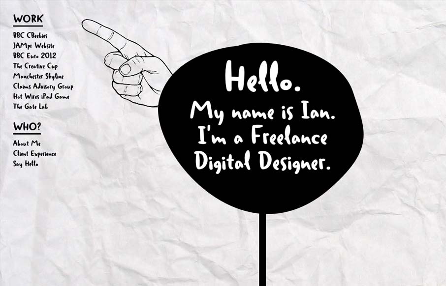
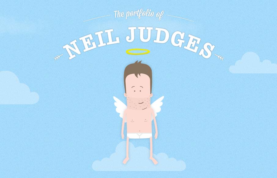
by Giovanni DiFeterici | Sep 6, 2012 | Gallery
Ian put together a nice post for us about his thought process while building this site. I love the experimental feel of the design, so I thought I’d throw it in the gallery. As Ian mentioned, this site certainly makes accessibility sacrifices to accomplish the...
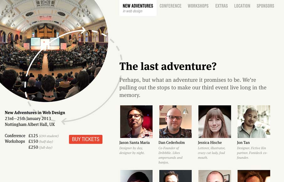
by Giovanni DiFeterici | Sep 6, 2012 | Conference, Gallery
Nice site. I really like the static content on the left. Really, this site is all about selling tickets. It makes sense to keep that button on the page at all times. I think that the collapsed nav is interesting, though I feel that area of the page has room for a...
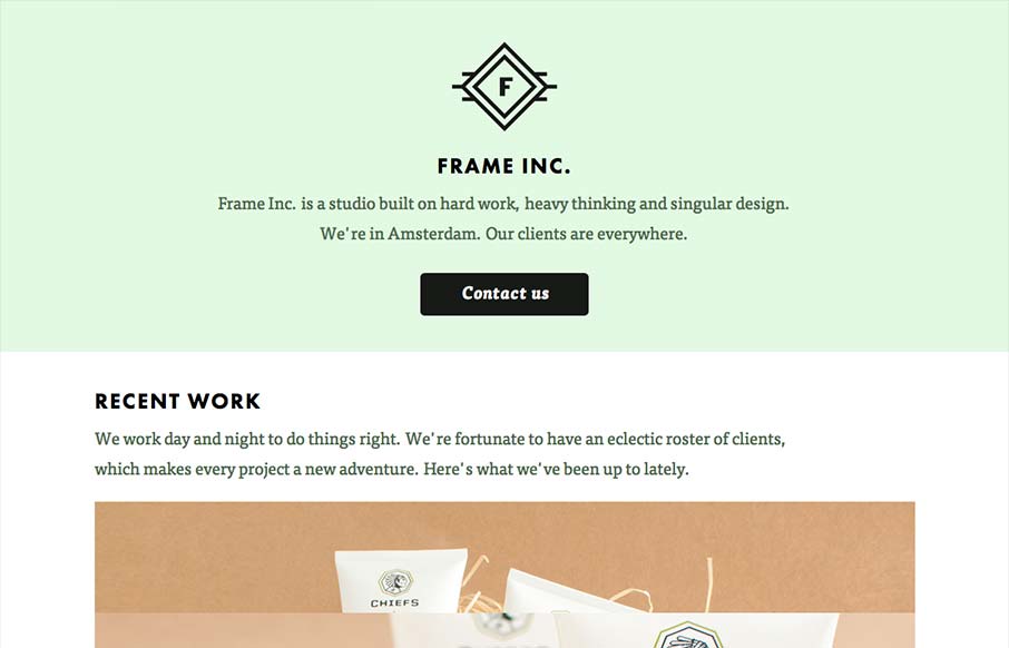
by Giovanni DiFeterici | Sep 5, 2012 | Design Firm, Gallery
I can really get behind the minimal approach to content that frameinc presents. The site isn’t cluttered up with overblown copy or quirky language and I’m not forced to wade through a huge portfolio to get a sense of what this business does. The design and...
by Giovanni DiFeterici | Sep 5, 2012 | Gallery, Screencast Review
Damn, this site is fun! It’s all about animation and storytelling, both of which it handles beautifully. Here’s a case where the art is the content. It shows how clever Neil can be, as well as his skill set. One of my favorite personal sites to date....