by Giovanni DiFeterici | Sep 11, 2012 | Design Firm, Gallery
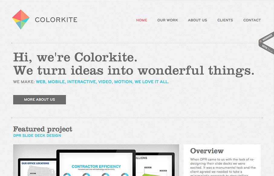
Colorkite is a clean, minimal design that does a great job at getting out of the way of the content. The typography is pretty solid and the color palette is subtle and sophisticated. The site is responsive, though it looks a little disjoint at some screen sizes. The...

by Giovanni DiFeterici | Sep 11, 2012 | Food and Beverage, Gallery, Screencast Review
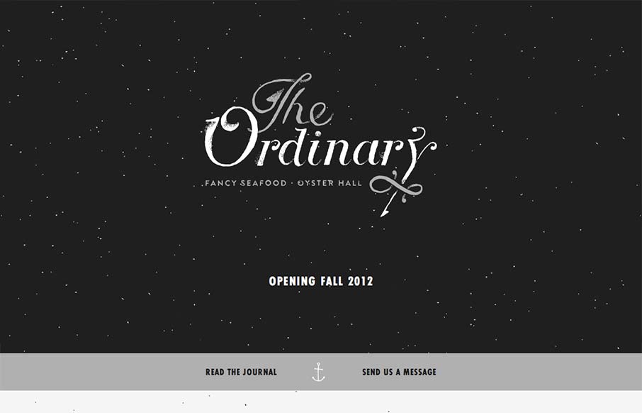
I have to say that I think this is an great site. It has just the right mix of texture, art and typography. My favorite part of the design is the speckled background, which does a great job of softening and activating the negative spaces without making the design...

by Gene Crawford | Sep 11, 2012 | Gallery
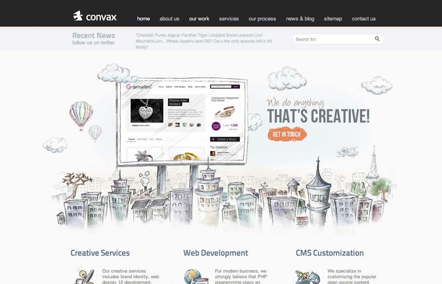
This slider is so coolconvax.com— Dan Denney (@dandenney) September 4, 2012 Agreed Dan, the animation that follows your mouse around behind the slideshow is clever. It’s something that’s pretty minimal really, as fare as interaction goes, but works...

by Maria | Sep 10, 2012 | Gallery
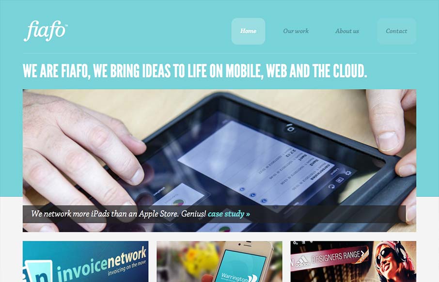
There’s a pretty structured grid feel going on here. The use of League Gothic emphasizes the grid weight, but Chaparral Pro is a welcomed contrast. I think both typefaces are executed well enough to marry the crisp imagery with the fun illustrations. I like the...

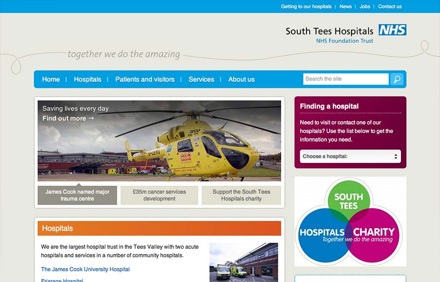
by Gene Crawford | Sep 7, 2012 | Gallery, Medical
The South Tees Hospital website is a superb example of responsive design for a large organization and not just a personal portfolio or design firm’s website. We always love it when we come across large scale projects like this that utilize a lot of the same...
