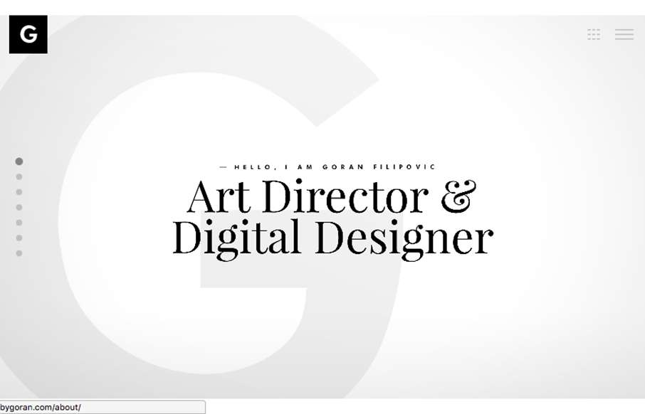
by Gene Crawford | Aug 18, 2016 | Gallery, Portfolio
Pretty nifty approach. The site largely exists as a slideshow. You could pretty much use it as a slide deck when you’re talking with a client. I like that. Clever sectioning of the case study project displays as well. Submitted by: G Filipovic Role: Designer...

by Aaron Griswold | Aug 25, 2015 | Gallery, Marketing, Marketing Company
Great clean site from emota out of San Diego (made by Bumbli also out of San Diego). They do video – and it’s pretty powerful stuff. Good use of actual client work for the video background to draw you into the site, and good use of it in the case studies...
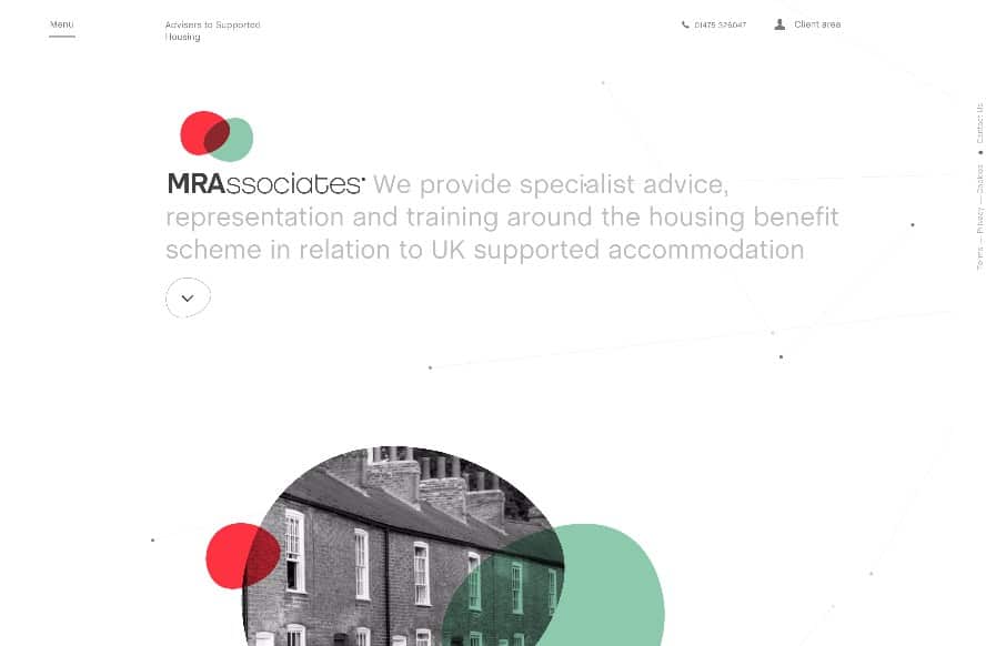
by Gene Crawford | Aug 20, 2015 | Gallery, Real Estate
I love the play between the symmetrical and asymmetrical elements to this layout. It’s full of little visual widgets and things to draw your eye around the page. I also really dig the menu design, having it open like it does really felt unique and memorable to...

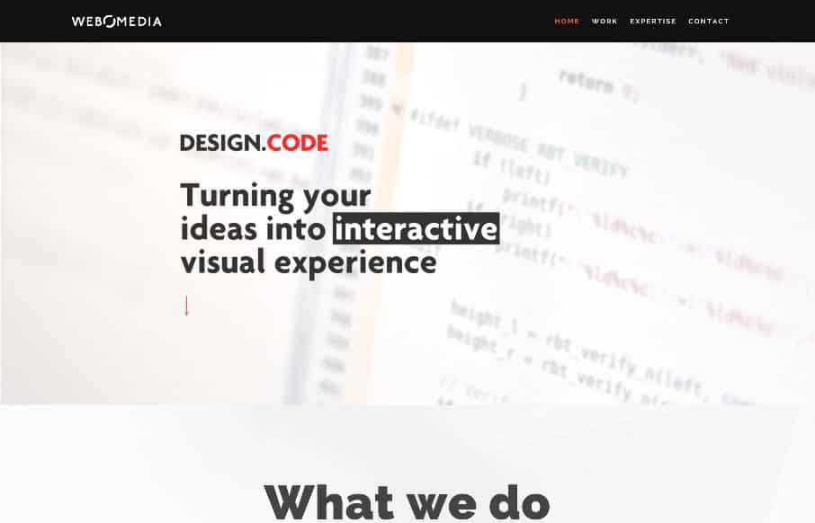
by Gene Crawford | Aug 18, 2015 | Gallery
I like the way this site layout feels almost like a new conceptual approach, much like the app seems to be. I dig the meta-ness of this. I like a lot about how they’ve managed the design across screen widths, and if you scale the page down in your browser the...
by Gene Crawford | Aug 13, 2015 | Gallery
Pretty cool animations triggered as you scroll down the page, I dig the way that lends to the story of what these guys do. It’s clever. I also dig the overall vibe of the site and how it plays with this type of animation technique.