
by Gene Crawford | Feb 10, 2015 | Gallery
There are some really cool pieces/parts to this design. I like the graphic way they tell the specific pieces of the story about their company. I also like the pattern used over the images.
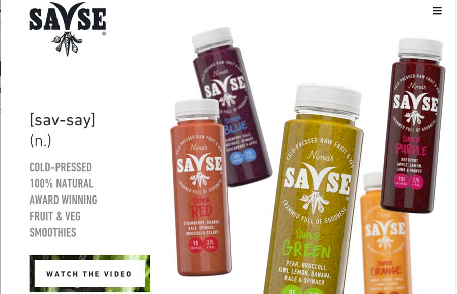
by Aaron Griswold | Feb 9, 2015 | Food and Beverage, Gallery
Pass the kale and beetroot, time for something good! Whether you like great tasting fruit and veggieGreat one-page site for Savse (sav-say) Smoothies done by NEVERBLAND out of London. Like using the animated SVG to transition from above the fold to below. The link to...
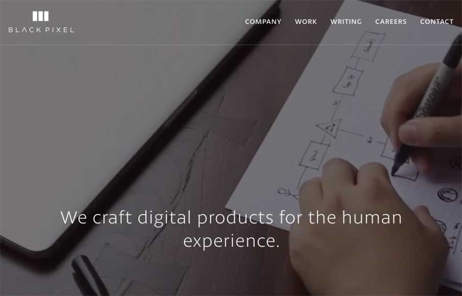
by Aaron Griswold | Feb 6, 2015 | Gallery
I have a new weather app because of the Black Pixel agency out of Seattle, Washington (The Funny or Die Weather app from Will Ferrell’s company). Black Pixel did the redesign. They also redesigned their website, which is pretty awesome, design-wise, and every...
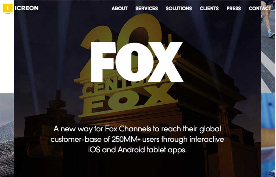
by Gene Crawford | Feb 5, 2015 | Gallery
I really dig the main hero area, the ‘masonry’ type layout and animation for the imagery. Solid design and overall organization too. Working with marketing, operations, sales, and of course the design team – we designed a website that is 100% focused...
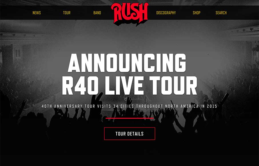
by Gene Crawford | Feb 5, 2015 | Gallery, Music
Pretty dang nice website for a classic band. I love the header/logo and how it moves a bit as you scroll. It stays “maximized” as you make your way past the hero image area and then gets much smaller as you go past it. Smart stuff. There’s other...