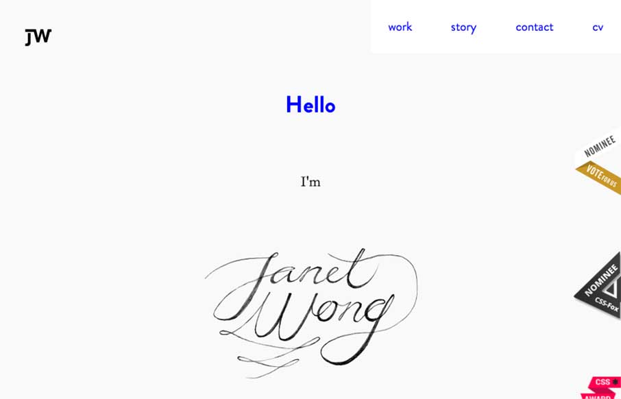
by Gene Crawford | Feb 5, 2015 | Gallery, Portfolio
Pretty cool stuff going on with Janet Wong’s portfolio site. I actually enjoyed the loading animation and the way you move around the page as user, simple but with some little quirky things here and there. Check out her CV – interesting way of presenting...
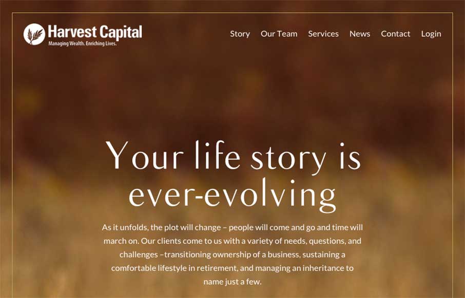
by Gene Crawford | Feb 4, 2015 | Gallery
Interesting website here for Harvest Capital. I many ways I like the approach but have issues with it on other levels. I put it here in the gallery to hopefully get some feedback on it from you all. So, what do you guys think? Harvest Capital wanted to convey their...

by Gene Crawford | Feb 3, 2015 | Gallery
I like the monochromatic approach to the color and the simple line art icons give it a good vibe. I also like the way the header is treated visually as you scroll down a bit.
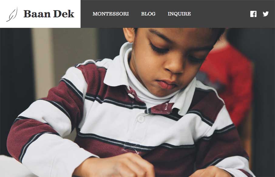
by Gene Crawford | Feb 3, 2015 | Education, Gallery
Simple and straightforward the Baan Dek site is. I like the oversized imagery and the simple layout. Solid responsive design and minimal page count make this a pretty easy to digest website. Bravo for their brevity. Submitted by: Bobby George @baandek Role:...
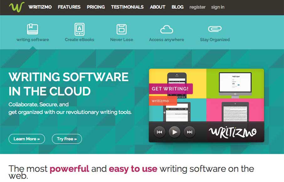
by Aaron Griswold | Feb 2, 2015 | Gallery, Software
I like how Writizmo went with their main content in the hero area. The marketing messages / feature lists that a lot of web apps use are normally in a long scroll below the fold, or in a rotating barrage / slideshow that no one really looks at…( just...