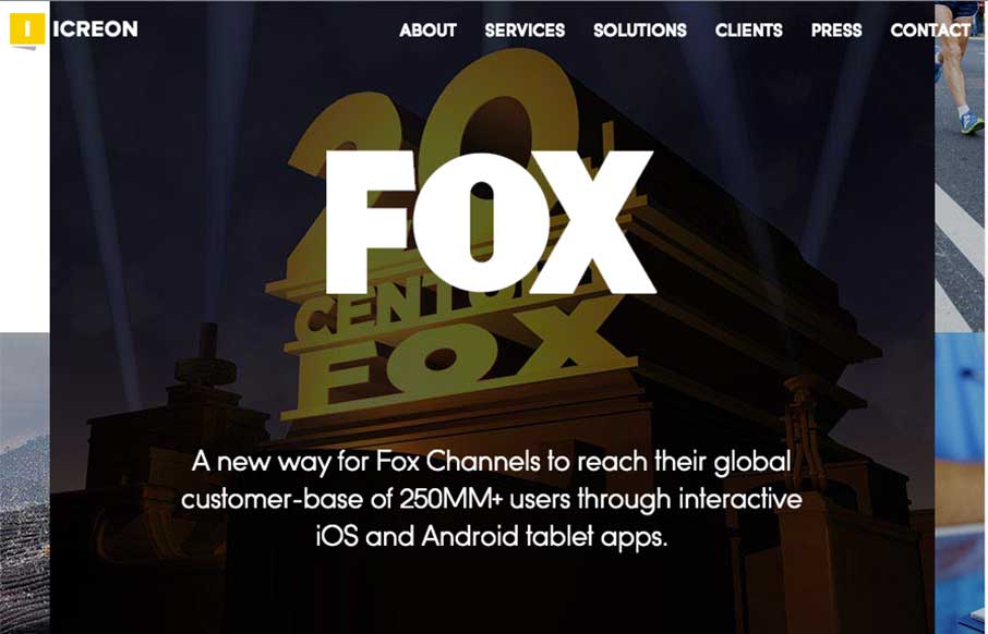
I really dig the main hero area, the ‘masonry’ type layout and animation for the imagery. Solid design and overall organization too.
Working with marketing, operations, sales, and of course the design team – we designed a website that is 100% focused on the user. From the visual layout, to detailed client pages, to the color scheme – everything we did was based around users.
Submitted by: Brian Melanson @icreontech
Role: Marketing


0 Comments