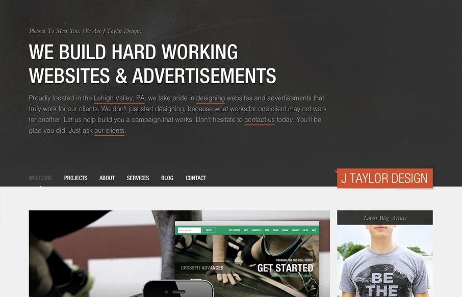
by Gene Crawford | Jul 20, 2012 | Gallery
Nice asymmetrical layout, I really think the larger photo/work shot really helps bring a sense of focus to that section below the gray background/header area. The type is nicely treated visually and there is a solid rhythm as you scroll down the site. I don’t...
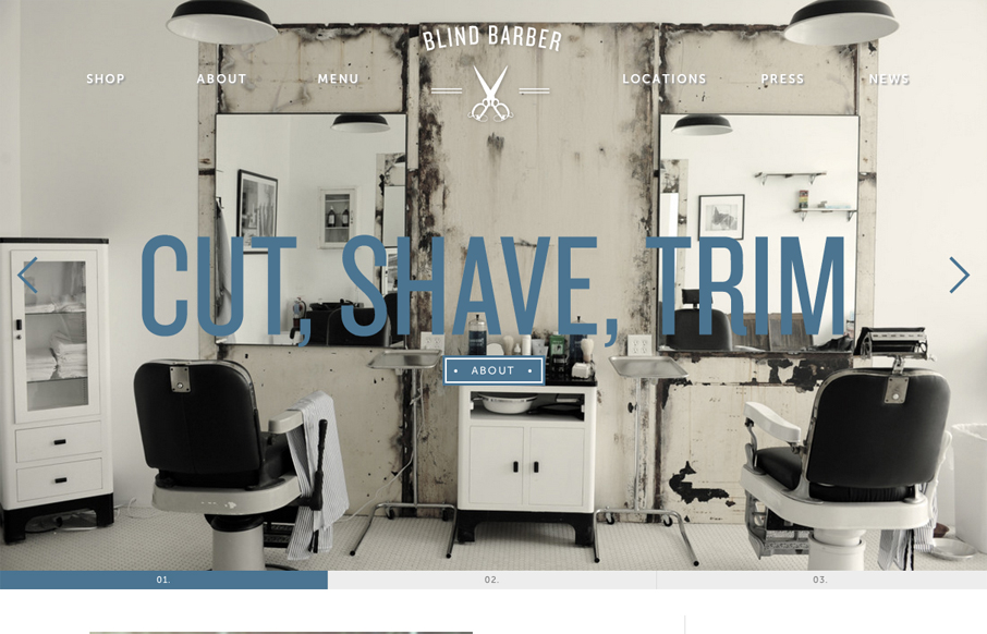
by Gene Crawford | Jul 19, 2012 | Gallery
For once I almost like a loading screen, it doesn’t take too long on this site which is good but it’s entertaining too. I think the monochromatic color scheme pulled out of the main photos and just the single blue. I also dig how the slider is done with...
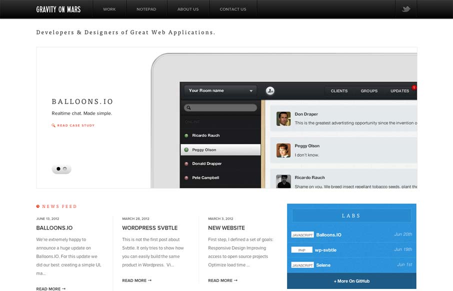
by Gene Crawford | Jul 18, 2012 | Gallery
Sharp looking minimal(ish) site design. I really like the cropping of the main image slideshow a lot. It gives a good sense of the apps and shows them in context on the iPad but it’s not overpoweringly large. The delicate lines and typography are matched up...
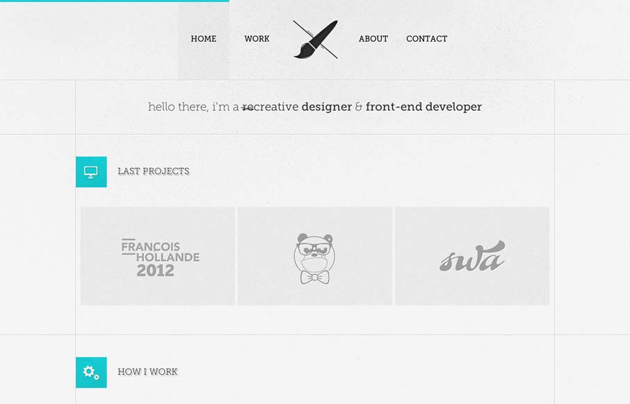
by Gene Crawford | Jul 17, 2012 | Gallery
I like the lines that the designer has used to support the grid in this layout. The flat/vector graphics also tie in very nicely with the overall vibe of the page. I really like that contact form design too, nice touch on the icon swapping out when I mouse over...
by Gene Crawford | Jul 16, 2012 | Gallery
What a beautifully designed experience here. I love the approach of something kind of unstructured yet totally integrated like this. The page jumps right into copy then plops you into some very swell looking info-graphic like sections. You gotta check ’em out as...