
by Maria | Jul 30, 2012 | Gallery
Nice clean and straight forward design for the Mozilla Webmaker website. Some interesting responsive navigation changes too. Wonder why they chose to drop that big selection nav off the Mozilla logo on smaller screen sizes. Overall I like the minimal feel to it while...
by Gene Crawford | Jul 25, 2012 | Gallery
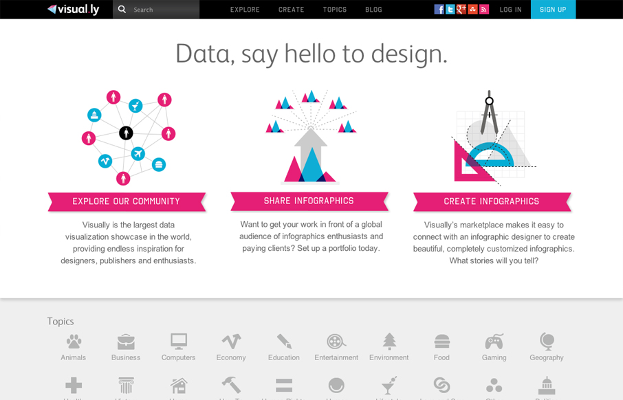
Nice illustrative explanation of how Visually works. It’s fast and effective and pretty bold with the magenta and cyan like colors. Very wide feeling layout, I like that I have room to breath because the site is very dense with info.
by Gene Crawford | Jul 24, 2012 | Gallery
I really like the full width design employed across the pages of this website. It gives it an overall visual structure that feels fresh and yet classic at the same time. The other thing that sticks out to me is the extensive content, there is a depth here that...

by Gene Crawford | Jul 23, 2012 | Gallery
God I love this website. It’s so full of sweet little details and then awesome features like ‘method’ page. The project planner form is a real piece of work too, I love interactions in the multiple choice section and the price range slider. Spend...
by Gene Crawford | Jul 23, 2012 | Gallery
Very thorough design. Overall the layout is engaging and crisp then the detail work is top-notch. From the interactions on the navigation and logo, the way the main navigation bar fixes itself in place as you scroll down and fades in and out. I also really like how...