
by Gene Crawford | Jul 16, 2012 | Gallery
Very thoroughly designed experience on this website design. I really dig how it’s consistent and clean yet feels fresh on each page. The layout is just enough different on each page to keep you engaged with the content. Perhaps it’s the header that...
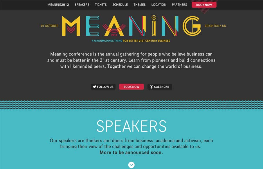
by Gene Crawford | Jul 16, 2012 | Conference, Gallery
Nice clean conference website design. I like the mix of the green and dark grey. The “book now” button is very clearly/obvious by being red and they also designed that little triangle pattern behind it. The sections are clearly marked with wavy lines and...

by Gene Crawford | Jul 10, 2012 | Design Firm, Gallery
Submitted by: Iain Harper @iainharper Role: Director Working on your own projects is often the hardest and this was no exception. After three long years we needed a new site to reflect the evolution of our agency. We took a fairly pragmatic approach, trying to...
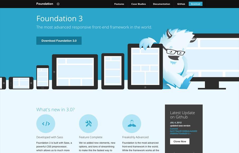
by Gene Crawford | Jul 5, 2012 | Gallery
Zurb has given us many good things, Foundation is surely one of them. But they also design pretty solid websites to house the things they make. This site is great example of making a monochromatic color scheme work. The idea of using the yeti and the cool blues...
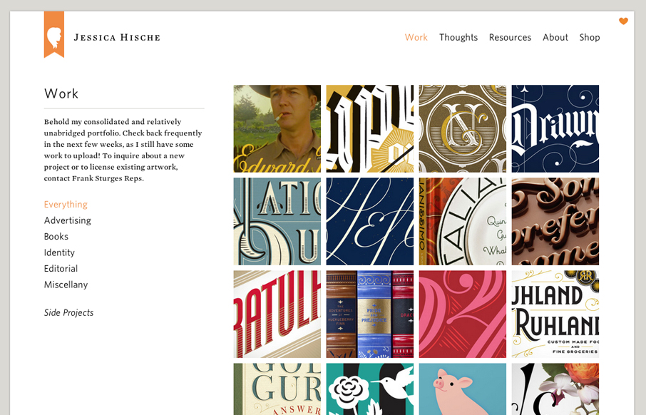
by Gene Crawford | Jul 3, 2012 | Gallery, Portfolio
Launched a new version of my website! jessicahische.is I think you’ll find lots of new goodies + it’s a lot easier to navigate— Jessica Hische (@jessicahische) July 2, 2012 The new Jessica Hische website is fantastic. Yeah yeah I just posted her wedding...