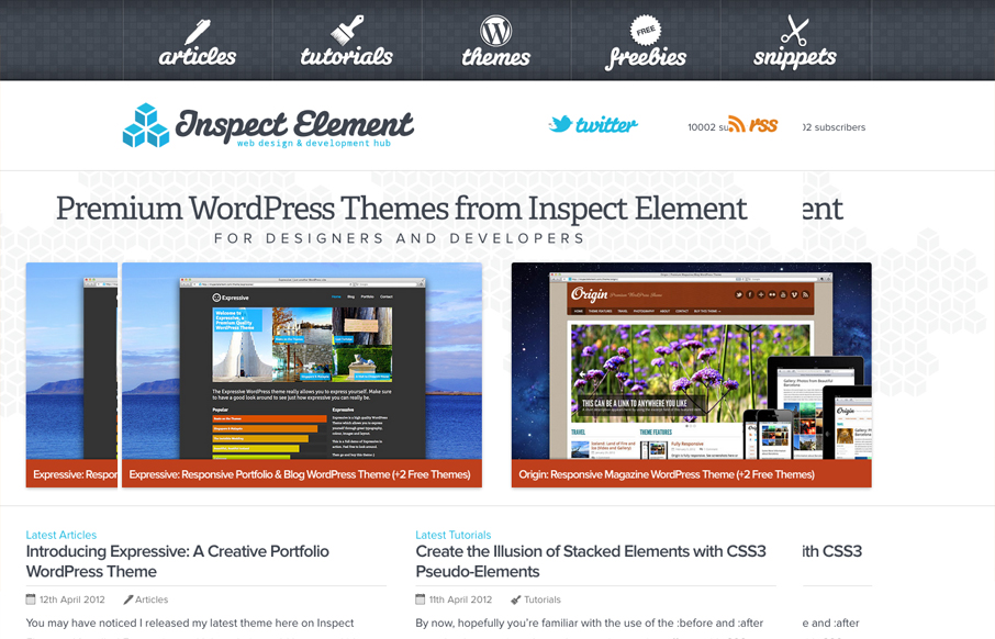
by Gene Crawford | Aug 1, 2012 | Gallery
Really nice simple yet deep looking layout for the Inspect Element website. I really like how the main nav sort of hides under the page as you scroll down, that’s a small detail but it makes you really notice it. Then the simple feeling 2 column layout with...
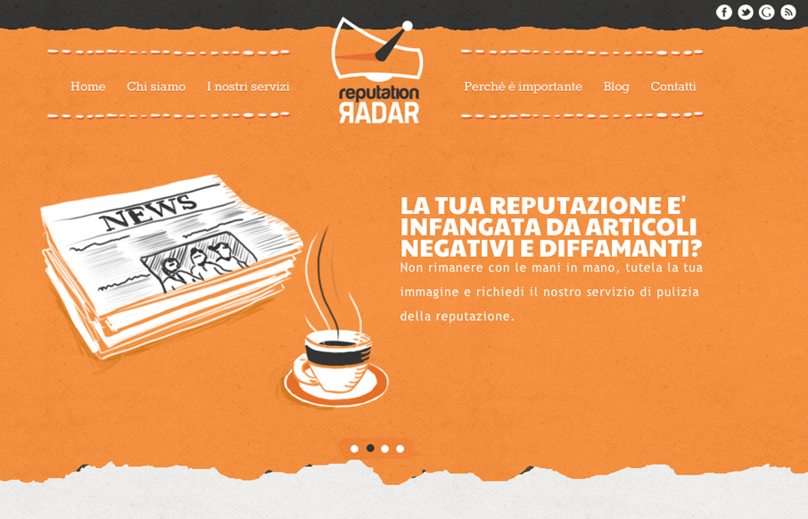
by Gene Crawford | Aug 1, 2012 | Gallery
The animated slideshow is very cool. It’s the thing that makes you pay attention to this site. Then the action on the fixed navigation as you scroll down has added impact. The home page is jammed with content and graphics and there is a ton of content across the...
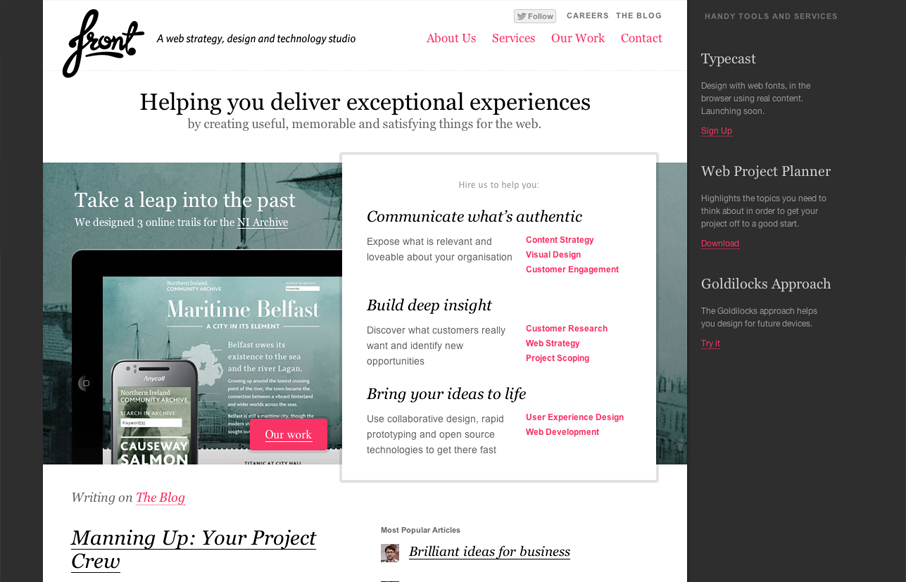
by Gene Crawford | Jul 31, 2012 | Gallery
I really like the way the layout of the homepage for designbyfront.com has been executed. The “badges” on the far right of the page are placed well and somehow don’t get missed like banner ads would. Then there’s the general layout of the...
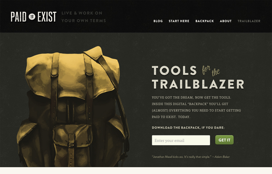
by Gene Crawford | Jul 30, 2012 | Gallery, Marketing
Beautifully designed website. I love the colors and tone, the visual rhythm is also superb, it invites you to scroll. The copy is also very intriguing, it’s as slowly revealing in it’s prose as the design is visually. It’s not often you see the two...
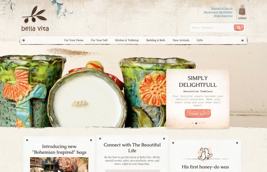
by Gene Crawford | Jul 30, 2012 | Gallery, Shopping
What I like most about the Bella Vita website is the consistency that the textures and colors are used. I love that search button, the same esthetic is echoed throughout the site’s details too, like on the back and next interactions on the slideshow. The main...