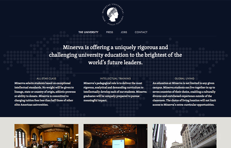
by Gene Crawford | Oct 3, 2012 | Education, Gallery
I like the patter of going dark to light with a top down design for websites like this. It makes the transition into more dense content very palatable to me for some reason. The way the navigation get’s fixed as you scroll down the page on this site is a nice...

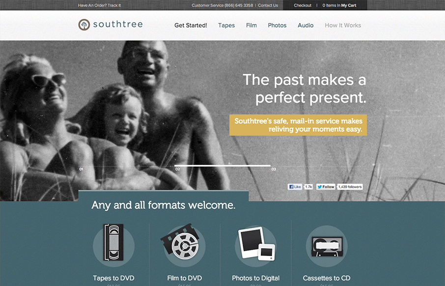
by Gene Crawford | Oct 3, 2012 | Design Firm, Gallery, Screencast Review
There’s so much design goodness here it’s making me giddy. From the rich colors, the way the home page slider has been designed to the custom photography it’s just a super high level effort. Check out the more in depth video review above or at this...
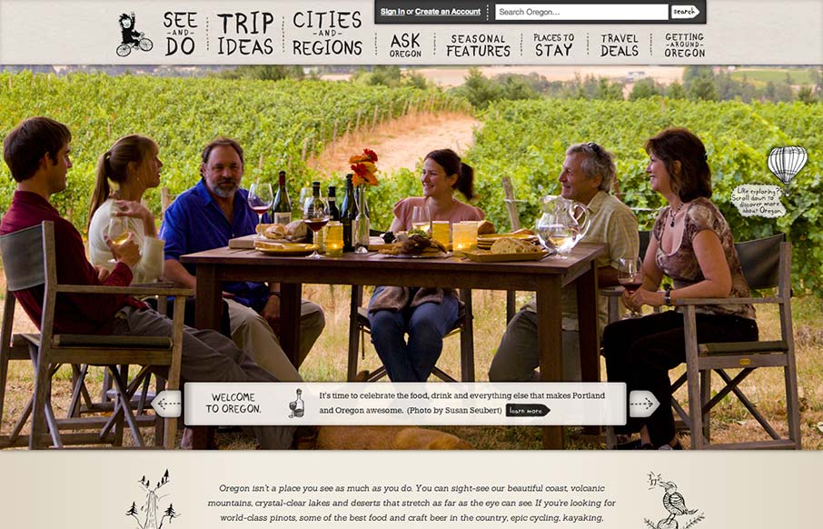
by Gene Crawford | Oct 2, 2012 | Gallery, Travel
The visual pacing when you scroll this home page down is superb. There’s a nice detail of the sideways movement when you get to the “preserve yours” section with the image. This is really the structure that makes the page sing for me, it’s all...
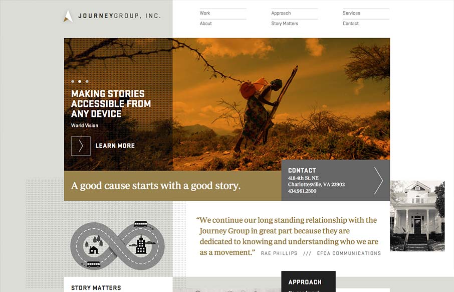
by Maria | Oct 1, 2012 | Gallery
Order yet disorder. That’s how I like to think about this design. It starts off with this really strong grid feel and then the shapes and blocks of copy/images start to feel really asymmetrical and wonderful. I like the blocky vibe with the type and the flat...
by Gene Crawford | Sep 27, 2012 | Gallery, Travel
Oh man, I love this design. There’s so much going on here with the responsive design. The search box has some interesting changes across screen sizes, which is worth some study. I also really like how the main hero/slide show is done, where when you get down to...