by Gene Crawford | Oct 10, 2012 | Gallery
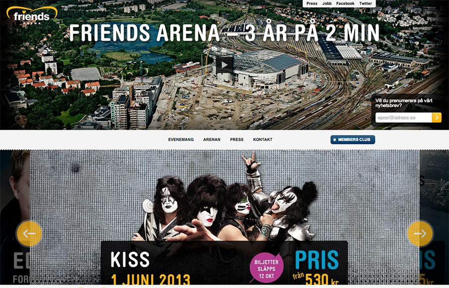
Those who are about to rock, we salute you: check out the responsive site for Sweden’s national arena! friendsarena.se /via @skogberg— Responsive Design (@RWD) October 8, 2012 I like how the header/navigation goes from being under the main image to being fixed...

by Gene Crawford | Oct 9, 2012 | Education, Gallery
The whole purpose of this site/page is to help you decide to become a student at this school. It’s a great linear narrative and it uses some cool techniques to engage you and some super great photography to show you around. I dig the fixed navigation design, it...

by Gene Crawford | Oct 9, 2012 | Education, Gallery
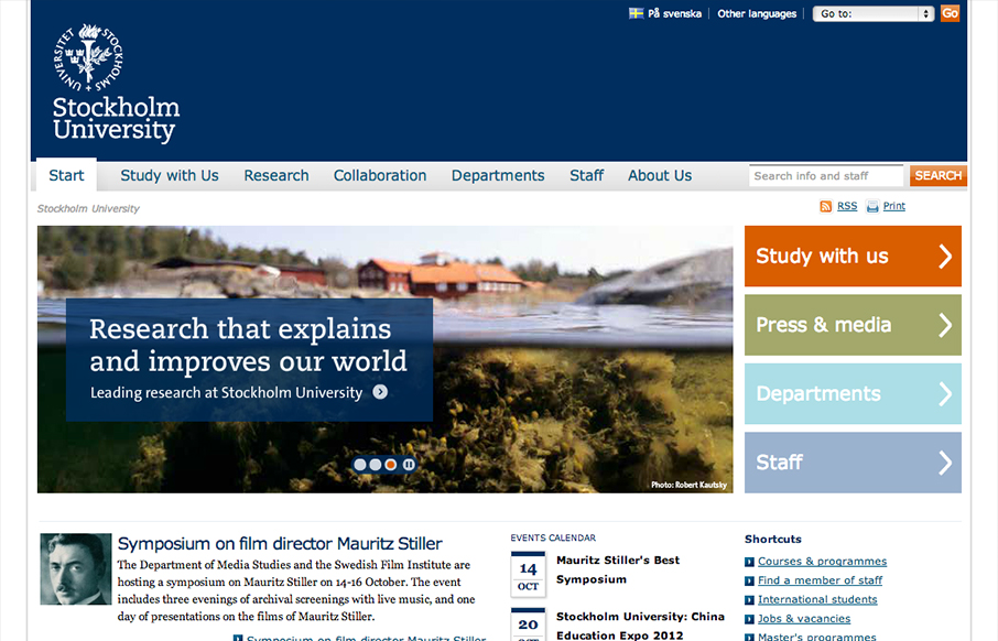
Looks like @stockholm_uni just went responsive! su.se/english/ /via @jan_lof(Some nice adaptation patterns in there, by the way.)— Responsive Design (@RWD) October 8, 2012 Really dig into the main “hero” area and main navigation and look at the...

by Gene Crawford | Oct 4, 2012 | Gallery, Portfolio
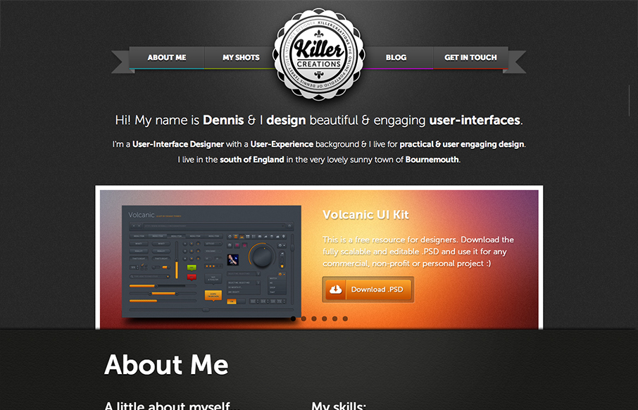
There’s a lot of good design packed into this website. So many blocks of details and very dense visually. I like the interactions the most, the fixed nav that appears as you scroll and then the different design looks as you size down the browser for the...

by Gene Crawford | Oct 4, 2012 | Gallery
The Insights book site is a well structured and bold design. I like most that they’ve designed it for super wide monitors and iPhone screens alike. Super nice design!
