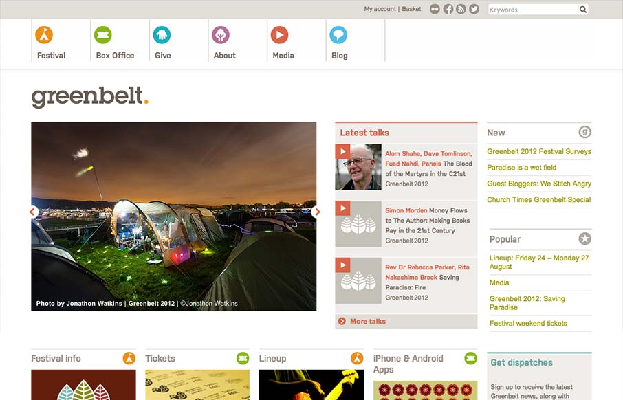
by Gene Crawford | Sep 27, 2012 | Gallery
Nice responsive work here. I like the changes in the main hero/slide show area and the column work in the image blocks under it. I also really dig the menu icon/link that shows up in place of the main nav, they keep the icons near those nav links which is really...
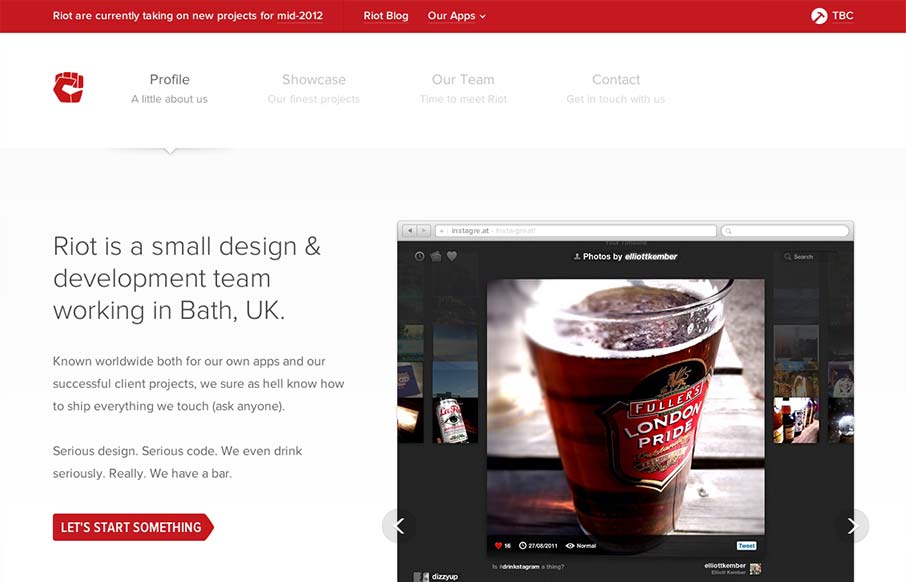
by Gene Crawford | Sep 26, 2012 | Gallery
Very nice clean looking design. I love how the “out apps” is used to slide down from the topmost header area. It’s a tight design all the way through too. Great looking work.
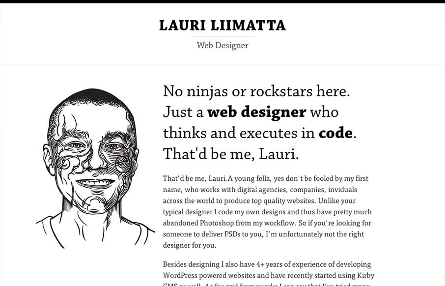
by Gene Crawford | Sep 26, 2012 | Gallery
Submitted by: Lauri Liimatta @laurilii Role: Designer & Developer My new redesigned portfolio. Responsive design and powered by Kirby CMS. I like the design approach of going light to dark from top to bottom, or light to dense visually. However you want to look...
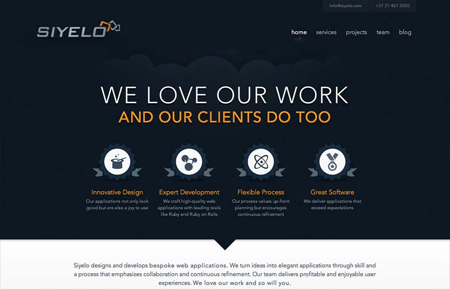
by Gene Crawford | Sep 25, 2012 | Gallery
I like the contrast between the dark background in the top half and the white in the bottom half. It’s a nice responsive layout too, check out how those main 4 icon/sections change when targeting different screen widths yo. I also really dig how there is...
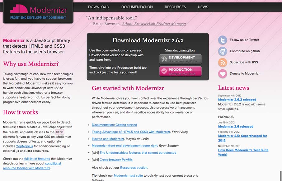
by Gene Crawford | Sep 21, 2012 | Gallery
I gave Modernizr․com a small facelift: faster, less finicky, clearer intro text. Enjoy! modernizr.com— Faruk Ateş (@KuraFire) July 20, 2012 Been meaning to put the Modernizr site in the gallery for a while now. Faruk does a great job keeping the site alive...