
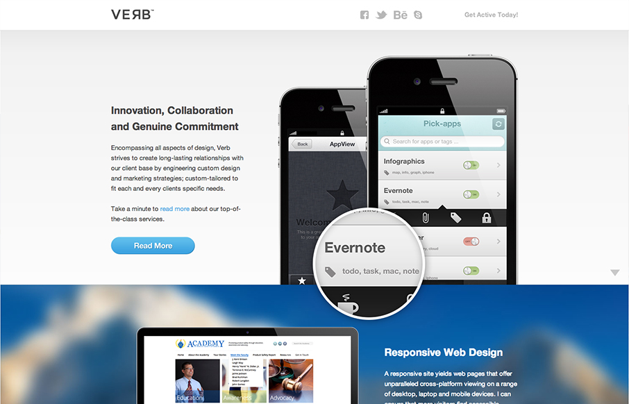
by Gene Crawford | Oct 15, 2012 | Gallery
Submitted by: Matt Hamm @matthamm Role: Designer & Developer It’s our newly designed responsive website. It’s been 2 years in the pipeline. We hope you like it! Solid responsive design. I’d say two years work is worth it for such a clean and...
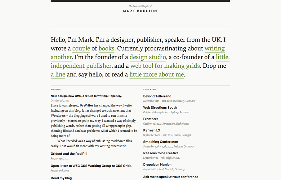
by Gene Crawford | Oct 15, 2012 | Blog, Gallery
I’ve watched Mark Boulton’s blog/site designs over the years make this really refreshing trip towards being completely minimal. I love it. He’s gotten down the just the bare essence of what he needs in a website, particularly with this latest design...
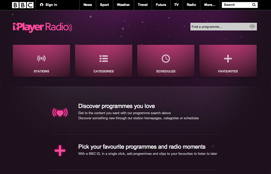
by Gene Crawford | Oct 12, 2012 | Entertainment, Gallery
Well, well, well: looks like the BBC Radio site’s just launched a fine-lookin’ responsive site. bbc.co.uk/radio/ /via @paulrobertlloyd— Responsive Design (@RWD) October 8, 2012 While this isn’t a typical “website” it’s still worthy of...
by Gene Crawford | Oct 11, 2012 | Gallery
Submitted by: Alex Deeley @aedeleey Role: Designer & Developer At first I thought the design was for a product, then read the copy and saw it was for a web design firm. I can dig that. Overall it’s a dang fine looking site and I like the slight parallax...
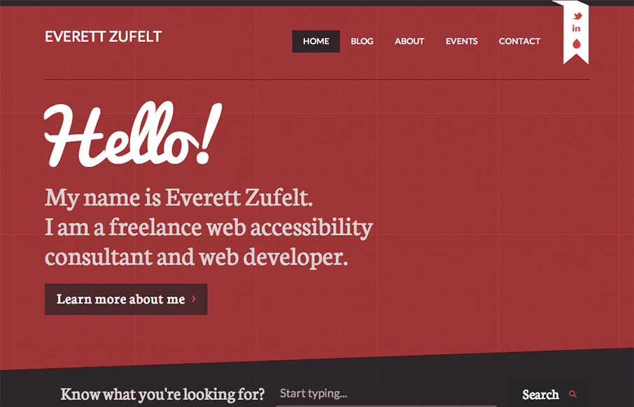
by Gene Crawford | Oct 11, 2012 | Blog, Gallery
The red and black design always works IMHO. Mixed with a nice grid and a diagonal it just comes off as smart. I like the subtle grid pattern that can be seen behind the design and the type mix works well with the grid vibe. I like that search form design a lot. Great...