by Gene Crawford | Sep 5, 2012 | Gallery, Music
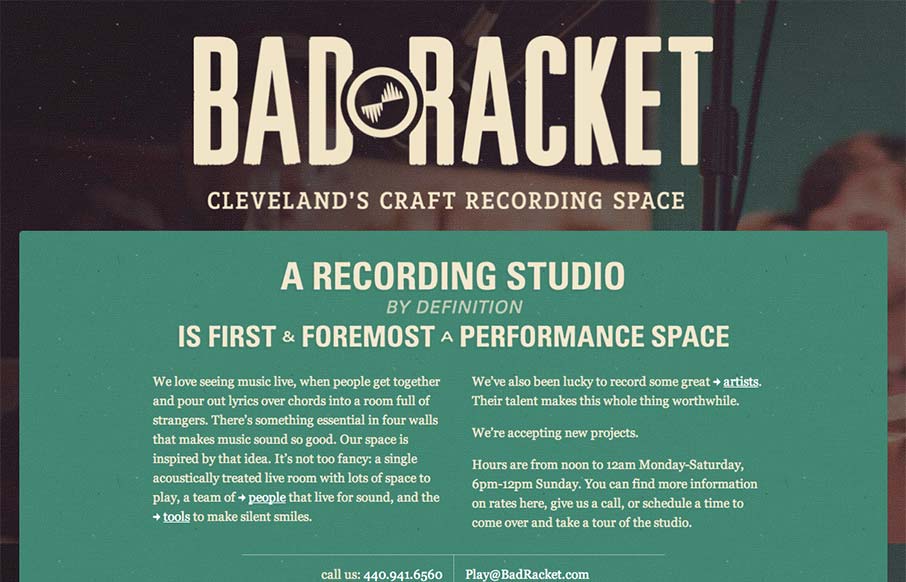
Deceptively simple design is badracket.com. It’s a well designed responsive solution with some nice little goodies spread across it’s single page layout. I love the interstitials designed into the content flow that allow you to open picture slideshows. The...

by Gene Crawford | Aug 30, 2012 | Gallery, Sports/Recreation
Submitted by: Steve Paterson @stevepaterson Role: Designer & Developer The Official Site for 3-time 2012 Olympic Gold Medalist, Allyson Felix, this single-page vertical scroller allows fans to get to know both her athletic, and personal side. Really a great...
by Gene Crawford | Aug 29, 2012 | Gallery
This site runs a little slower than we would like but unfortunately, the host provider was already chosen by the client. That aside, amazingly, this is @lindzington ‘s first ever site design. First ever! Can’t wait to work on more. The cool photos were...

by Gene Crawford | Aug 29, 2012 | Gallery
Beautiful site from @addison – well.io – love the subtle animations— Jason VanLue (@jasonvanlue) August 23, 2012 Beautifully simple and minimal website for the iPhone app Well. Using some simple animations as you scroll down the page to engage you...

by Gene Crawford | Aug 28, 2012 | Gallery
Submitted by: Brian Onorion @WeAreO3 Role: Developer I love the bold graphic nature to this design. That illustration of the city is boss and the icons used in the main nav are nice as well. Great simple site with some visual depth in terms of the illustration and...