by Gene Crawford | Aug 27, 2012 | Gallery
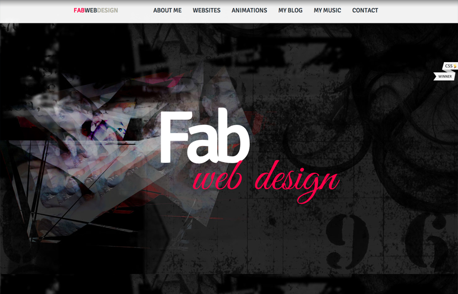
Submitted by: Fabrizio Michels Role: Designer & Developer The scrolling/parallax effect on this site is a pleasant surprise when you first start clicking nav links. I like how it smoothly loads in each page and it’s overwhelming. Clear nav and clear...

by Giovanni DiFeterici | Aug 24, 2012 | Education, Gallery
Submitted by: healinghistories.org The W.K. Kellogg Foundation recently launched a new interactive documentary project called Healing Histories. This innovative effort showcases authentic stories about communities across the country working to heal racial divides and...
by Giovanni DiFeterici | Aug 23, 2012 | Gallery, Marketing Company
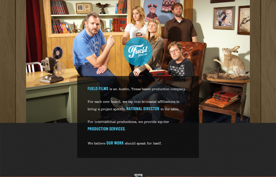
Submitted by: David Guillory @builtbysource Role: Designer & Developer Fueled films has an amazingly bright feel for such a dark design. I like the theatrical photography and understated humor. I can tell that these people are in the business of entertainment....
by Giovanni DiFeterici | Aug 22, 2012 | Gallery
narrowdesign.com is a beautiful site. It has a wonderful mix of understated elements and bold active movement that is really exceptional. I love the gallery views of past projects. The three panel slider is impressive and bold. It makes me think of dribbble in some...
by Giovanni DiFeterici | Aug 20, 2012 | Design Firm, Gallery, Marketing Company
Submitted by: Steve Craw @AguruStudio Role: Designer I’m often against splash screens, but the one presented by agurustudio is really helpful and definitely improves the experience. The simple animation is easy to understand and introduces visitors to a behavior...