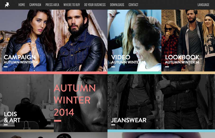
by Gene Crawford | Oct 3, 2014 | Entertainment, Gallery
Pretty cool to see a page for a campaign, something that’s part of something larger and possibly offline to boot. Good stuff. This site is wild and has all sorts of stuff going on but at the same time it’s easy enough to get into. Submitted by: Raul Ortiz...
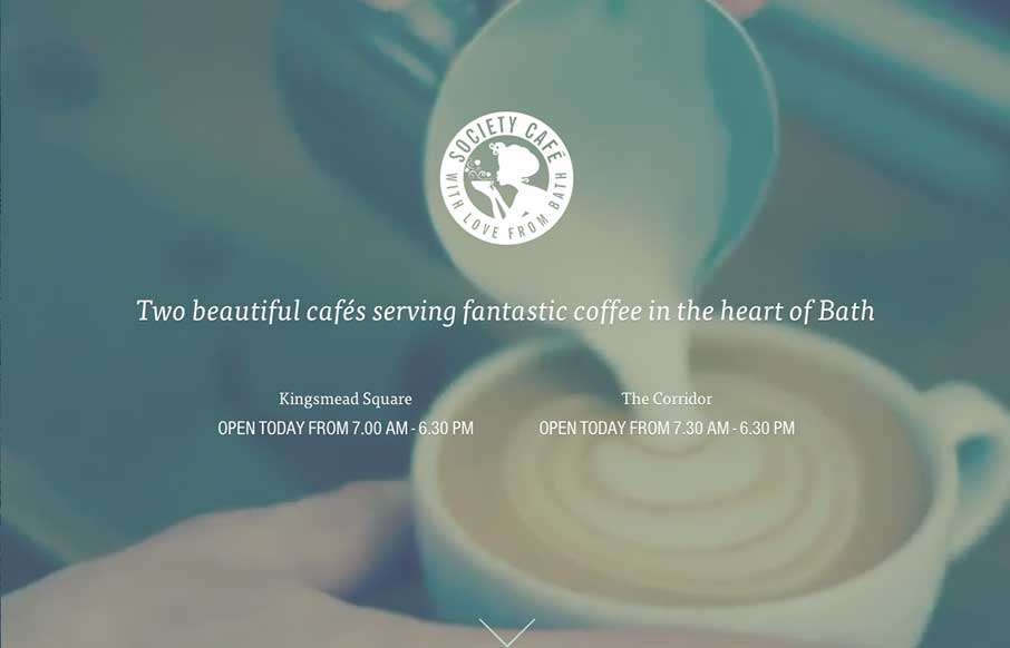
by Gene Crawford | Oct 1, 2014 | Food and Beverage, Gallery
What a beautiful and soft feeling site design for Society Cafe. I love the soft colors and thin line work used across the page. The video in the background is a good touch to keep a kinetic vibe going as you scroll down the page too.
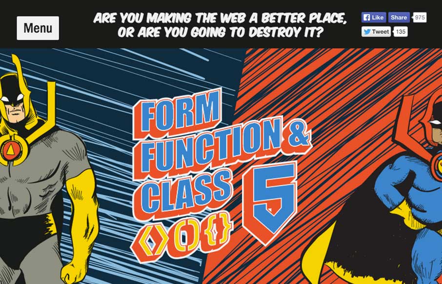
by Gene Crawford | Sep 29, 2014 | Gallery
Very neat design. I like the hero/comic book vibe and bold approach. I also really dig the ken burns effect on the main hero image area. Fun and inviting. This is our* conference site for the year, designed by Aceler Chua of The Missing Bulb and Angello Alarcon. We...
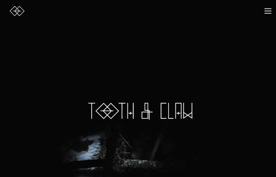
by Gene Crawford | Sep 26, 2014 | Gallery
Very ‘story telling’ centric design with Tooth & Claw. I like this aspect of it, keeping you focused on this aspect seems important for these guys. Some of the nav elements are a little hard to see and get to, but in the end i’m not so sure...
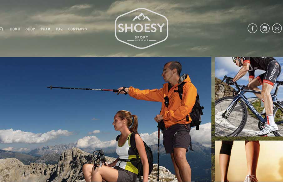
by Gene Crawford | Sep 24, 2014 | Gallery, Sports/Recreation
Nice vibe to this design. I love the photography and the responsive work is pretty decent too. Nice seeing a lot of these patterns we see on other designer site’s employed successfully on client end-type websites. Submitted by: Carla Sartori @carlasartori23...