by Gene Crawford | Jan 10, 2013 | Gallery
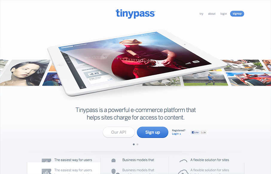
Really like the design of this site, tinypass: d.pr/mZeq— Noah Stokes (@motherfuton) January 4, 2013 TinyPass is a really great site. I like that its got that Apple vibe but also has its own heart too. The slideshow is well done and feels fresh with the way...
by Gene Crawford | Jan 9, 2013 | Gallery, Software
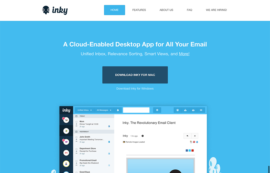
Pretty cool looking email app. Aside from that, the site design is a nice example of putting the full narrative from screenshot down to FAQ type content. I like how it flows both copy and visually.
by Gene Crawford | Jan 8, 2013 | Gallery, Shopping
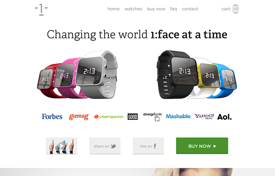
I dig the long scrolling page approach of the 1:Face Watch website. The photography is inspired IMHO and the other smart move was putting a “purchase” call to action next to every section of the page.

by Gene Crawford | Jan 8, 2013 | Gallery
The Made By Few site employs a nice fairly minimal design. I like the blue for the call to action and the other black, white and grey helps to make other details like the speakers images really stand out. I like the progressive loading as you scroll too. Capped off...
by Gene Crawford | Jan 4, 2013 | Gallery
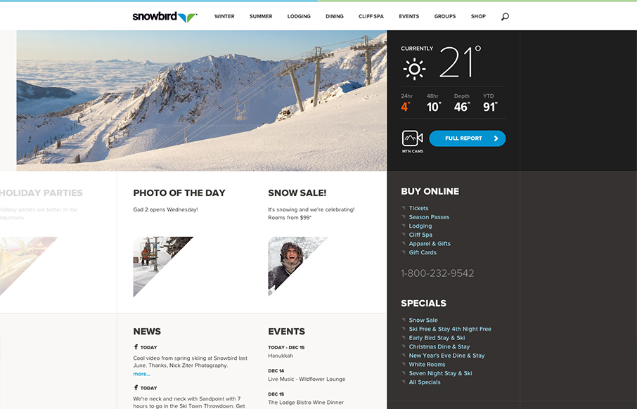
Well that’s a nice looking’ site. snowbird.com via @alliwagner— Chris Coyier (@chriscoyier) December 11, 2012 Agreed, it’s an amazing experience as you use it. The interactions are spot on and even more it’s fun to use. That’s...
