by Gene Crawford | Jan 9, 2013 | Gallery, Software
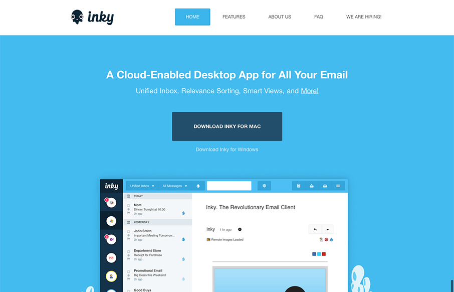
Pretty cool looking email app. Aside from that, the site design is a nice example of putting the full narrative from screenshot down to FAQ type content. I like how it flows both copy and visually.
by Gene Crawford | Jan 8, 2013 | Gallery, Shopping
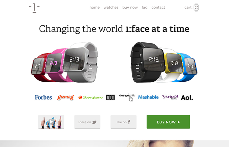
I dig the long scrolling page approach of the 1:Face Watch website. The photography is inspired IMHO and the other smart move was putting a “purchase” call to action next to every section of the page.
by Gene Crawford | Jan 8, 2013 | Gallery
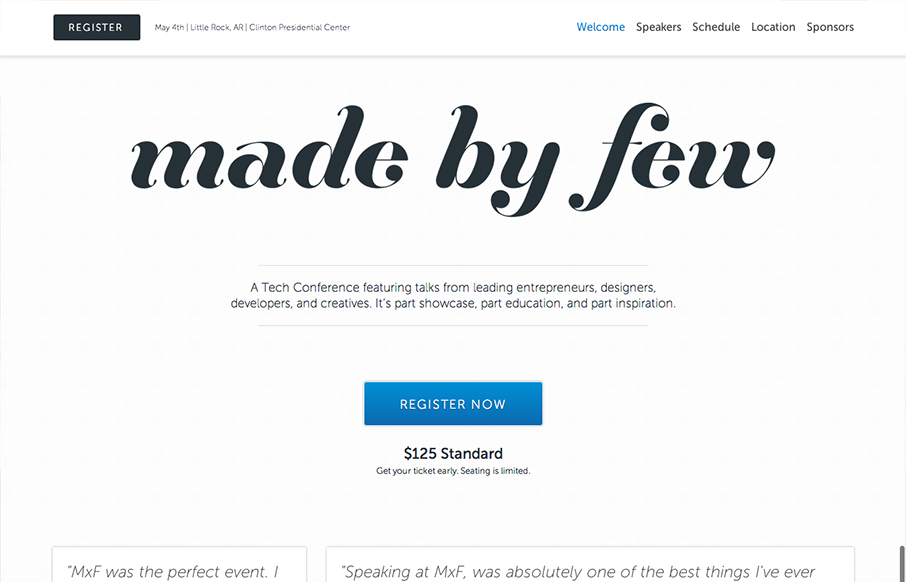
The Made By Few site employs a nice fairly minimal design. I like the blue for the call to action and the other black, white and grey helps to make other details like the speakers images really stand out. I like the progressive loading as you scroll too. Capped off...
by Gene Crawford | Jan 4, 2013 | Gallery
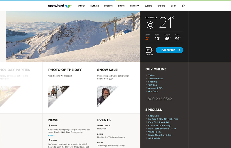
Well that’s a nice looking’ site. snowbird.com via @alliwagner— Chris Coyier (@chriscoyier) December 11, 2012 Agreed, it’s an amazing experience as you use it. The interactions are spot on and even more it’s fun to use. That’s...
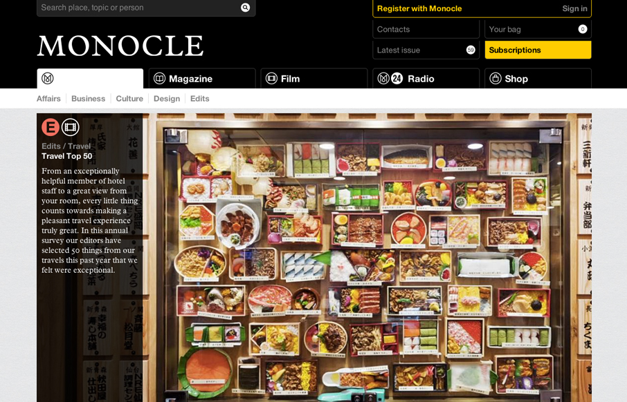
by Gene Crawford | Jan 3, 2013 | Gallery
The new Monocle design is smart and sleekly crisp. I really love the header interaction design. It goes from full height to small and sticky very fluidly. Then the asymmetrical feel to the broken up grid of story blocks as you make your way scrolling down the home...
