by Gene Crawford | Oct 8, 2013 | Gallery
You’ve all probably seen this site already. It HAS to be in the UMS gallery for posterity. Simply badass IMHO – ’nuff said.
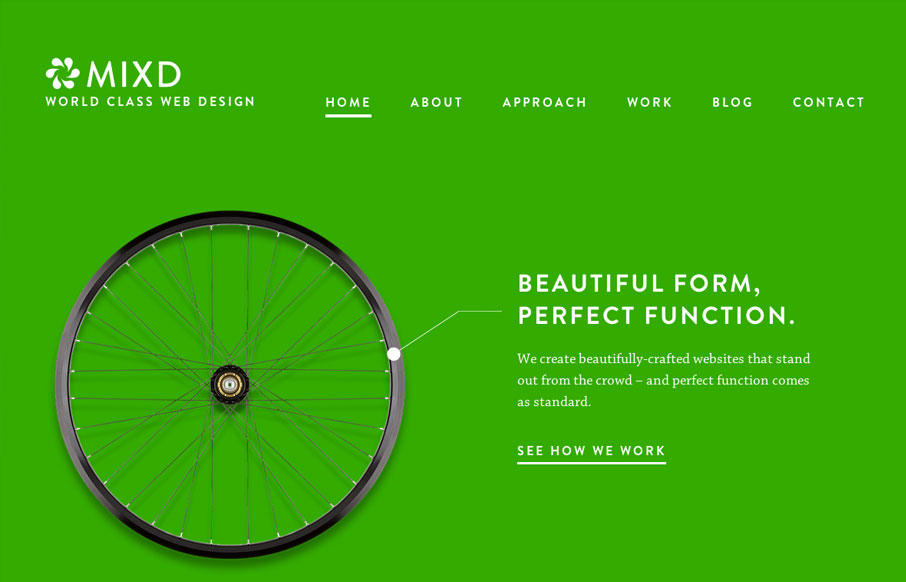
by Matt Keogh | Oct 8, 2013 | Gallery
This site shows the agency’s design philosophy by comparing their online design work to simple, functional, perfectly designed offline products. Sometimes the simplest ideas are the best. This concept is reinforced through the website by using bold, strong colours, an...

by Maria | Oct 7, 2013 | Gallery
A rather straight forward site design, using some of the latest cool stuff. But something about it, maybe the clean layout and/or easy going vertical rhythm makes it sing to me. My favorite part is the “clients” drop down section under the header. Very...

by Gene Crawford | Oct 2, 2013 | Design Firm, Gallery
I love the simply stated yet perfectly executed design of the Lullabot website. The rhythm of this site is superb as you scroll down the page. Everything just queues up perfectly for you. The site starts off as a place to get into what type of work the firm does, then...

by Gene Crawford | Oct 1, 2013 | Gallery
What a great website. First off it’s about Axes, which are just cool to think about and use. The design of the site has lots of little surprises but executed in a simple way. The main nav has these great large icons that are worked into the drop-down navigation...