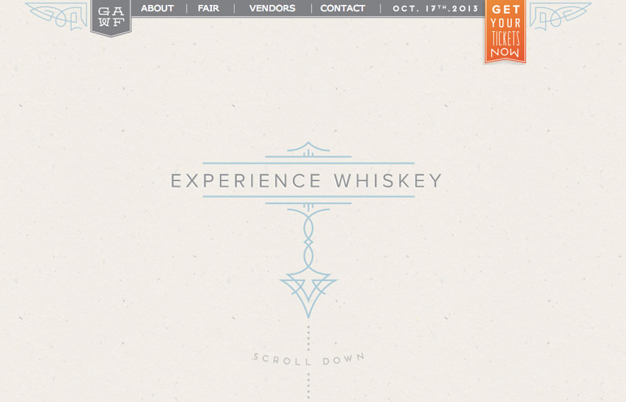
by Gene Crawford | Oct 1, 2013 | Food and Beverage, Gallery
Super simple design but I love the illustration work and limited feel to the layout while being ornate at the same time. It’s almost like whiskey itself, simple yet full of volume when it comes to taste.
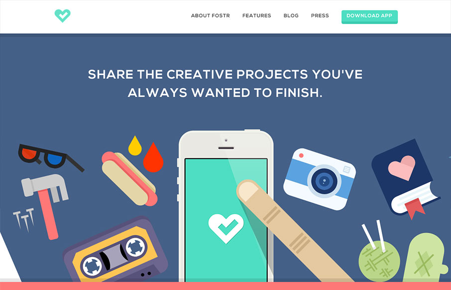
by Jay Barry | Sep 4, 2013 | Gallery
It’s hard to tell exactly what Fostr is quite yet, but it’s some sort of iOS app for people to ‘Support, follow and cultivate creativity’. The site is pleasingly clean with nice colorful and poppy icons. I like how there’s a lot of space...
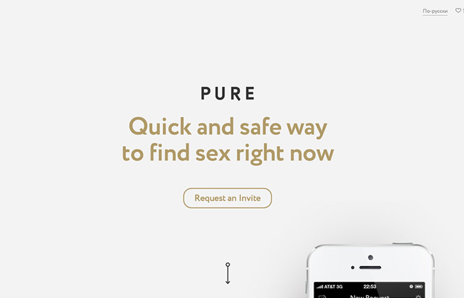
by Giovanni DiFeterici | Sep 3, 2013 | Gallery
I have now seen everything. Pure is a hookup app with no illusions about it’s intended purpose: booty calls. So, there’s that. Now lets talk about the site! getpure.org/en is a slick little single page scroller that snaps to particular scroll heights. The...

by Gene Crawford | Aug 27, 2013 | Gallery
I really dig the Hashrocket site design. It’s concise but not minimal, it’s functional but not trendy. Lovely! It’s just fine looking working website which is something I really like. There’s plenty of nice illustration pieces across the site...
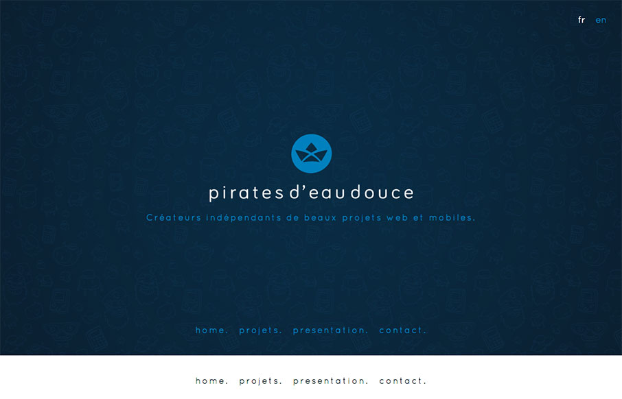
by Giovanni DiFeterici | Aug 26, 2013 | Gallery
Pirates d’eau douce is a fun site to say the least. I really enjoy the subtle animated characters and the playful branding of each of their apps. Blink, blink.