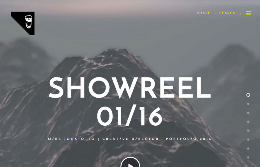
by Gene Crawford | Jan 26, 2016 | Gallery
I dig the oversized image scroll and large text. I also like the navigation fly-out design too. Pretty nifty looking work to boot.
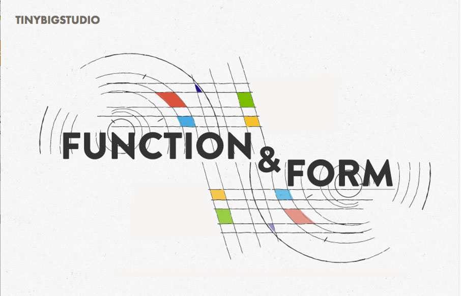
by Gene Crawford | Jan 26, 2016 | Gallery
Really nice layout, it immediately draws me in with the animated illustration and the nav being in the lower left corner(ish). I also like the soft color palette and a lot of the asymmetric layout decisions. Beautiful work. From the Designer: New iteration on my...
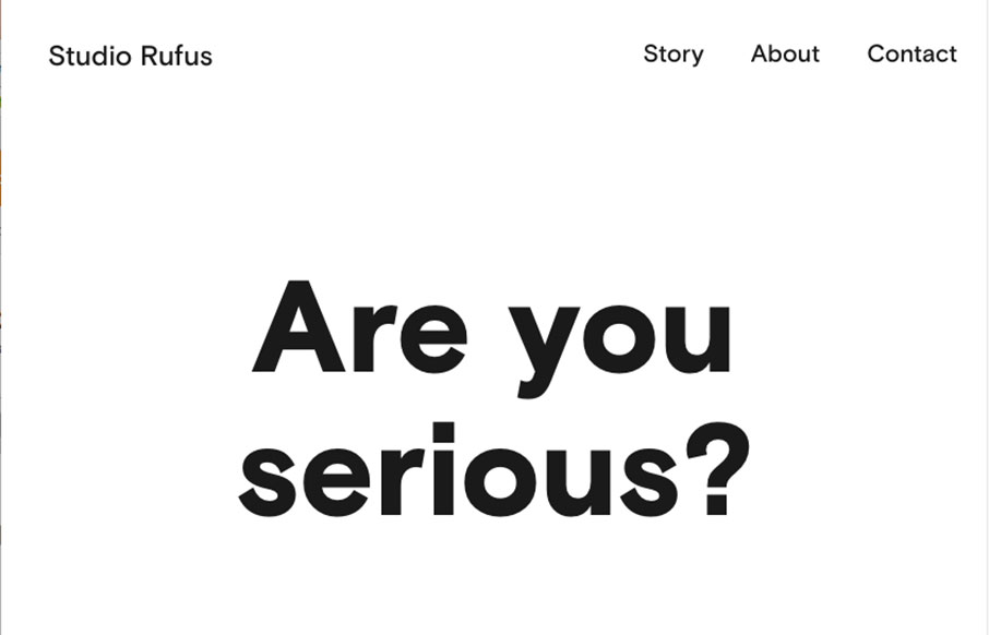
by Gene Crawford | Jan 26, 2016 | Gallery
Seriously good minimal layout here. I extra love the selection choice to display the work links in line or with images. The bold typography displayed next to simple project images is always a good choice and it’s worked to perfection here. From the Designer:...
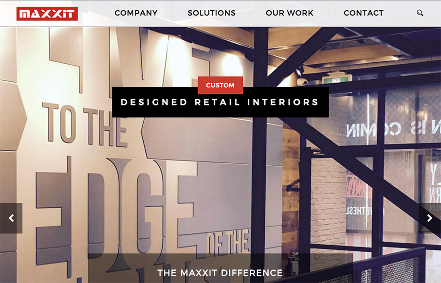
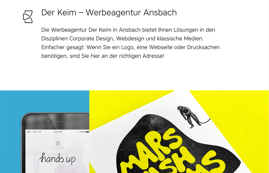
by Gene Crawford | Jan 25, 2016 | Gallery
It’s a pretty standard looking layout, I like most things about it too. What I like most is the 2nd section, the card/block design of the individual project focused part. Strong. The bold read color really helps give things weight too. Submitted by: Jonathan...
by Gene Crawford | Jan 25, 2016 | Gallery
I love the off balance feeling of this layout. The header area is very light visually then below is a heavy image and colorful work section. This immediately draws my attention where it needs to go. Solid looking work too. From the Designer: Clean and colorful...