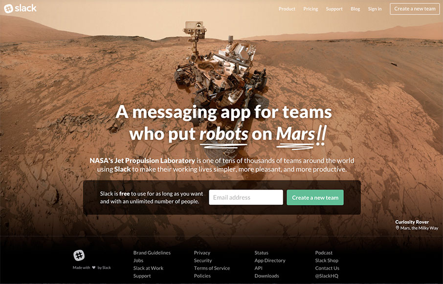
Be sure to refresh a few times – very cool images and typography – but we like Slack’s site because it cuts to the chase – the one thing they want you to do here is “Create a New Team” – CTA is key – looking good is smart too.
Glassmorphism: The Transparent Design Trend That Refuses to Fade
Glassmorphism brings transparency, depth, and light back into modern UI. Learn how this “frosted glass” design trend enhances hierarchy, focus, and atmosphere, plus how to implement it in CSS responsibly.


0 Comments