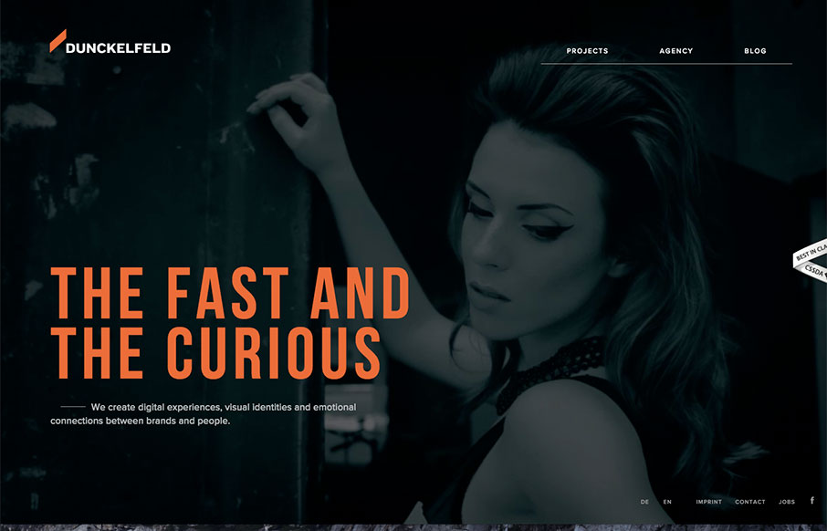
by Gene Crawford | Feb 1, 2016 | Gallery, Marketing Company
There is some rather interesting interaction/animation on this site. I like the way the elements load up the first time you visit. It can be a bit slow to react to you as you make your way through it, which I could see may lead to some confusion on the user’s...
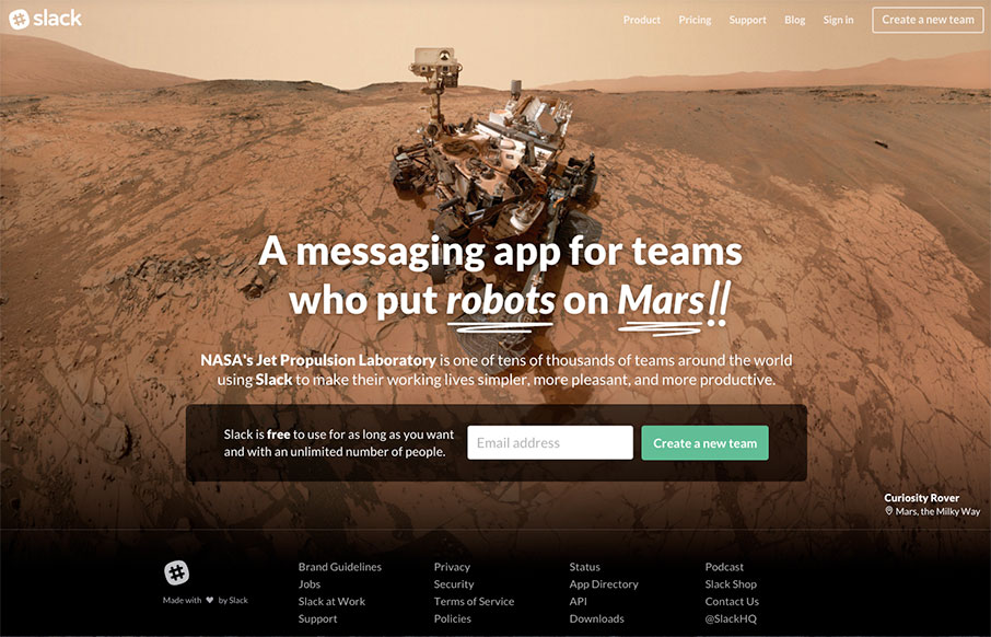
by Aaron Griswold | Feb 1, 2016 | Gallery
Be sure to refresh a few times – very cool images and typography – but we like Slack’s site because it cuts to the chase – the one thing they want you to do here is “Create a New Team” – CTA is key – looking good is...
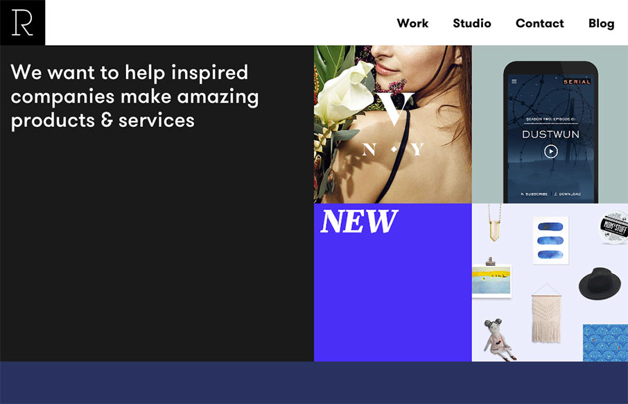
by Gene Crawford | Jan 28, 2016 | Gallery
Pretty slick looking layout for Studio Rodrigo. I really like the big open areas matched up with smaller product images in a small grid like it has. Pretty solid design as you scroll down the home page too. Love this site.
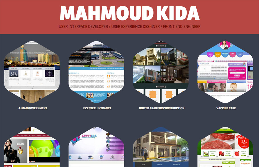
by Gene Crawford | Jan 28, 2016 | Gallery
Pretty nifty single page style portfolio website. The tightness of the details all work well together visually and I really like the interaction design on the main project images. Good work! Submitted by: Mahmoud Kida Twitter: @mahmoudkida Role: Designer Country:...
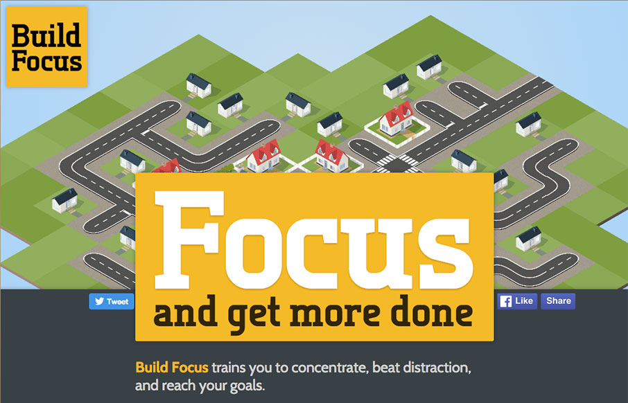
by Gene Crawford | Jan 28, 2016 | Gallery
I really like the simple approach of just centering the design here. The illustration is spot on and makes me want to see what this app will look like. Solid construction. From the Designer: This is the pre-launch landing page for a new productivity startup: Build...