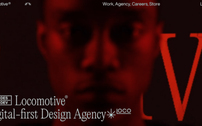
Locomotive adopts a minimalist brutalist aesthetic for its portfolio, yet it infuses the design with engaging elements, such as animated interactions and image pixelations, which enhance the visitor's experience.
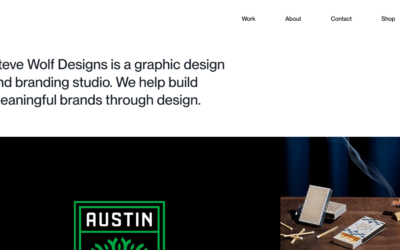
Steve Wolf Designs
Love the grid here. The juxtaposition of the type and images is solid. I like the little "flitter" of the photo before it loads into it's place on the grid, it's subtle, not subtle, and always makes you take note of the element.
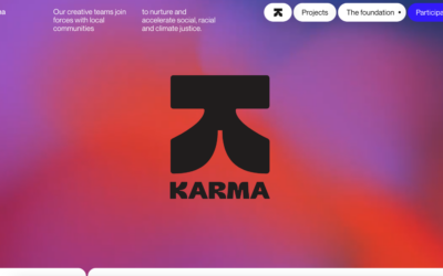
Tux Karma
Tux Karma, an initiative by creative agency Tux, is dedicated to championing projects focused on social and climate justice. The website features a bold design, marked by vibrant, fluid backgrounds, and an array of distinct typefaces. Additionally, it incorporates...
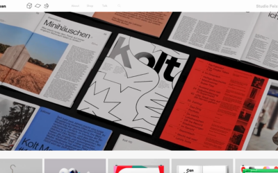
Studio Feixen
Studio Feixen's portfolio strikingly exemplifies the art of infusing vibrance without inundating the user. A harmonious equilibrium between playful and sophisticated elements suggests a perfect fusion of personal flair and top-notch craftsmanship.
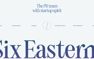
Six Eastern
Interesting overall interaction here making this side scroll. I'm not sold on it 100%, but it kinda works here - makes it all stand out. Good too that it's based on a foundation of solid visual design.
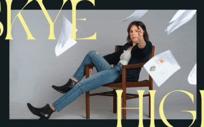
Skye High
Skye High employs oversized typography, with the motion cleverly confined to the background layer. The design's synergy is evident as the flying pages from the background animation interact with the letters, proving that an engaging visual doesn't require excessive...
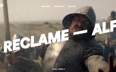
Alfred
In the hero header, a bold, easily readable text layer smoothly scrolls from right to left. What stands out is the minimal word count, making reading during motion user-friendly. Moreover, this moving text layer is overlaid on an animated video roll, and the...
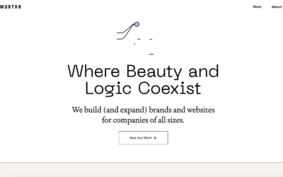
Grain & Morter
Beautiful, simple and clean design always wins. I love all the elements of this design - from the easy going type treatment to the fun illustration work, solid work.
kappow
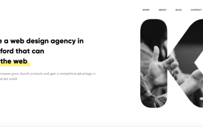
Cool, almost minimal layout. I like the interaction when you move your cursor over the K - pretty neat/fun. I like how certain sections load for you as you scroll down the page, it really rewards the user well for exploring the content.
Lovi
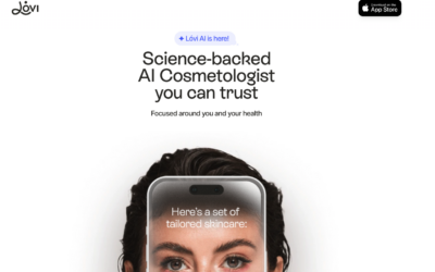
Pretty nifty one-pager. I really like how the targeted scrolling sections draw you in and then help educate on the app's subject matter. Solid photo and detail work as well - i'd expect that from an AI based app too.
Faculty
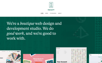
I really, really love the simplicity in this design/layout. Simple isn't the right term, it's minimal. Which is super difficult to achieve and they've done it. Bravo.
Cybertruck
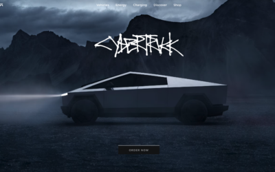
At first glance this page looks really simple and it is from a visual/layout perspective. But, at the same time there are some nifty things going on interaction wise as well as some really top-notch photography.
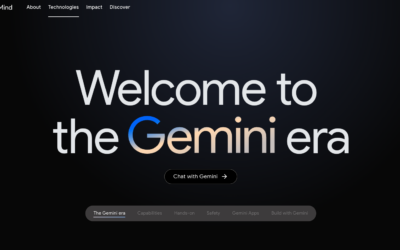
Google Gemini
Pretty good visual design from Google here with this page. I like the scroll-to infographics sections and the black background gives it a classy look.
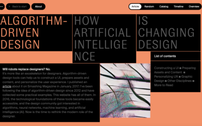
Algorithm Design
Some real clever interaction stuff built on this website design. It's clearly directed toward more design savvy people and that's cool too, considering it's about AI driven design stuff.
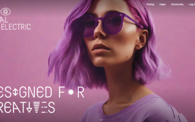
Visual Electric
AI image generator... I like the ripple effect on the hero image area. That display type is pretty far out there - reminds me of sci-fi for sure.
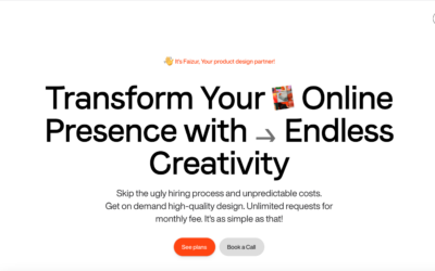
faizur
https://youtu.be/4Mpo8VlkUHU Slick looking layout and design for this design service website. It has all the design details you'd expect to look very professional and trustworthy. Good job there! Check out the video to see what you think about the overall concept of...
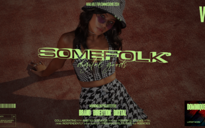
Somefolk
Pretty rad look and feel to this website design. I love the oversized type and the colors used in contrast with the "dark" photography used. I also find it very interesting that the top part of this design starts to look like or at least interacts like a YouTube card...
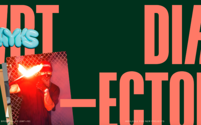
Flayks
https://youtu.be/cb7dCitixm0?si=K1fk5ZTQZV5bZ6Ji Very interesting layout for the Flayks portfolio website, some cool typography work to stand it all up on. I like the green and orange colors - very trendy yet not really. I also very much like the work section and how...
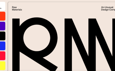
Raw Materials
Raw Materials takes an unconventional approach by not featuring images of their work above the fold on their single-page site, necessitating scrolling to reach the work section. However, their effective use of bright colors and large typography adeptly conveys their...
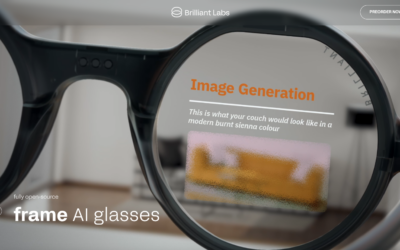
Brilliant Labs – AI Eyewear
I dig scrolling on these long parallax style page layout/interactive/animation based pages. This one is well built and seems pretty seamless. Interesting product as well.
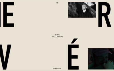
Herve Baillargeon
Interesting visual style for this layout. I like the, i'm going to call it, "broken" typography style - reminds me a bit of David Carson's work from back in the day.
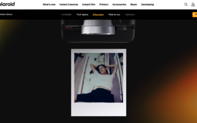
Polaroid i2 Camera
Super slick demo website for the new i2 camera. Solid parallax style triggered animations and super clean and interesting usage of product photography. Not to mention showing off the camera's photo styles as well. Fun!
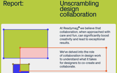
Readymag Report: Unscrambling Design Collaboration
Readymag, the design tool for creating outstanding websites, celebrates its 10th anniversary by launching a report on design collaboration in the form of an interactive digital editorial.
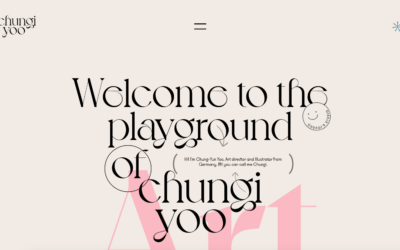
Chung-Yun Yoo
Lots of creative folks, like designers and photographers, really dig HTML5 websites because they let them express themselves in cool ways. Chungi Yoo's portfolio is a neat example. It's not just a plain showcase; it's like a fun playground where you can mess around...
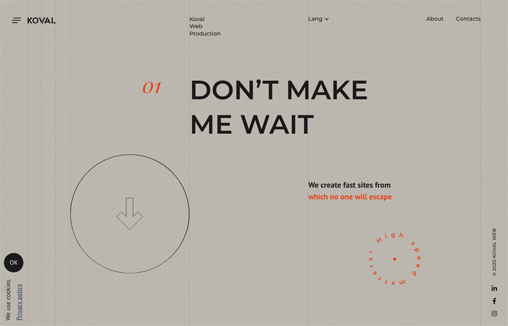
Koval Web
Captivating play between the type layer and background/grid. I like the scroll interactions. Not crazy about taking over my cursor with a circle. Overall solid layout.
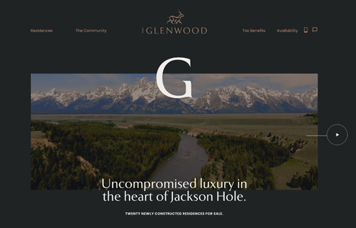
The Glenwood
Branding & Interactive design for The Glenwood, Luxury Real Estate development in the heart of Jackson Hole
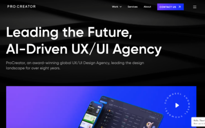
Procreator
Cool background animation. I also dig how the microinteractions work when you mouse over the video area and then the number animations. All in all, this is a compelling visual design that pulls me in.
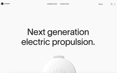
Propel
I LOVE minimal website design. This one really matches the product itself. Clean lines and simply type drive it home to let you just scroll and take in the beauty.
Slavery Footprint
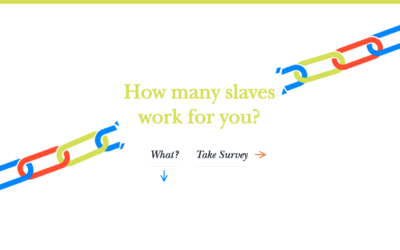
The folks working on Slavery Footprint went with a popular choice for their CSS design: a storytelling approach. They used scroll-activated animations, illustrations, and CSS effects to share a compelling story about slavery. They kept it simple with sliding...
Tarik Jamil
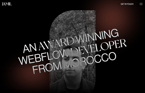
A portfolio site for Tarik Jamil, a Webflow Developer based in Morocco

