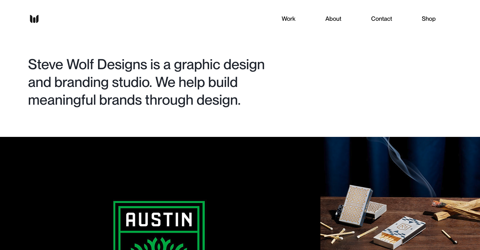
Love the grid here. The juxtaposition of the type and images is solid. I like the little “flitter” of the photo before it loads into it’s place on the grid, it’s subtle, not subtle, and always makes you take note of the element.
Glassmorphism: The Transparent Design Trend That Refuses to Fade
Glassmorphism brings transparency, depth, and light back into modern UI. Learn how this “frosted glass” design trend enhances hierarchy, focus, and atmosphere, plus how to implement it in CSS responsibly.


0 Comments