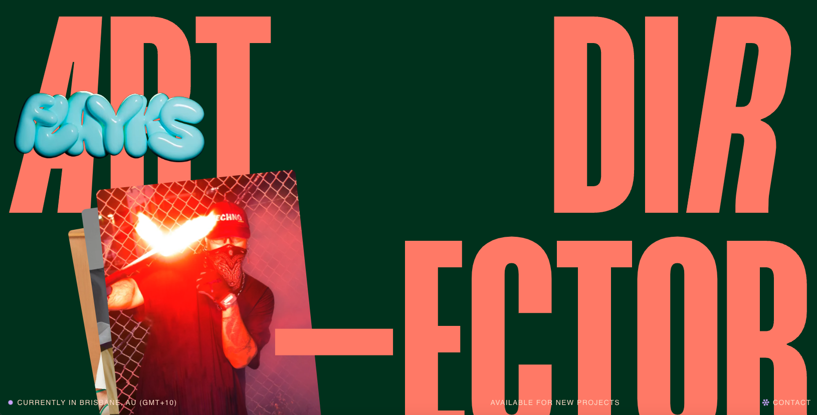
Very interesting layout for the Flayks portfolio website, some cool typography work to stand it all up on. I like the green and orange colors – very trendy yet not really. I also very much like the work section and how it uses video to show off interaction work.


The Call to Action, Revisited
The Call to Action hasn’t changed in a decade, but the bar has. A fresh look at prominence, copy, mobile tap targets, and accessibility, with lessons from three major design systems.


0 Comments