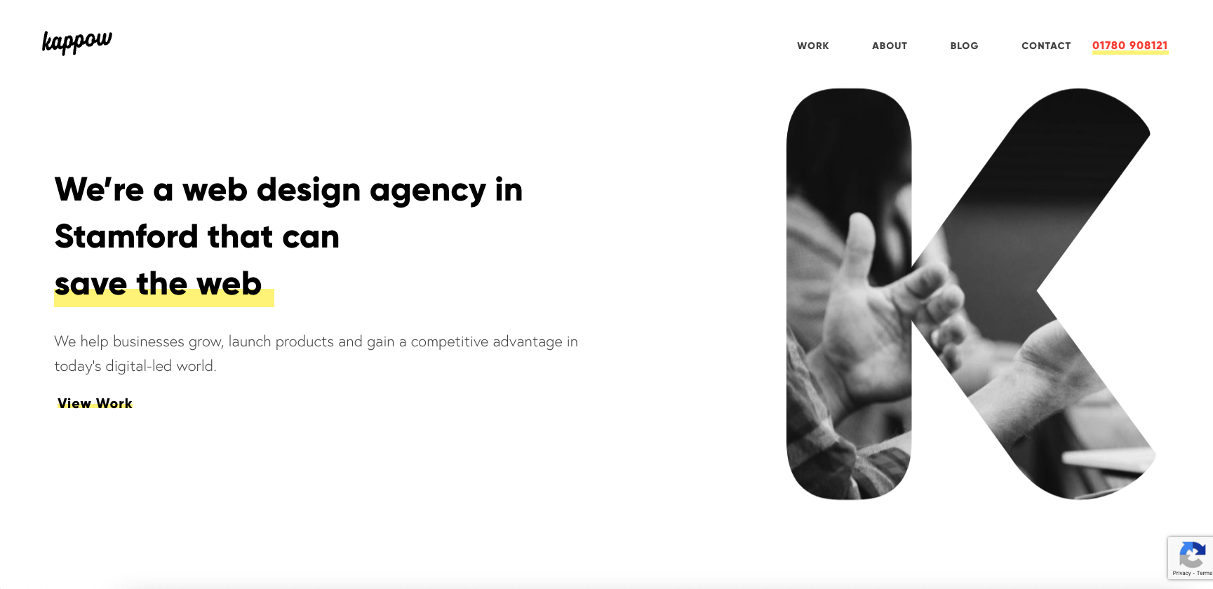
Cool, almost minimal layout. I like the interaction when you move your cursor over the K – pretty neat/fun. I like how certain sections load for you as you scroll down the page, it really rewards the user well for exploring the content.
Glassmorphism: The Transparent Design Trend That Refuses to Fade
Glassmorphism brings transparency, depth, and light back into modern UI. Learn how this “frosted glass” design trend enhances hierarchy, focus, and atmosphere, plus how to implement it in CSS responsibly.


0 Comments