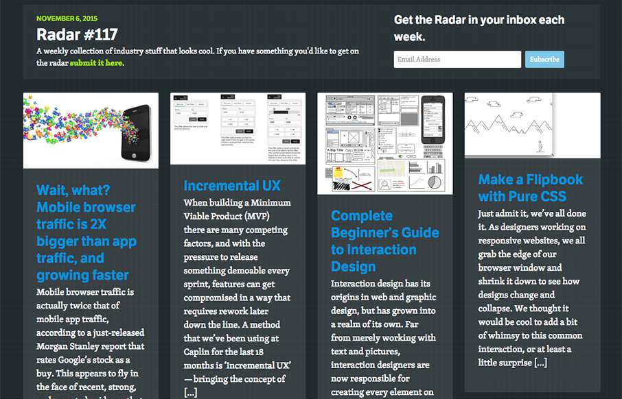
In this week's 117th Radar: Wait, what? Mobile browser traffic is 2X bigger than app traffic, and growing faster Incremental UX Complete Beginner’s Guide to Interaction Design Building an Enterprise CSS Framework Make a Flipbook with Pure CSS CSS Animation - Spheres,...
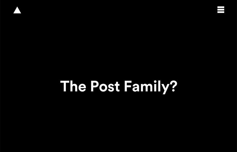
The Post Family
The Post Family website looks great on desktop, I love the wide open feeling and the play of the large headlines on the background images and patterns. It loses some of that luster on the smaller screen versions, however it is still easy to use and get to sections.
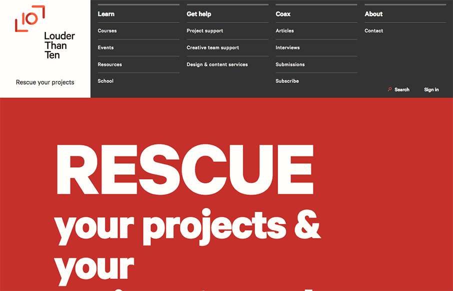
Louder than Ten
Louder than Ten, the digital home of Rachel and Travis Gertz, is a wonderfully designed approach to a digital services company website. I love the thoughtfully placed main navigation, including it's transformation on smaller screen widths, and the large and easy use...
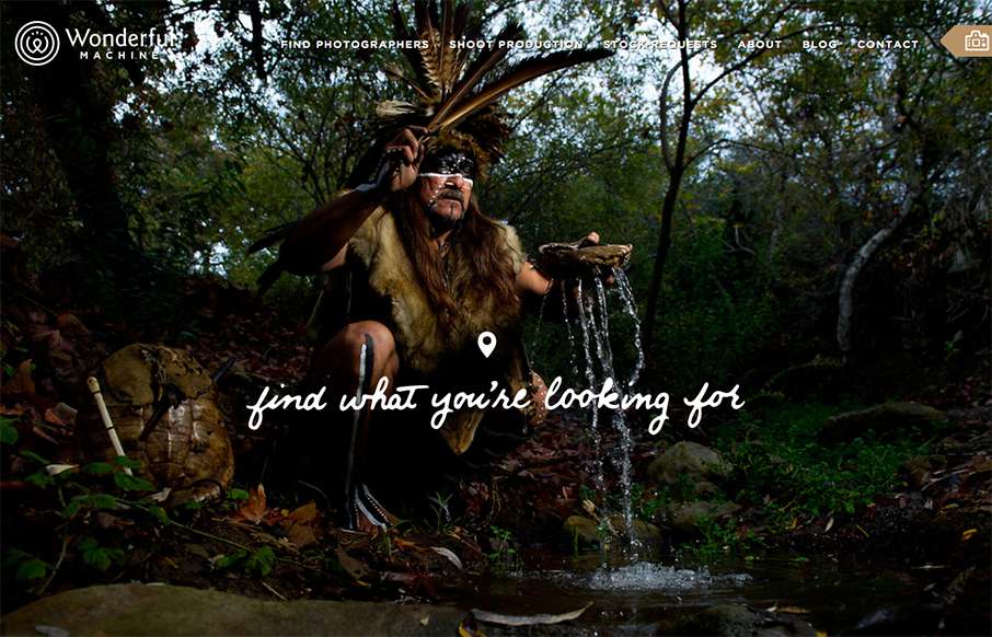
Wonderful Machine
Wonderful Machine is a production company with a network of more than 700 highly curated commercial photographers worldwide. The site houses a photographer search used by agencies worldwide, and Wonderful Machine's other services such as stock photo requests, crew...
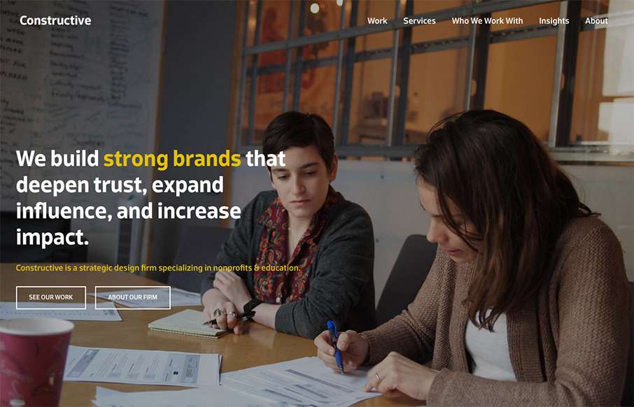
Constructive
It's a fairly standard approach to a layout but I dig it. I like the way the large splash image blends on top of the modular boxes below it. It feels fluid this way. Add in some decent responsive design and it makes for a great site.
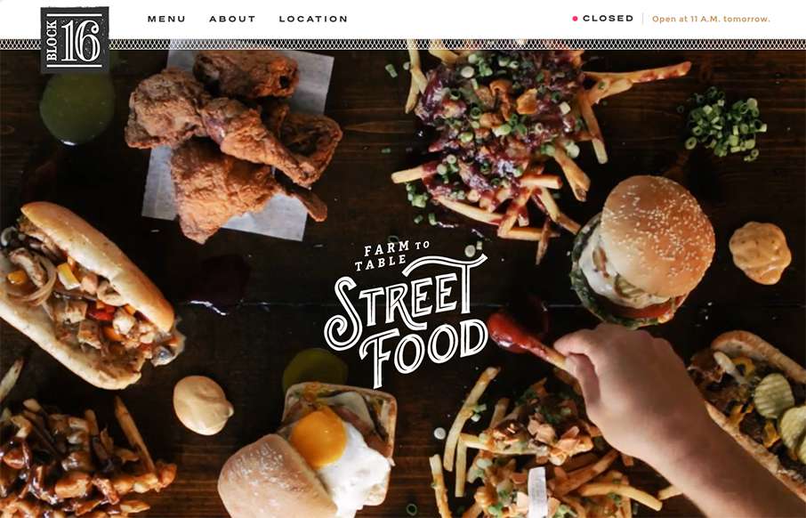
Block 16
One more example of how restaurant sites are finally getting facelifts - love this one that Grain & Mortar did for Block 16 out of Omaha, Nebraska. As an aside - restaurant websites have always been horrible (here's my 2nd site I ever made for a restaurant franchise...
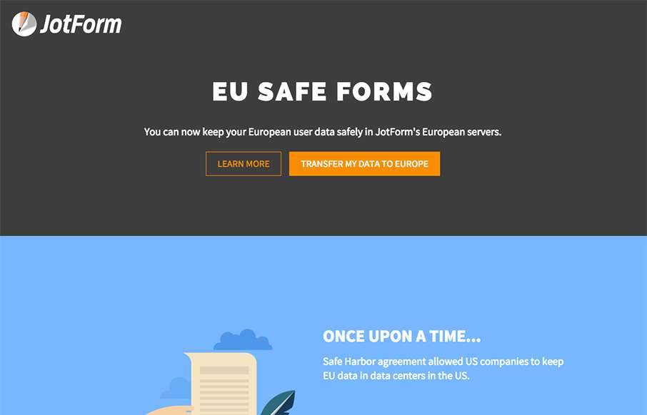
EU Safe Forms – JotForm
We're reviewing this page for this page only. It's a good example of great, clean product (product feature) page - good funnel - good illustrations. (keep in mind that parts of the JotForm site need a good bit of work design-wise - so my hope would be that they...
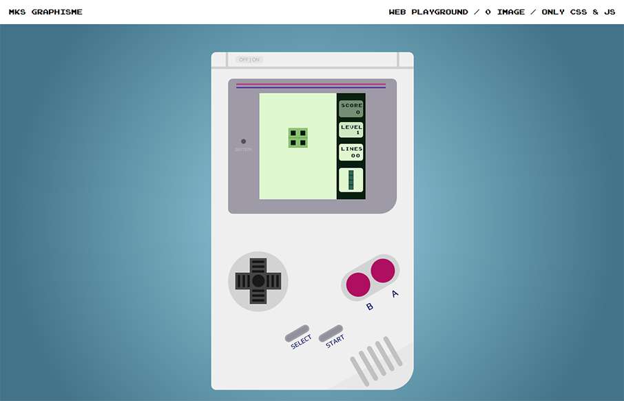
MKS Graphisme
Very Cool. From the Designer: French webdesigner, from Lyon, France Submitted by: Mickael Soler Role: Designer & Developer Country: France
Faculty Creative
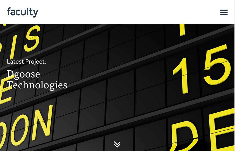
Good, fast, clean agency site from Faculty Creative out of the UK. I like their social media feed - a little different than others, so kind of cool. Submitted by: Jamie Gregory Twitter: @madebyfaculty Role: Designer Country: UK
Beefeater Gin
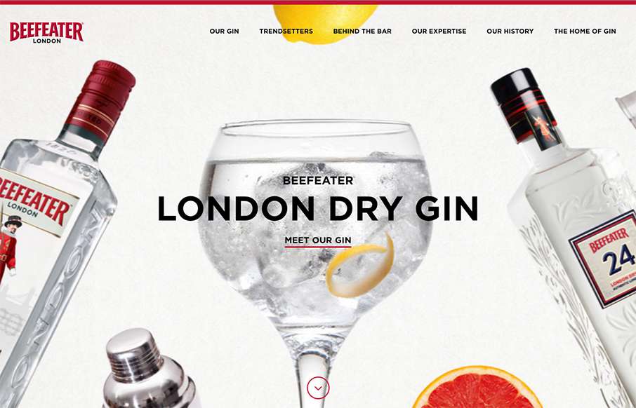
Excellent site for Beefeater Gin out of London - bright and clean, with big bold, full width images. Also like what they've done on one of their pages with the London Sounds interactive music map - very cool. Submitted by: Lauren McGregor Twitter: @WeAreImpero Role:...
Chicago Bulls History
Tight and fast sub-site from the Chicago Bulls - great visuals on the video and image backgrounds - and surprisingly no scroll-jacking. Looks like they are still adding some content to the site (Teams / Players) - but really like where it's going. Submitted by: Ray...
Locumstory
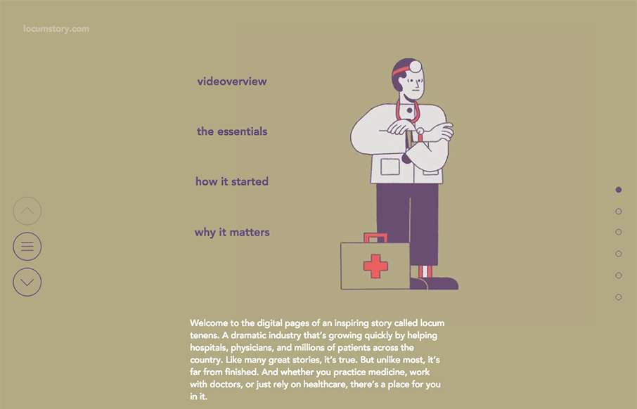
Love the animations and transitions from this site, that is about healthcare... yep. Looks like it was produced by CHG Healthcare out of Salt Lake City (still trying to find out the designer info - Tweet back if you know: @thegrizzwolf)
Radar #116
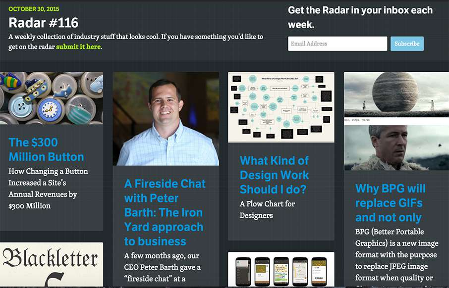
In this week's 116th Radar: The $300 Million Button A Fireside Chat with Peter Barth: The Iron Yard approach to business What Kind of Design Work Should I do? Why BPG will replace GIFs and not only A History of Typeface Styles & Type Classification Starbucks Android...
James Bond Drag Race
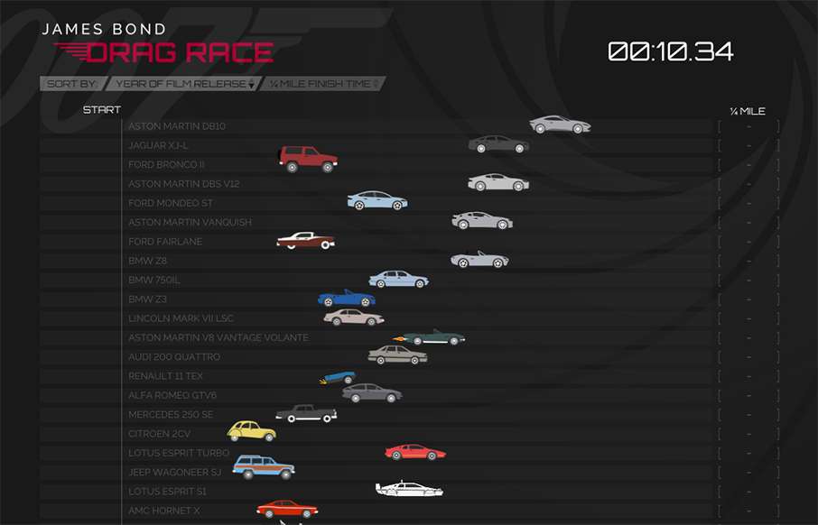
Just a quick, cool, James Bond fan page from Just Park out of London. I like these when they come up, just like the when we reviewed the "wekeeptheotherbadmenfromthedoor.com" - just a little bit of fun for your day.
Creative Tim
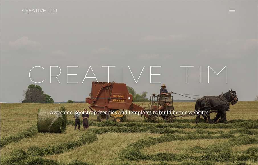
I like that Creative Tim, the design team out of Romania that brought you the "Get S*** Done" Bootstrap UI Kit, has added a layer to their normal site. While their main site is a clear shopping site for themes / kits / etc, the "presentation" site is a great About...
What is Burning Man?
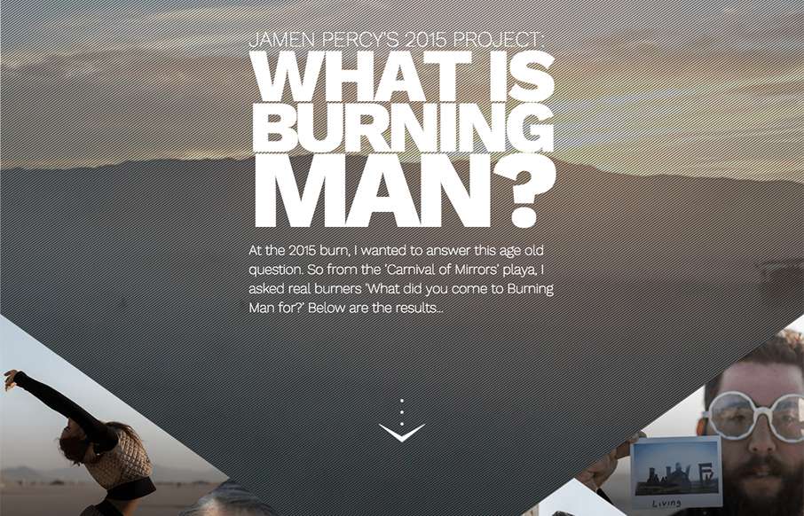
Here's a cool pet project from Jamen Percy of London about his experience at Burning Man this year. Listen, if you're going to do something fun for yourself - make it dynamic and awe-inspiring like Jamen has here. Love the site in general - think the video progress...
AdorableGeeks
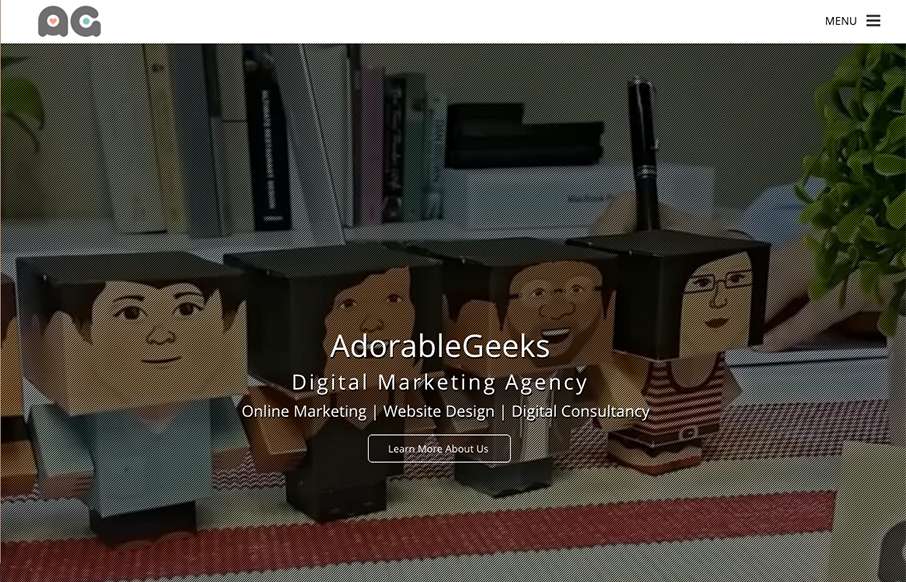
Really like the full screen/page video background as an intro the the AdorableGeeks site (out of Singapore). Also like how they carry that concept to their work detail pages under Showcase - it may be another click downstream, but the full screen/page image that you...
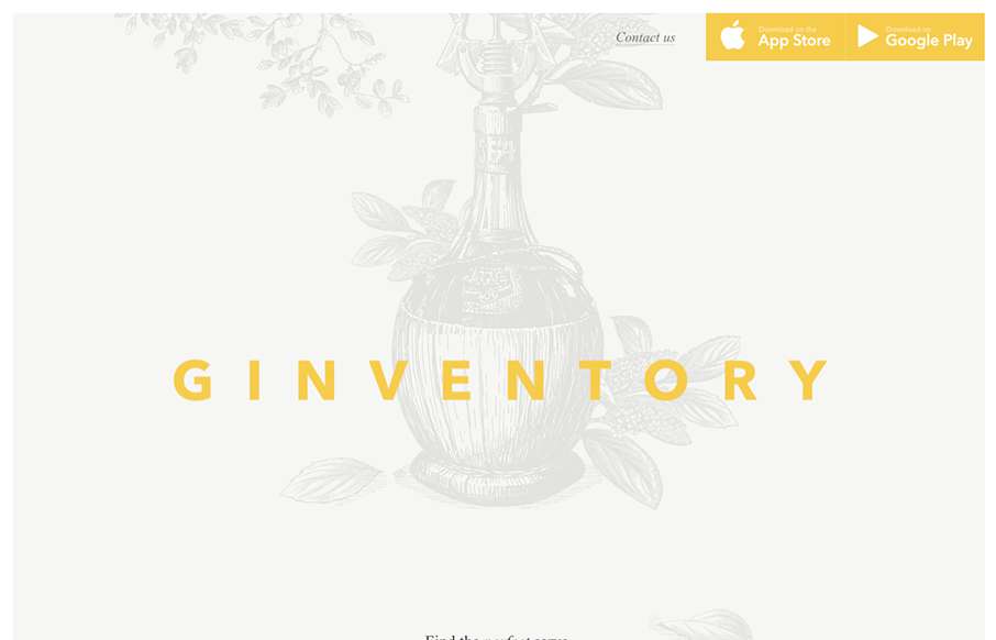
Ginventory
Ok... throw out your old, stodgy, bootstrapped App Product Pages... Ginventory out of Brussels just broke the mold. Cool transitions and great video capture of the app itself, all in a beautifully designed container.
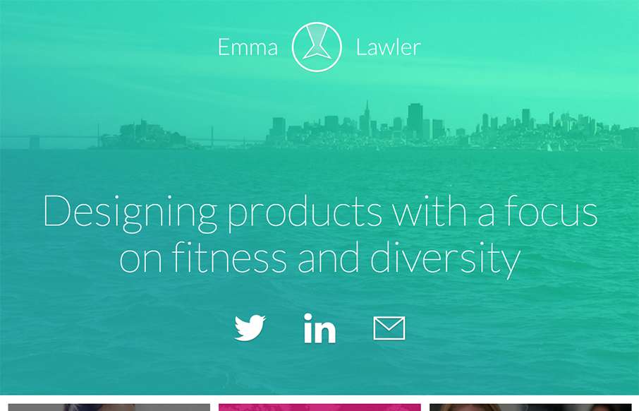
Emma Lawler
Solid and simple portfolio from Emma Lawler out of San Francisco. I like the movement when you click a work sample - also like that there are only three work examples (as not to clutter the page), but that each example has a nice quick narrative, so you get a good...
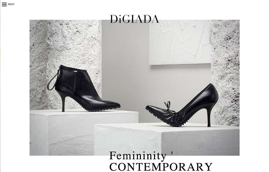
Digiada
Pretty sweet minimal site from Marco Amato out of Italy, for Digiada Shoes. It's clean and has really good slight movement as you move down the page. Submitted by: Marco Amato Role: Designer Country: Italy
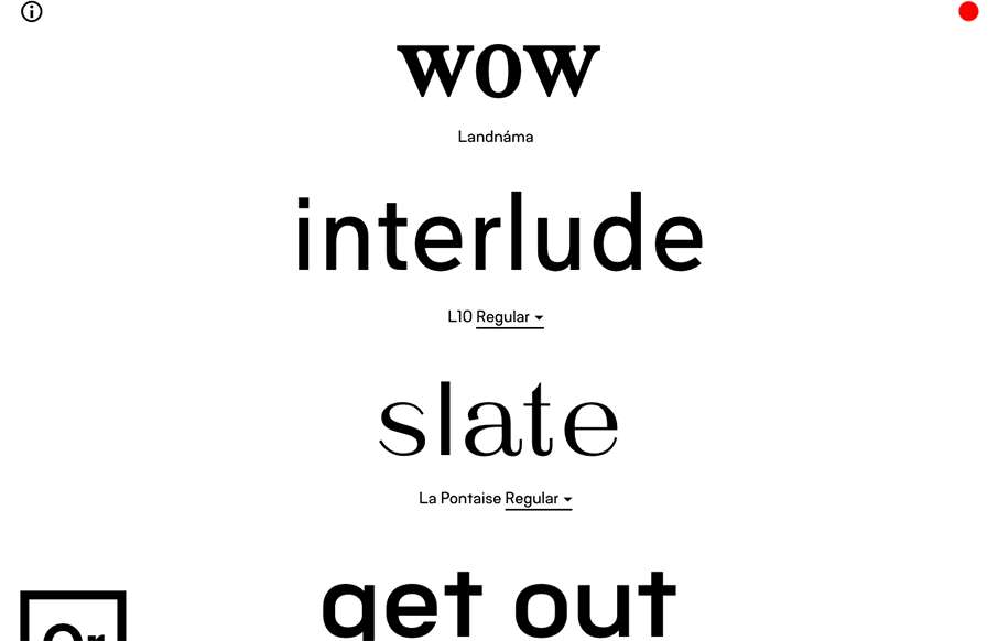
Or Type
Best Font / Type site we've seen in a long time. Or Type's site, out of Iceland, is live - you change the words for the example fonts, it changes it for everyone viewing the site - instantly. Then, you can either do a rewind of all of the changed words, or see them in...
Google Frightgeist
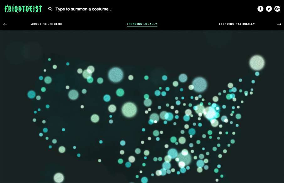
I'm an analytics nerd - so this Frightgeist site from Google Trends really speaks to me on two levels (design being the other). It's a fairly simple site - but the US map with the blue/green shimmering specter-like bubbles (which look like the "spirit bubbles" in...
OVO Things
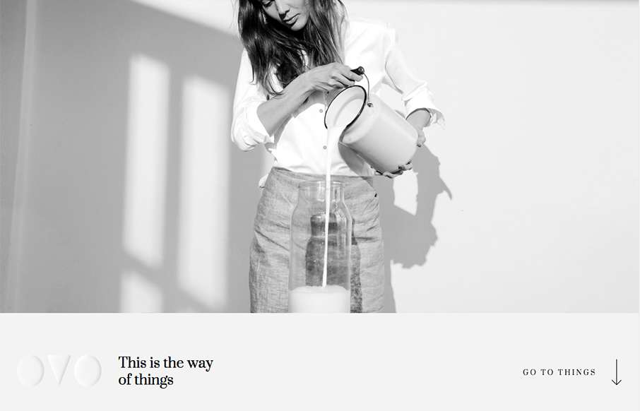
We've started to see a couple of good sites coming out of Lithuania lately - and I like this one from OVO. I really like the transparent logo, and how it plays on different pages - also like the fact that they are willing to partially cover up the product category...
George Leonardo
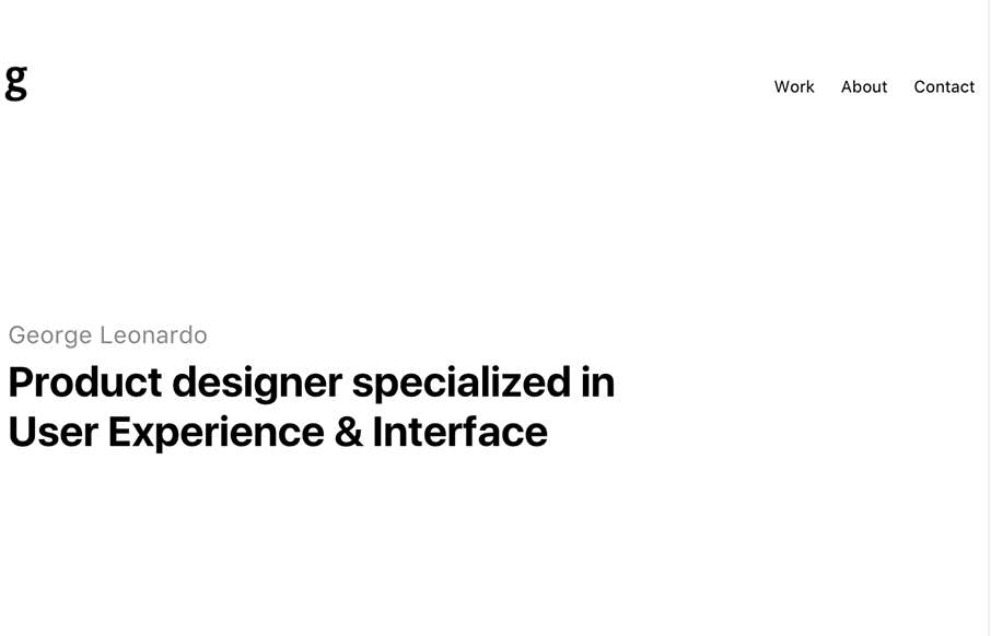
For being a seemingly minimal portfolio site from George Leonardo out of Brazil, it has some good, subtle pieces that add to it being a strong site. I was about to say today was black and white site day, but George had some hidden color in his tags leading to the Work...
stilbox studios
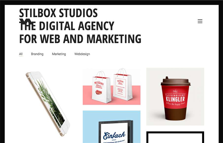
Good looking black and white agency site by Stilbox Studios out of Germany. Very simple - focuses on their portfolio - and I like how the foot unveils. From the Designer: stilbox studios is a Web & Marketing Agency - Consulting. Strategy. Implementation. Submitted by:...
Radar #115
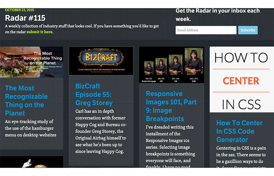
In this week's 115th Radar: The Most Recognizable Thing on the Planet BizCraft Episode 55: Greg Storey Responsive Images 101, Part 9: Image Breakpoints How To Center In CSS Code Generator Animate Elements on a Path with CSS The JavaScript World Domination An...
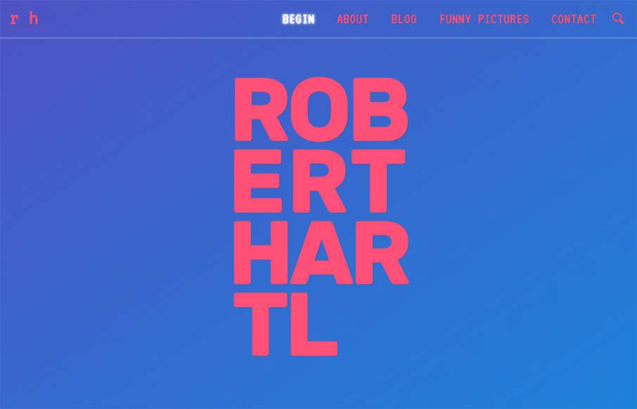
Robert Hartl
I almost didn't post this one, but I've been reading Robert Hartl's site with Google translation turned on - and have crossed over to bizzaro world, but it's fun, and Robert looks like he's having fun with this (see the About section / and the SelfieInterview). I like...
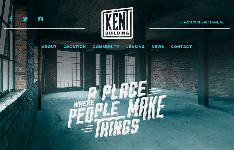
The Kent Building
Excellent site from Open Door Design Studio out of Asheville for The Kent Building. Yes, normally I would say - "compared to other real estate sites..." - but we've seen really good growth in the real estate niche of awesome looking websites, like this one. Really...
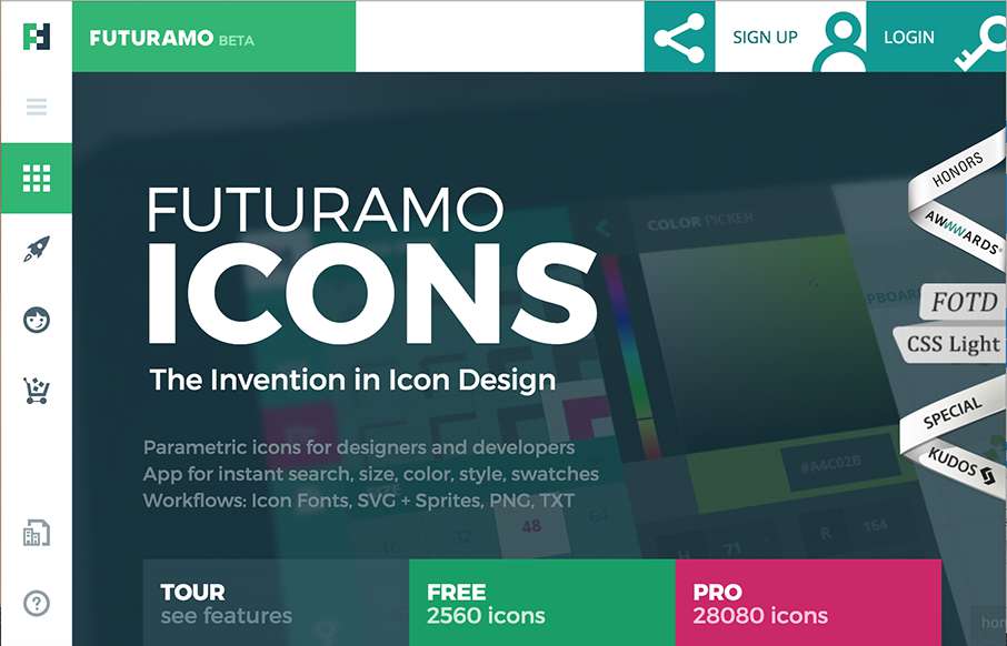
FUTURAMO Icons
Love the look of this site from Futuramo Apps out of Poland. Check out the Tour and Team pages - great use of movement and a totally different look than what we're used too from "app" product pages. From the Designer: Parametric icons for designers and developers. App...
Will Fernandes
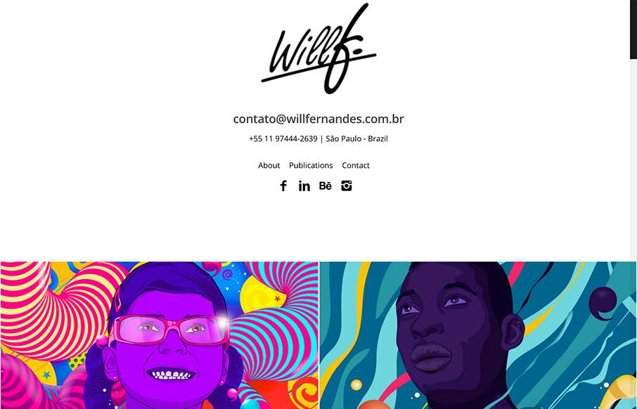
Love this site from Will Fernandes out of São Paulo, Brazil. I know that on the face of it, the site is mostly images - but everything is laid out cleanly to let the art be the center piece - great imagery! From the Designer: I am Will Fernandes, a brazilian...

